NKORA COFFEE ‣ BRAND IDENTITY
Client
- NKORA
Role
- STRATEGY
- CONCEPTION
- ART DIRECTION
- DESIGN
- PRODUCTION
Deliverables
- VISUAL IDENTITY
- PACKAGING DESIGN
- WEBSITE
- PHOTOGRAPHY
- VIDEO
Date
- 23 Sept 2025
How can a coffee brand mature without losing the independent charm that makes it special?
monopo crafted a visual identity that leans into the contemplative powers of a walk. Complete with a lino-printed character called Miles, custom typography and bespoke illustrations to preserve the character and quirks that make NKORA special.
/01 CHALLENGE
Rebranding an independent London Coffee chain for a new era, without losing its soul
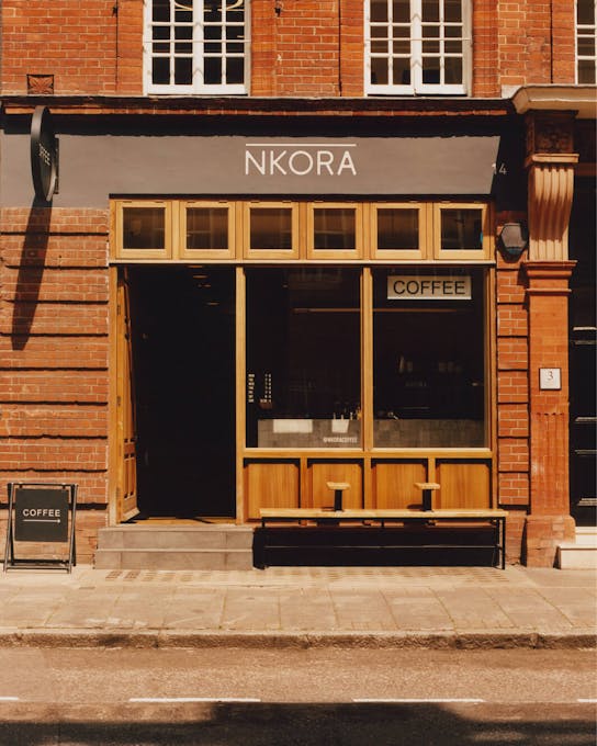
NKORA began in 2015 when founders Nancy and Emile, living opposite a small empty unit on East-London’s Hackney Road, decided to open the kind of coffee shop they wished existed: simple, welcoming, and quietly considered. Ten years and 6 additional locations later, NKORA retained everything that makes an independent special, despite growing as a business.
With space at a premium however, coffee has increasingly become a take-away experience and it was time to evolve the brand’s identity to confidently step into the future. From the first conversations however, we knew that the solution lay in the humanity of the brand’s founders. The way they allow life to reveal itself during quiet moments or peaceful walks. To rebrand NKORA would be an exercise of bringing the truth out that was hiding within.
/02 CONCEPT
Slowing down the coffee run to enjoy the walk
The rebrand reimagined coffee-to-go as a ritual to savour rather than a routine to tick off the list. Where take-away coffee is usually associated with speed and functionality, NKORA leans into the opposite; slowing down. Walking and having a coffee both hold strong contemplative powers and they are reinforced when you bring them together.
NKORA proudly owns the overlap between the psychology of walking and that of drinking coffee, where having a cup in hand has the power to unlock a more contemplative moment. Coffee becomes a quiet counterpoint to a world that rarely stops, serving cups for those who think gently and notice more.
/03 NKORA’S UNIVERSE
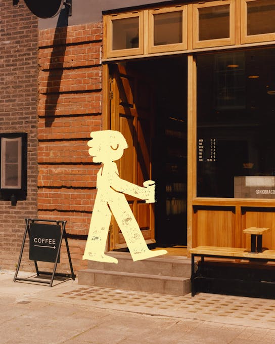
A mascot called Miles and a world to wander through
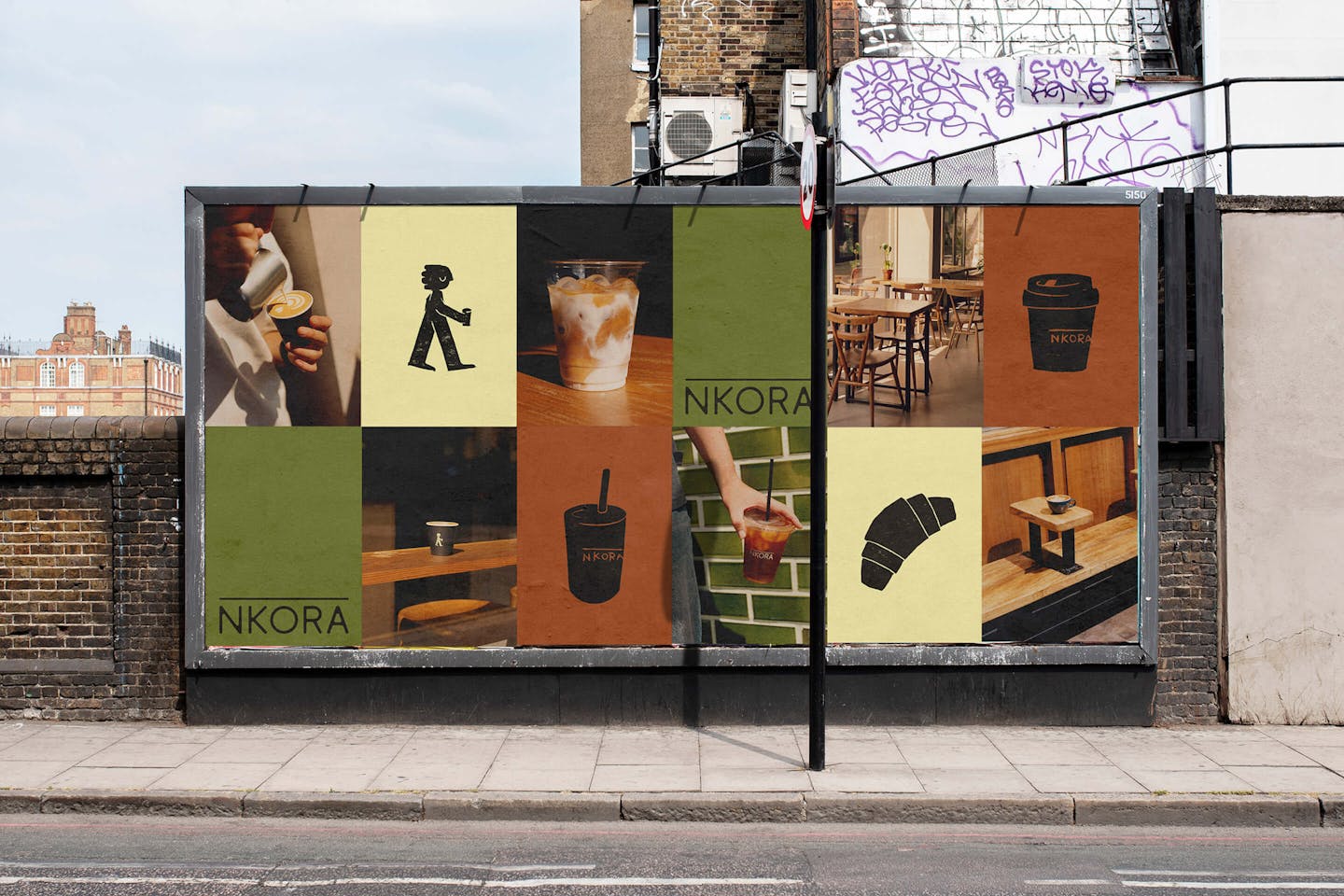
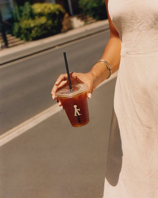
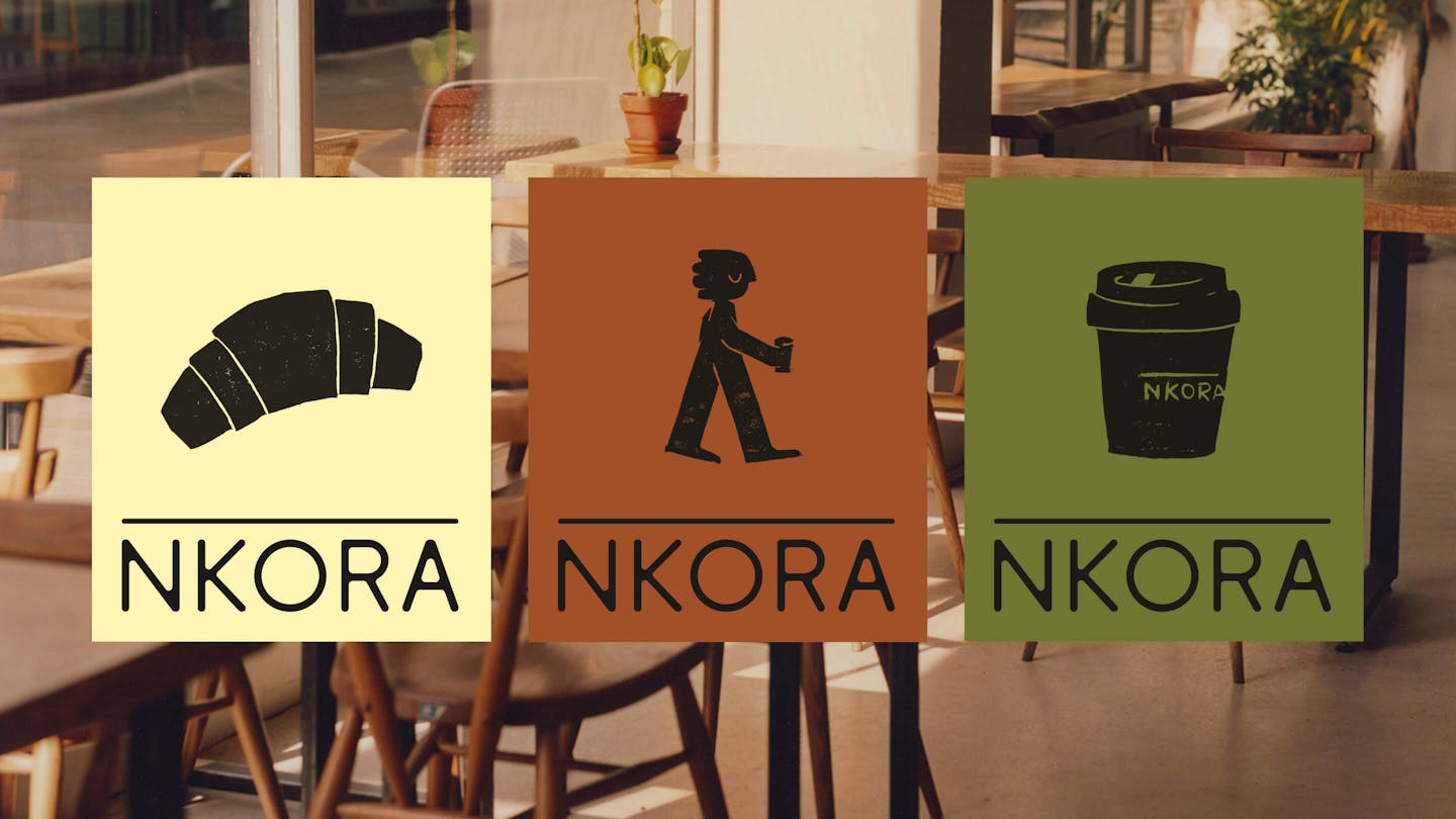
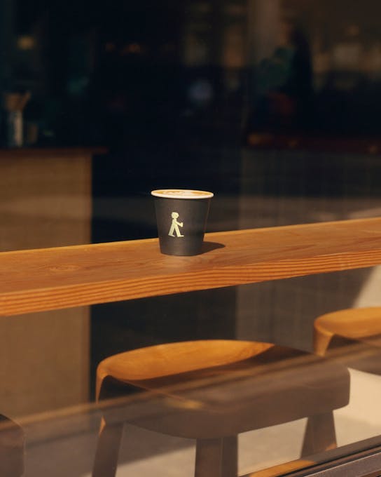
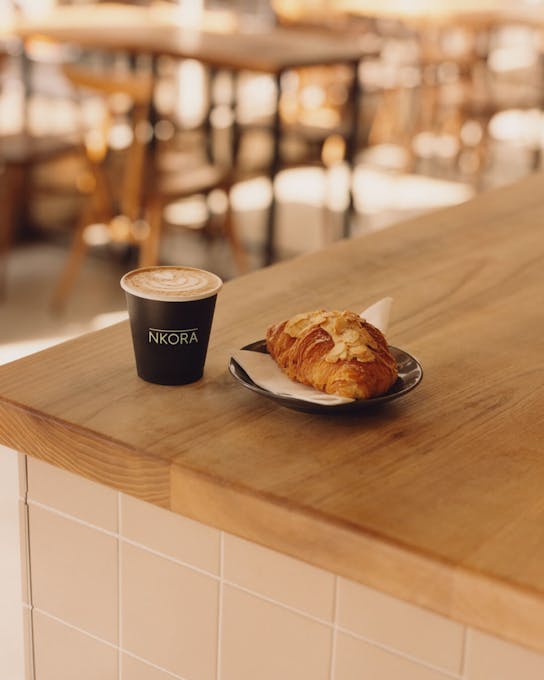
The tactile world of NKORA called to be crafted outside the frame of a digital screen, just like stepping outside for a walk to clear your head. NKORA’s new walking mascot, ‘Miles’, was born in the corners of a lino sheet, each frame hand-carved through an imperfect, tactile process that leaves behind a subtle human mark. Later printed, digitized and animated, Miles is the visual embodiment of NKORA’s values – a character that captures the quiet, thoughtful nature of moving with intention. He represents the reflective pace at the heart of the brand.
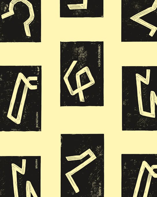
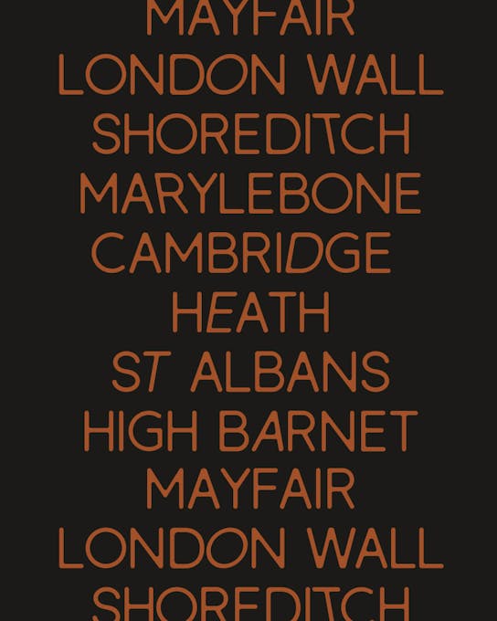
To give Miles a world to walk through, we built an illustration system using the same lino technique. Every store received its own illustration that traces and abstracts a walking route in the local area.
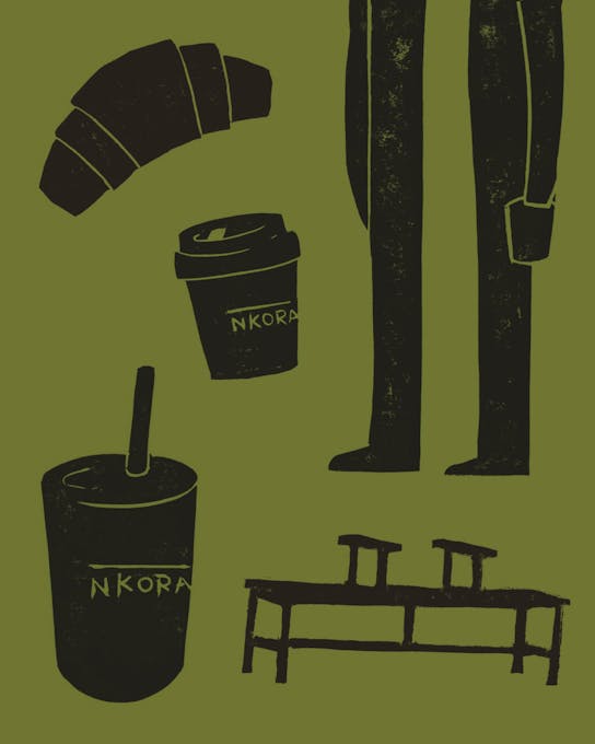
Secondary illustrations represent the benches, cups and pastries found in each NKORA location.
/04 TYPOGRAPHY
Wandering typography
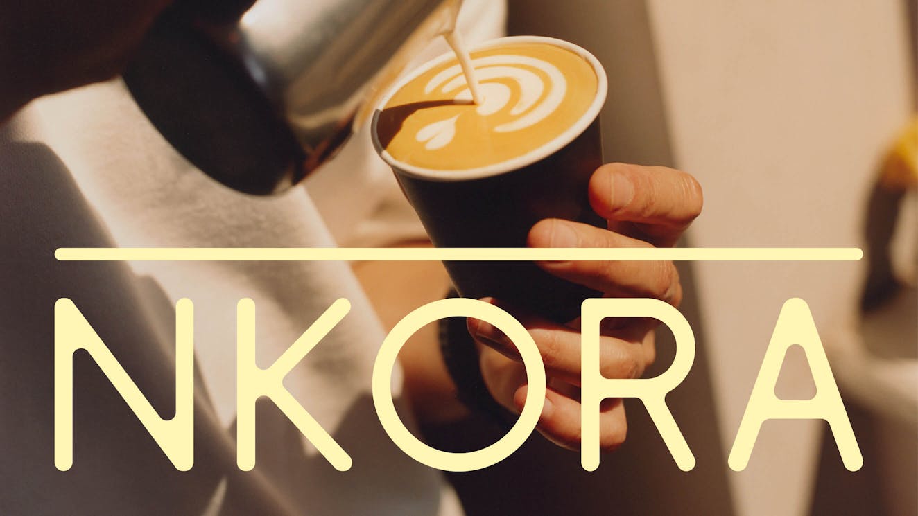
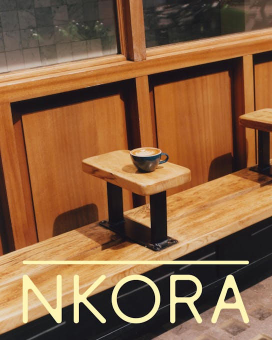
NKORA needed a typeface that felt warm and friendly, but still had a clean, modern edge. We started with an existing geometric sans serif (Antonio Rodrigues Jr’s Berlin) and softened it - rounding the edges and adjusting the structure to give it a more handmade, human feel. Those subtle curves add a quiet charm and help tie the type back to the tactile side of the brand. The NKORA wordmark was elevated with the same customised typeface - refined to reflect the brand’s clean, modern, and gentle personality.
The idea of a ritual walk also led us to create two expressive variable styles of the typeface: Italic and Reclined. They give the typography a sense of presence and rhythm, as if the letters themselves are wandering. When used in motion, the typography gets a walking treatment where it appears to be taking footsteps into the frame.
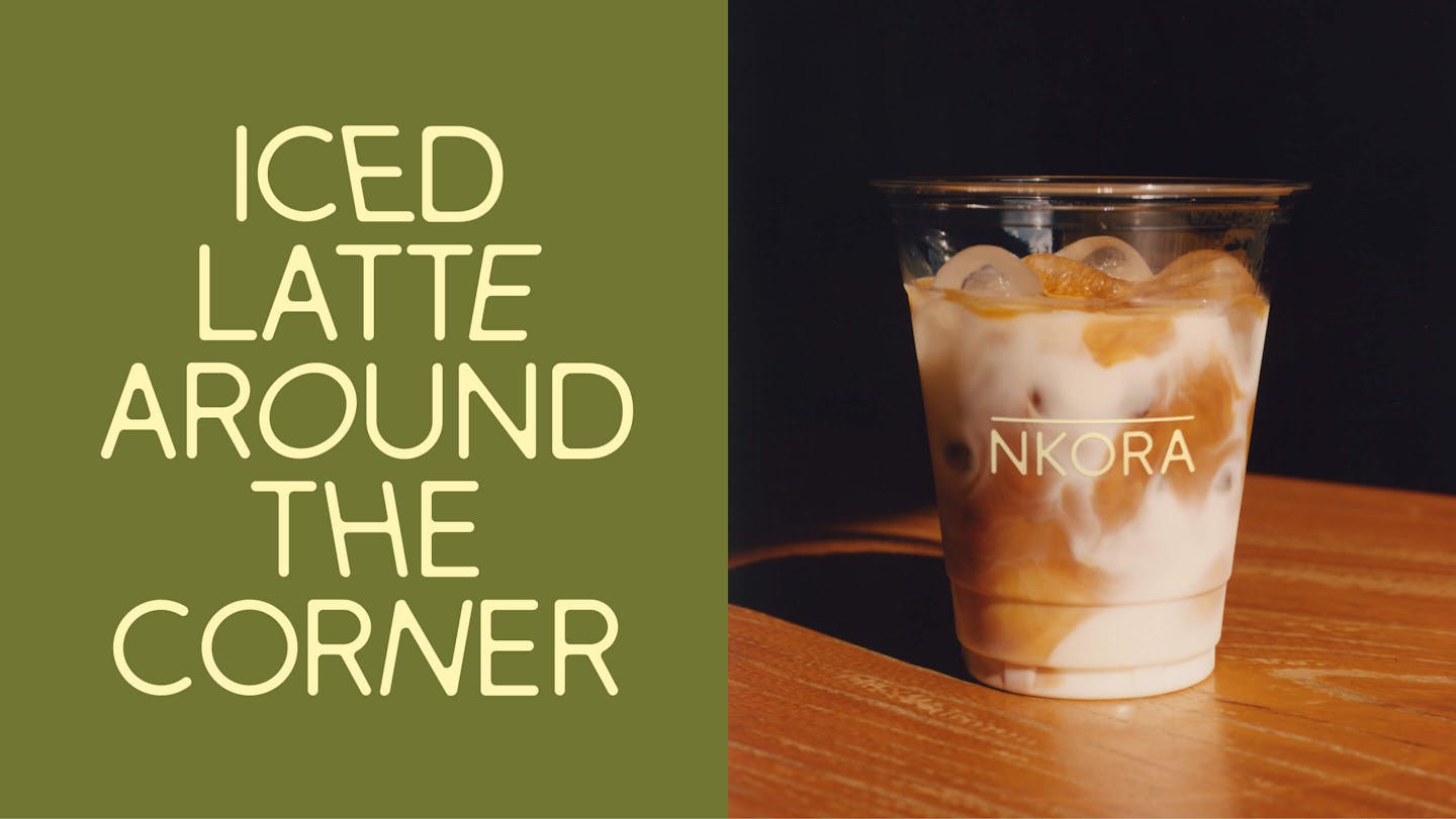
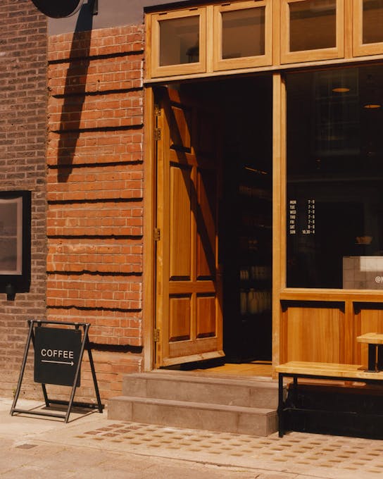
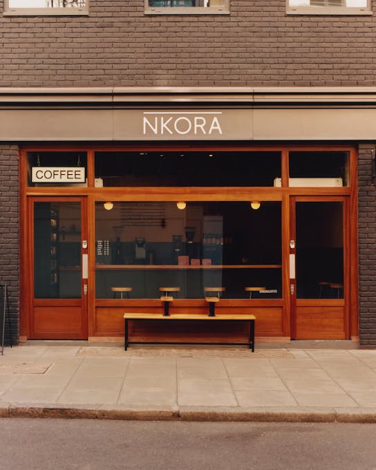
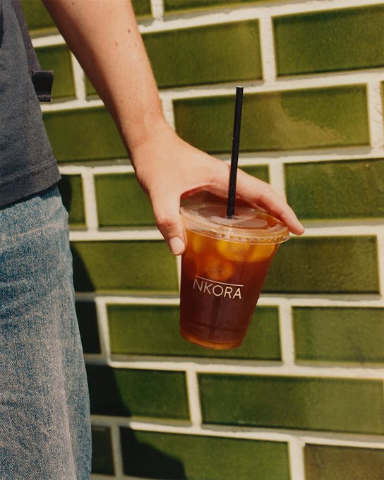
/05 PHOTOGRAPHY
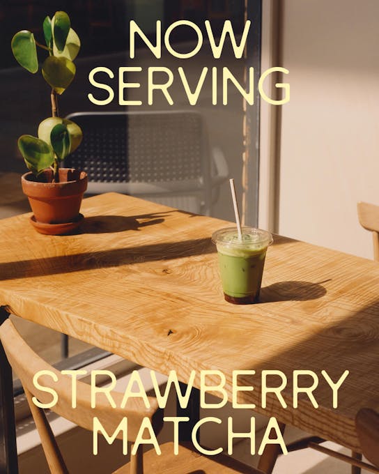
Warm film photography that invites you in
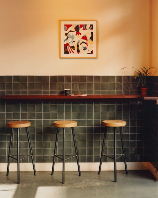
To complement the naturally warm accents of olive green, butter yellow and burnt orange in the colour palette, monopo produced photography that felt soft and approachable. Each store was photographed on film in a quiet, observational style. Focusing on romanticising the lived-in and textured details of the cafes, locals are captured mid-walk and each space appears crystallized in a grounding energy.
Credits
The team
- Lead designer: Jack MacKinnon
- Creative: Luna Gooriah
- Designer: Sam Beaton
- Film & Photography Project Management: Mary Wu
- Creative director: Mélanie Hubert-Crozet
- Strategy & Account management: Mattijs Devroedt
Partners
- Photography: Joshua Sneade
- Videography: Billy White
- Website development: Fred Mouniguet
This website uses cookies.
Learn more.
case study
→ View
project
→ Discover
more →