KODAMA CAPITAL ‣ BRANDING
Client
- KENJIRO FAMILY OFFICE
Role
- Strategy
- Branding
- Art Direction
- Photography
- Web Design
- Production
Deliverables
- Visual Identity
- Landing page
Date
- 04 Sept 2024
A family of families. Building an enduring, community-focused investment alternative to traditional finance.
Kodama Capital is a new venture by the Japanese-European Kenjiro Family Office. Building on a decade of investing experience, Kenjiro launched Kodama Capital to unite and steward various family offices across Asia and Europe. monopo was invited to craft the story and visual identity, continuing a partnership that started several years ago when we crafted the identity of Third by Kenjiro.
/01 AMBITION
Designing a legacy
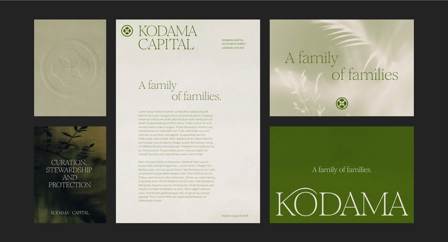
Kodama Capital was established to nurture generational investment rather than short-term profits. This prompted us to create a brand that has longevity built-in. Away from any trend or fad, the Kodama brand should show the intention to persist across the ages. Seeking a timeless balance between history and future, we blended graphic elements from the past into a modern aesthetic.
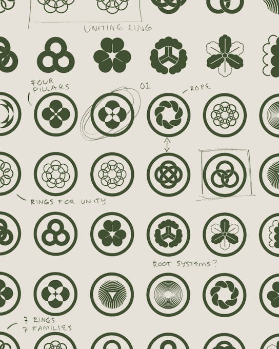
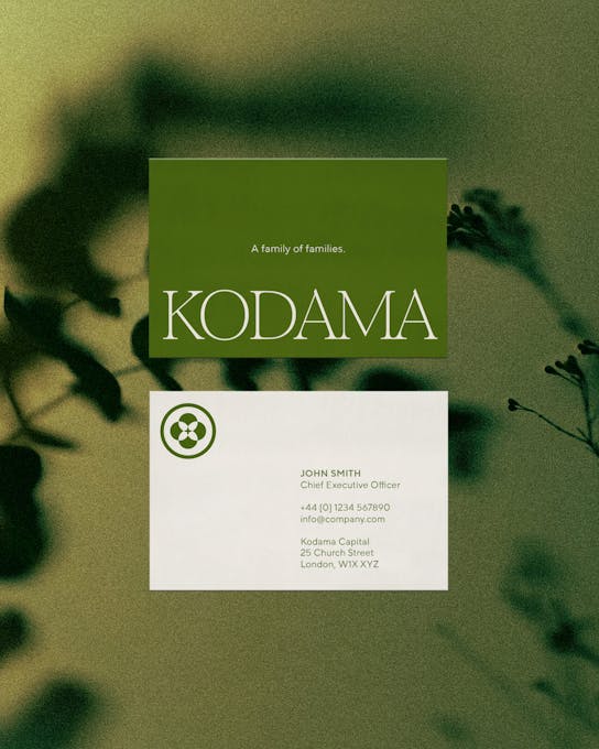
Our inspiration for the logo came from traditional Japanese Kamon emblems. Used as a symbol to represent a family, we designed a contemporary Kamon that united all the family offices under one brand, Kodama.
/02 ART DIRECTION
Representing the Kodama Spirit
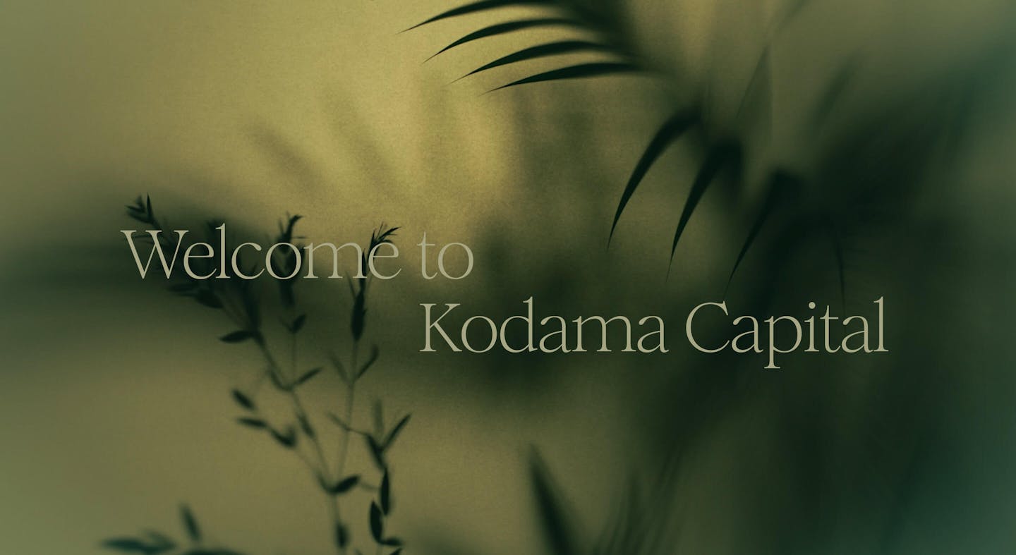
The name “Kodama” borrows from Japanese folklore, where Kodama are spirits that inhabit trees. Their presence ensures and represents a healthy, resilient forest. In naming the new venture after Kodama spirits, Kenjiro indicates that Kodama Capital is driven by a spiritual desire to create enduring growth through unity. A family of families. A forest of forests.
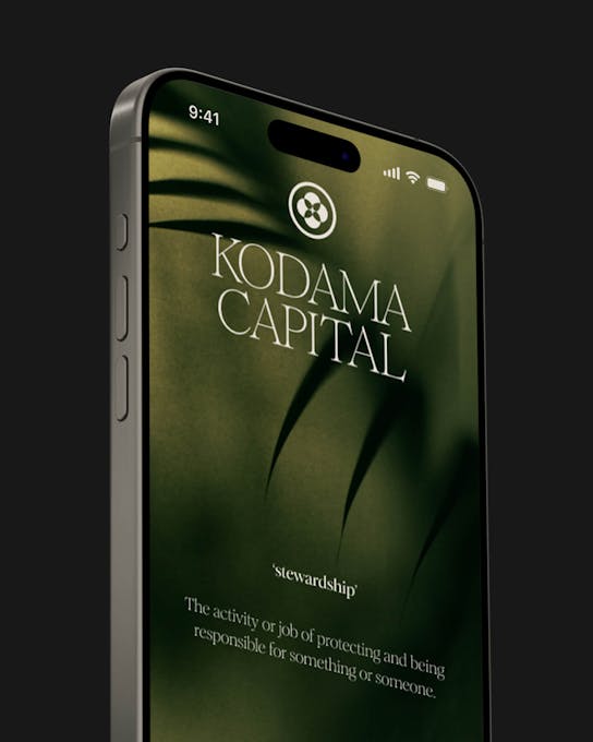
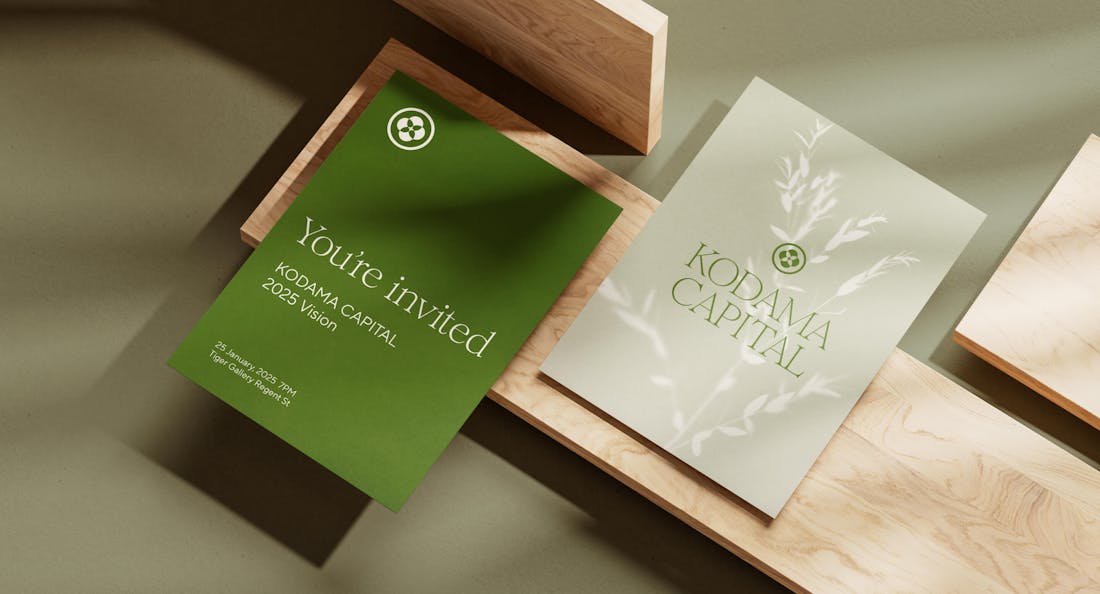
This mystical side to the Kodama brand is something we wanted to express across all components of the art direction. Ethereal photography became an especially powerful way to represent the folklore of Kodama.
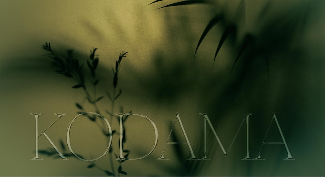
The spirits inhabit ancient forests and are not seen, but felt. Taking the form of wind, their presence could be heard in echoes or the collective rustle of the trees. We captured this intangible feeling through custom photography with shadow play in our studio. In addition to static assets, we also created custom cinemagraphs that carry the subtle motion you might experience in the middle of a calm forest.
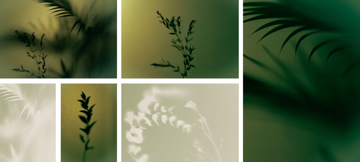
Expressed by the Japanese word, Komorebi, meaning “Sunlight leaking through trees,” the brand images have a spiritual sensibility that feels calming—welcoming new members into a sanctuary away from traditional private finance. This is further enhanced through choiceful inverted duotone treatments in selected photography, offering a mix of more powerful assets as well as more emotive assets that represent the subtlety of the Kodama spirit.

/03 TYPOGRAPHY & COMPOSITION
As resilient as a forest
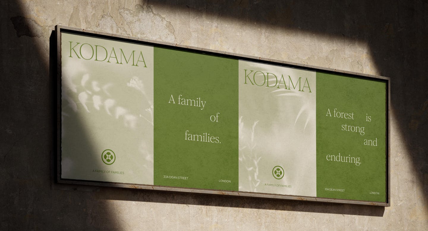
Throughout the Kodama brand, we felt it was integral to bring in the organic qualities of the forest, its imperfections, its permanence, and its ever-evolving growth. The brand leans into these principles through typography and composition.
We made the typographic choice to lead with the calligraphy-inspired display font Romie by Margot Lévêque Foundry. Romie’s intentional imperfections give Kodama its warmth, while poetic-style layouts allow the brand to be expressive and organic.
Credits
The team
- Strategic Director: Mattijs Devroedt
- Art Director: Karim Kadi
- Designer: Jack MacKinnon
- Producer: Maud Dedecker
- Project Manager: Mary Wu
- Creative Director: Mélanie Hubert-Crozet
Partners
- Web Developer: Fred Mouniguet
This website uses cookies.
Learn more.
case study
→ View
project
→ Discover
more →