OUTFRY — KOREAN FRIED CHICKEN ‣ BRANDING
Client
- TASTER
Role
- STRATEGY
- CREATIVE DIRECTION
- ART DIRECTION
- GRAPHIC DESIGN
- ILLUSTRATION
- PACKAGING DESIGN
Deliverables
- VISUAL IDENTITY
- LOGO DESIGN
- ILLUSTRATIONS
- PACKAGING DESIGNS
Date
- 15 Oct 2024
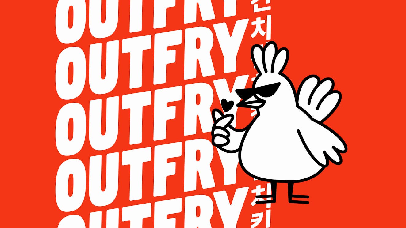
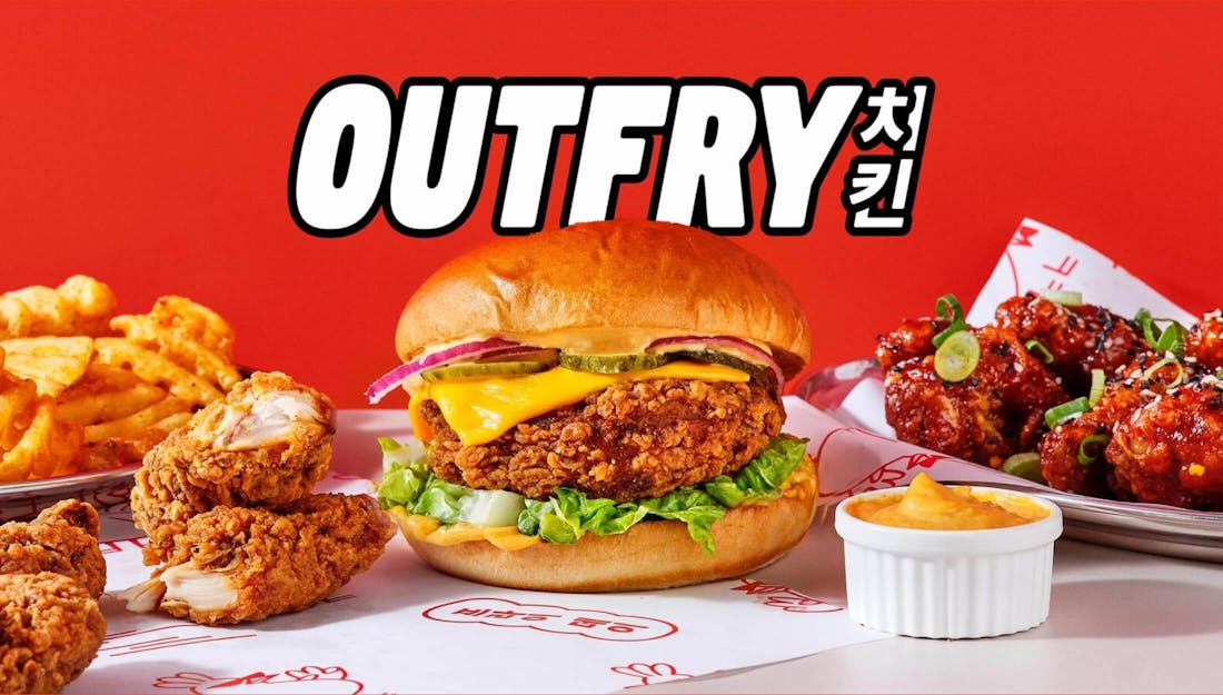
Outfry is a delivery-only Korean fried chicken brand available across the UK, France, Belgium and The Netherlands. Created in 2019 by Taster, one of the leading delivery-only (“dark kitchen”) food operators in Europe, Outfry prides itself on high-quality authentic Korean cuisine, available to all. In France alone, Outfry has over 90 outlets spread across the country.
After five years, Outfry was looking to refresh its brand and get on the radar of the uninitiated - Gen Z. The result is a vibrant brand universe, complete with lore, a duo of likeable mascots and a suite of graphic assets that work across everything from delivery packaging to social media and merch.
/01 CHALLENGE
Introducing the brand to Gen Z
Outfry started 5 years ago as one of the first dark kitchens. Its bold flavours and authentic recipes quickly created a cult following. Outfry’s success also attracted copycats however, especially during COVID, when most restaurants went online-only and increased their digital presence.
In 2024, it was time to repeat the success of Outfry’s initial launch. A whole new generation had graduated into professional life, hungry for satisfying delivery options but unaware of Outfry’s success. Time to re-introduce Outfry to the world, with a refreshed brand identity that speaks to European Gen Z.
/02 APPROACH
A punchy brand universe that is ready to entertain
As Outfry is essentially a digital fast-food chain (in the absolute best sense of the word), we realised that we needed a visual identity that would be able to generate constant communications ideas. We needed a brand that feels alive and active. That can have a constant voice on social media, but also dish up attractive deals on delivery apps. A brand that you’re proud to wear on a t-shirt, but also trust to order from if you’re ordering it on a cheeky Sunday morning.
Inspired partially by Korean entertainment culture, we imagined the rebrand as the creation of a “brand universe”. A brand with its own lore and protagonists, that could generate a constant flow of new stories and expressions.

/03 THE OUTFRY UNIVERSE
The story of two love birds: Chuck and Cherry
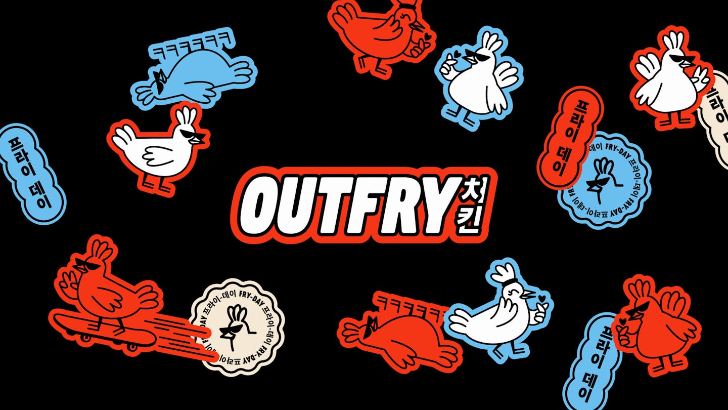
Everything started with a fictional origin story. Two main characters, Chuck and Cherry, bumping into each other on a night out in Seoul and hitting it off over their (dis)agreements on how to best eat Korean fried chicken.
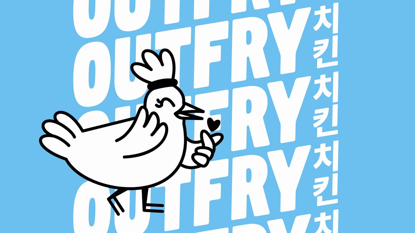
Chuck and Cherry became illustrated characters that appear across social media, packaging and merch, and lend the brand a personality that feels both entertaining and approachable. Outfry might take its food very seriously, but not itself.
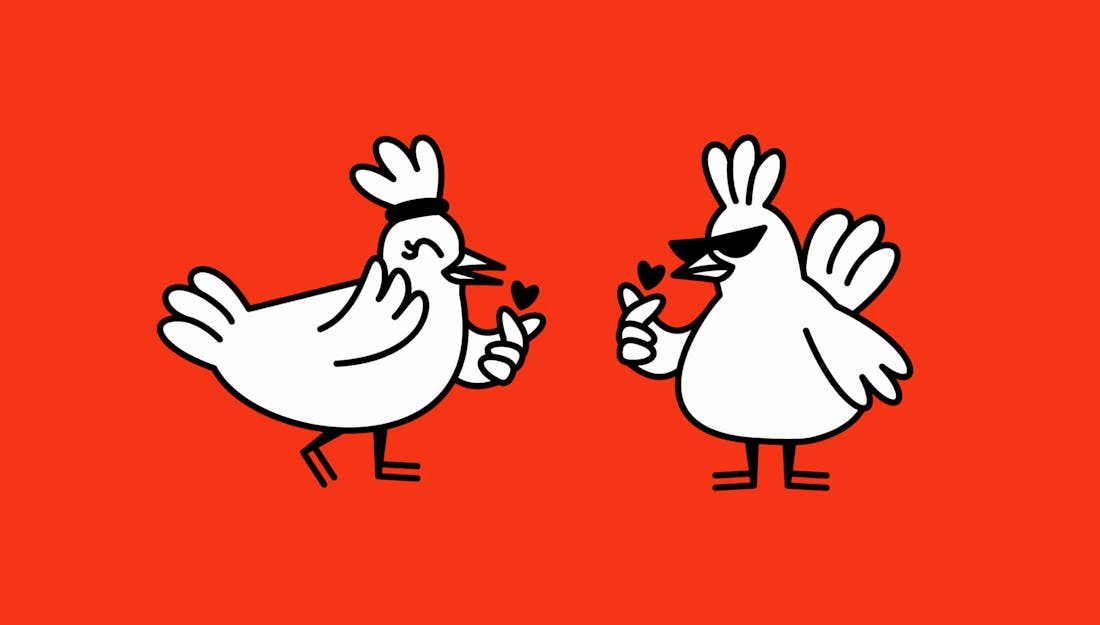
The story of Chuck and Cherry
On a summer rainy evening in the bustling streets of Hongdae, Seoul. Chuck spent the evening bar-hopping with his friends. Cherry spent the evening clucking along to her favourite k-pop songs in a karaoke bar. Both of them were headed home, until… the rain started intensifying.
As they found shelter in a small alleyway, their stomachs started growling at the unmissable aroma of Korean fried chicken wafting from a nearby restaurant. It was a small canteen-like restaurant with its neon logo glimmering in the night.
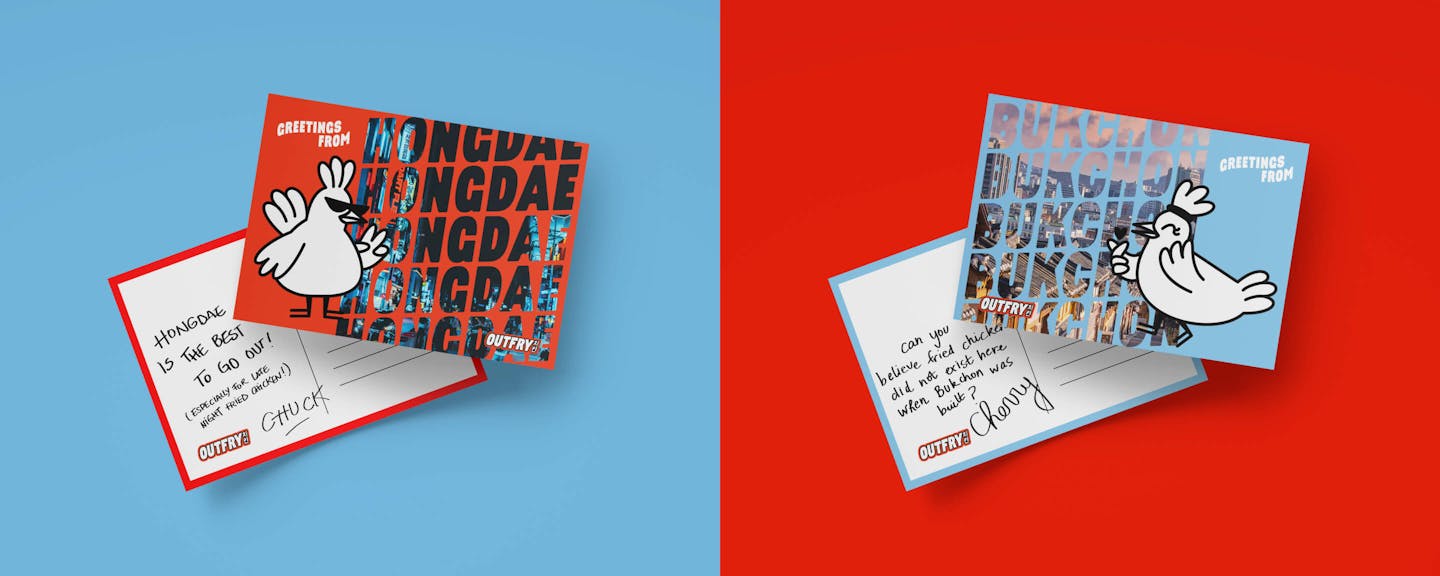
Intrigued, they respectively entered the restaurant, sitting at the last two available seats, next to each other. They eagerly ordered a variety of crispy fried chicken dishes. However, when the waitress brought out their orders, there was a mix-up and Chuck and Cherry found themselves arguing over whose fried chicken order belonged to whom. Their debate quickly escalated into a playful banter as they each defended their chosen dishes. Chuck insisted that the chicken wings were his favorite, while Cherry argued in favor of the tenders.
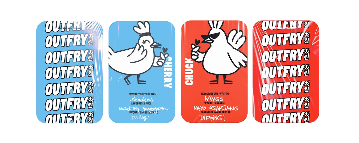
Amidst the friendly rivalry, Chuck and Cherry realized they shared a similar passion for fried chicken. They decided to put their argument aside and sample each other's favorite dishes, exchanging playful pokes and tasting different sauces along the way. This newfound friendship born out of a fried chicken quarrel is the reason Out Fry exists.
By combining their eclectic tastes, Chuck and Cherry advocate for a brand that offers the iconic Korean Fried Chicken without being scared to experiment with new flavours.
/04 VISUAL IDENTITY
Dialling up the volume: saucier, crispier, and juicier.
The rebrand came alongside an overhaul of the recipes and menu. Focus was put back on authentic Korean ingredients and properly punchy flavours. Saucier, crispier, and juicier. Inspired by this shift, we evolved the Outfry brand by injecting extra energy into every part of the identity.
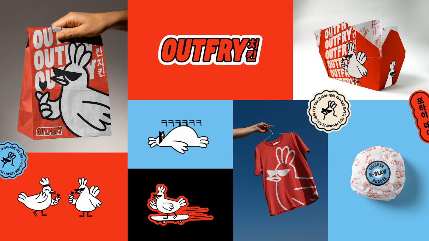
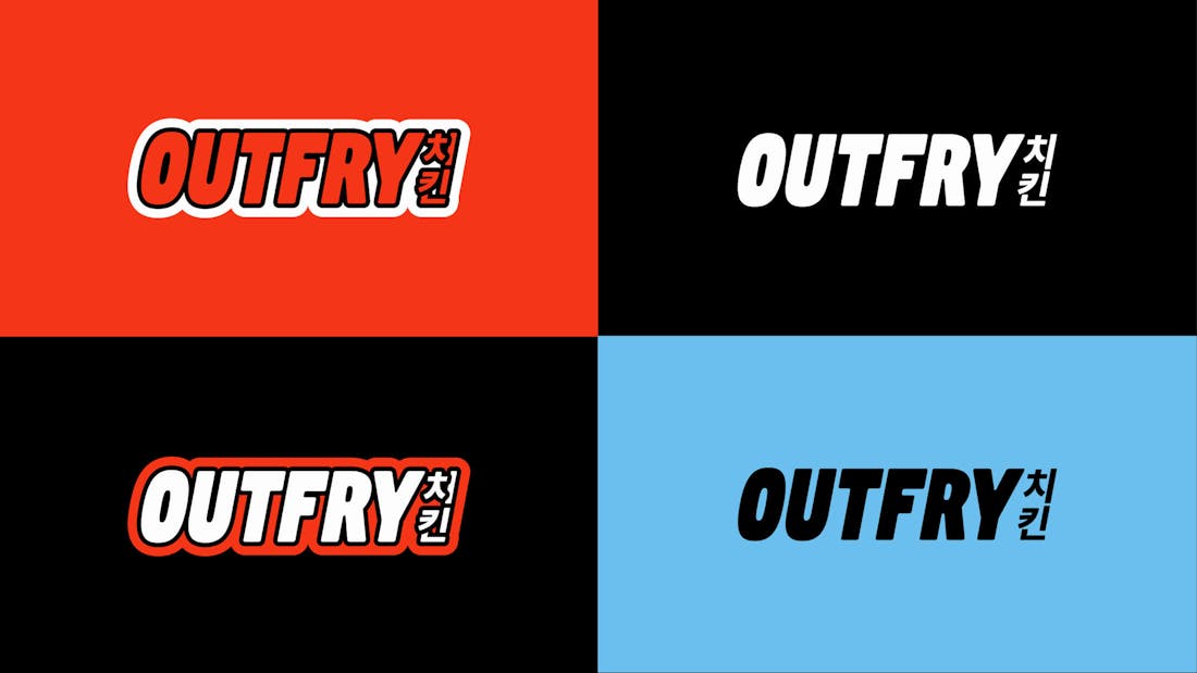
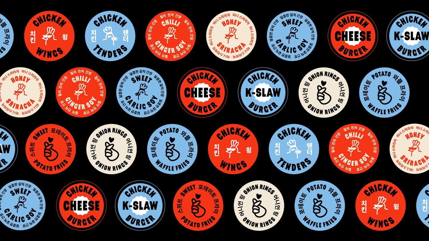
The colour palette combines a fiery red with a sky blue, while the logo and typography received a “sticker” treatment, making them feel more playful.
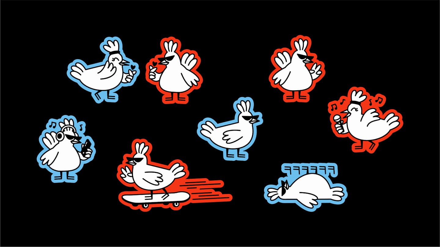
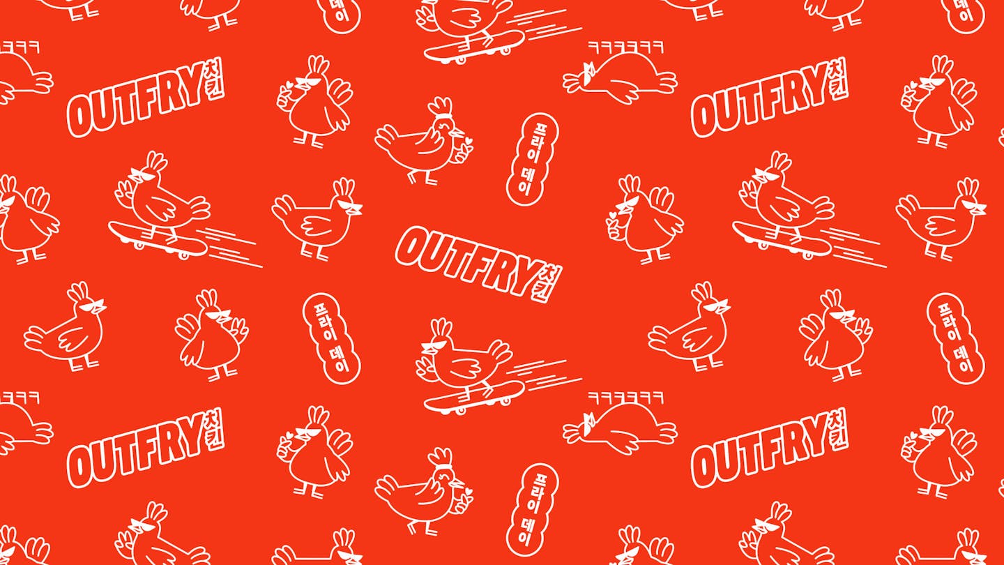
Illustration became a fundamental part of the new Outfry brand. We created a full suite of character illustrations in-house and expanded that same cartoony style into statement stickers and packaging design.

/05 PACKAGING DESIGN
Delivering our story across every touch point
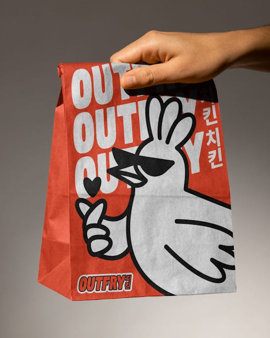
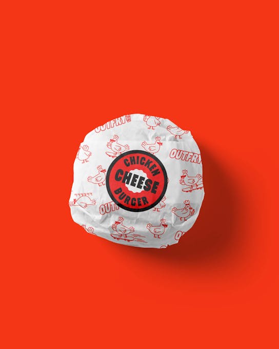
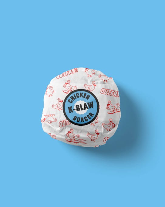
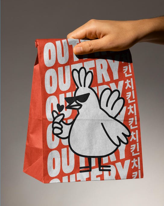
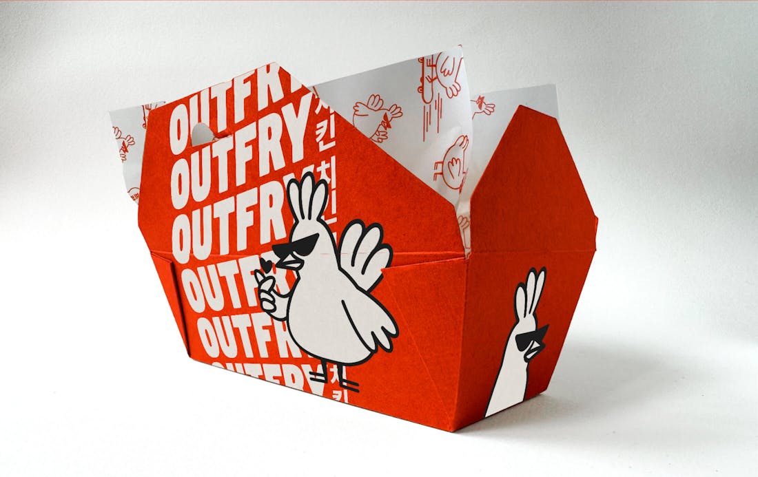
Since Outfry is only available via delivery apps, packaging is one of the most important opportunities we have to tell the brand story. We carefully crafted delivery bags, sides boxes, greaseproof paper, sauce stickers and burger wraps to make sure that the new brand lands a punch on every possible surface.
Credits
The team
- Creative Director: Mélanie Hubert-Crozet
- Strategic director: Mattijs Devroedt
- Producer: Paige Collins
- Graphic designer / Illustrator: Jorie Einarsen
- Creative: Luna Gooriah
- Project Manager: Mary Wu
This website uses cookies.
Learn more.
case study
→ View
project
→ Discover
more →