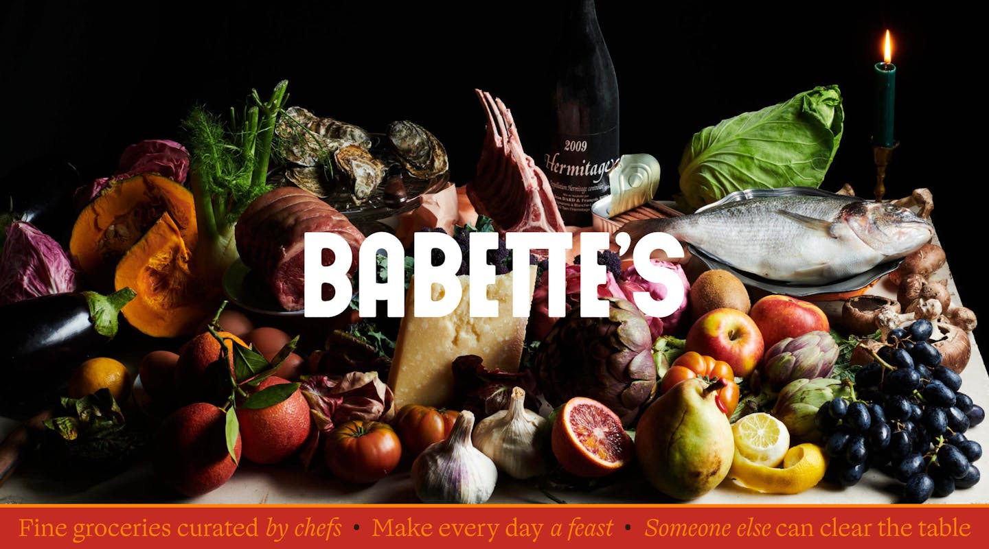
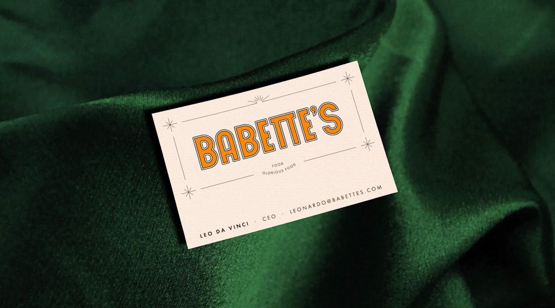
BABETTE'S ‣ BRAND IDENTITY
Client
- Charlie Mellor
Role
- STRATEGY
- VISUAL IDENTITY
Deliverables
- BRANDING
- START-UP PACKAGE
Date
- 01 Dec 2022
In the summer of 2021, hospitality entrepreneur Charlie Mellor approached monopo with an exciting new food venture, Babette’s. A name inspired by the cult classic Babette’s Feast, indicating the intentions of the new venture: to make the joys of chef-quality produce available for all through a modern-era grocery concept.
monopo embraced the challenge and established a visual world that brings about a food renaissance, filled with dramatic portraiture and indulgent detail.
/01 CONTEXT
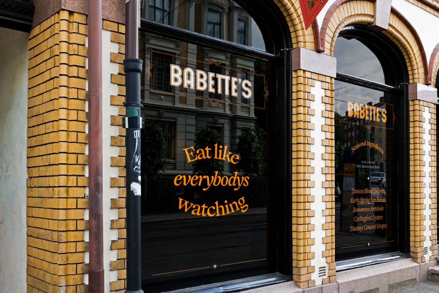
Hospitality meets retail
The concept for Babette’s was born from a frustration with traditional convenience stores and the bad decisions they nudge shoppers into. Unwelcoming environments that incentivise laziness and poor quality. Babette’s is a modern alternative; making it easy to access the produce that chefs use and sharing the know-how that chefs have, to help you build a quality meal without having to go through the traditional convenience channels.
The Babette’s roadmap includes both digital and physical outlets. monopo was invited at the pre-investment stage and worked with the Babette’s founding team to define the brand and make it an investable asset.
/02 BRAND CONCEPT
The food renaissance
Babette’s is here to give the miracle of cooking back to the people, and bring the culinary arts back to our hearts. Through the visual identity we glorify food and ingredients the way they were long before the processed food revolution. We tease people to feast, in a way that is so grandiose and over-the-top that it becomes humorous. This is Royal for all.
/03 INGREDIENTS
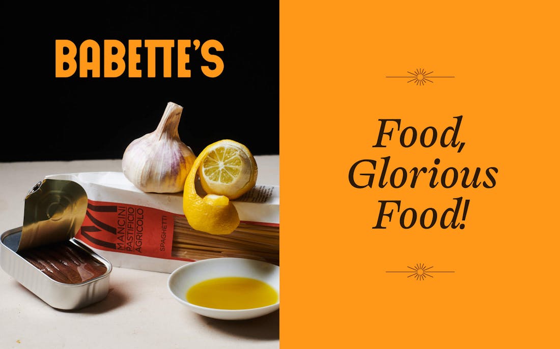
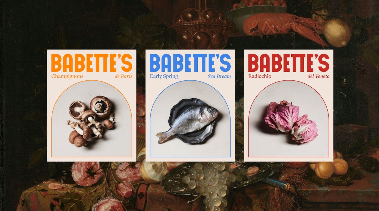
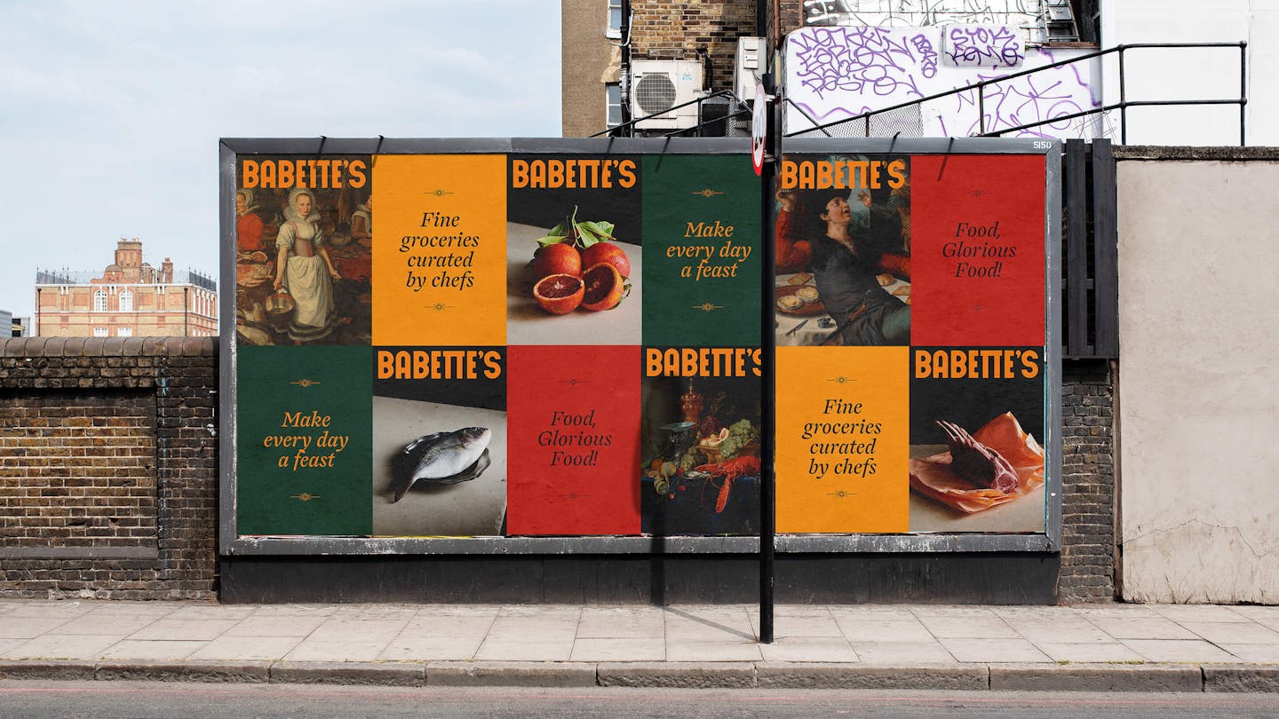
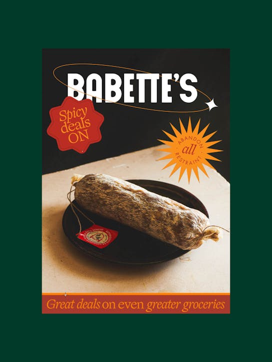
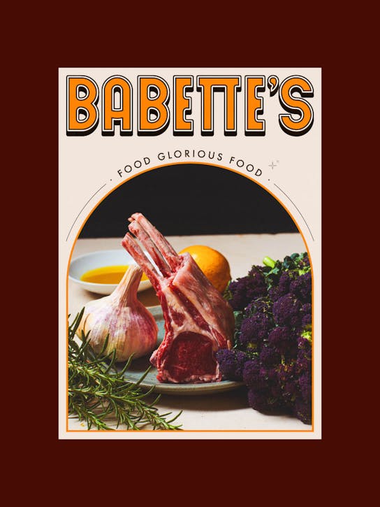
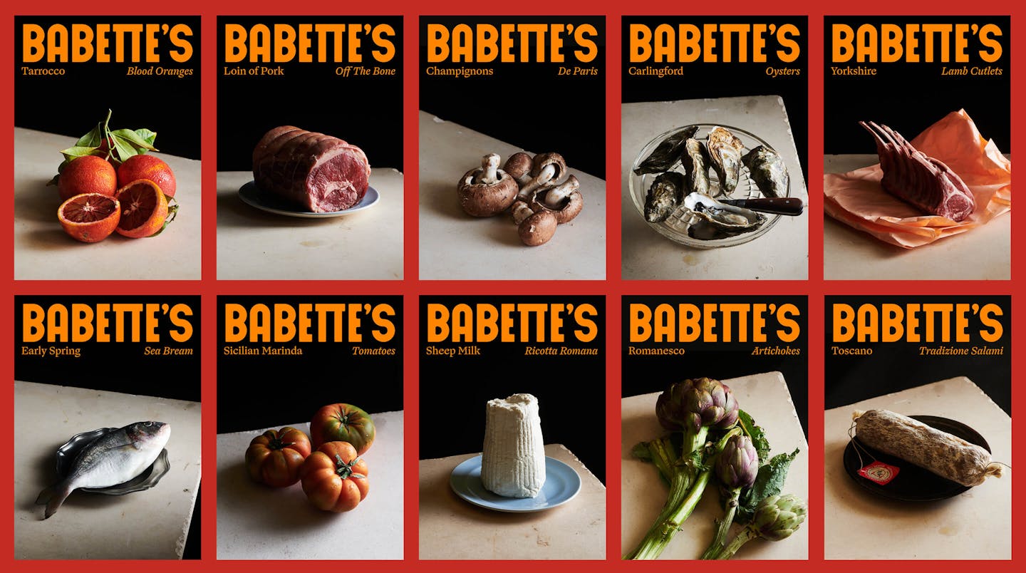
Dramatic food imagery balanced out through pop colours and cheeky typography.
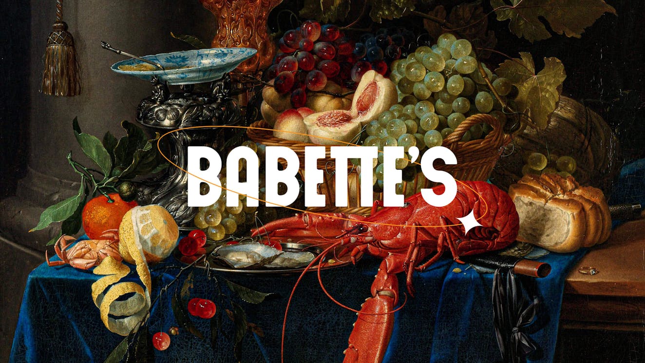
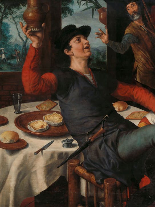
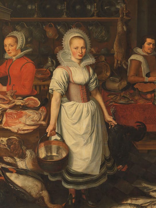
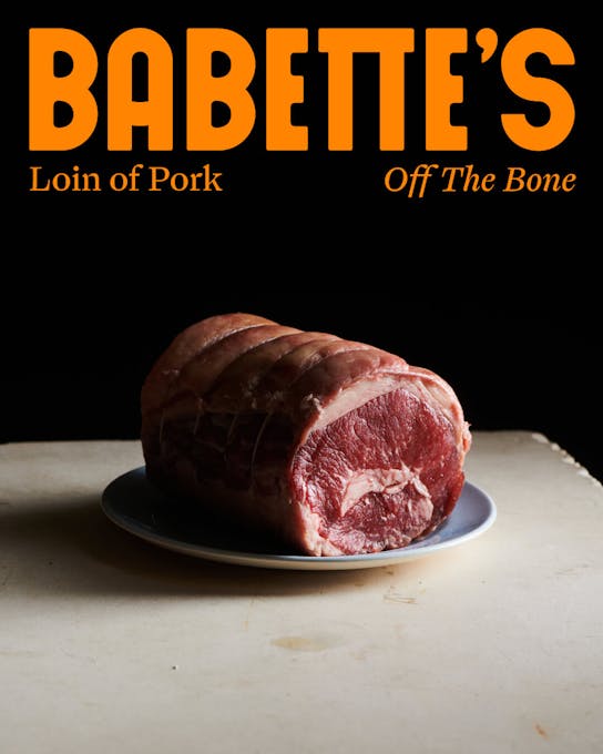
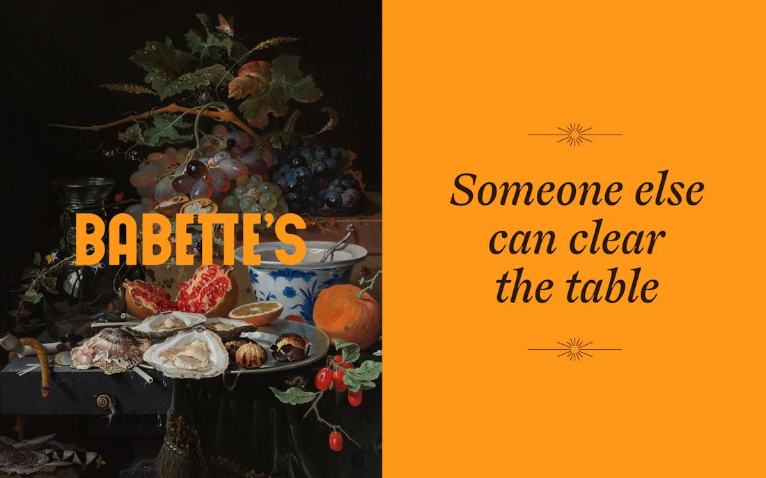
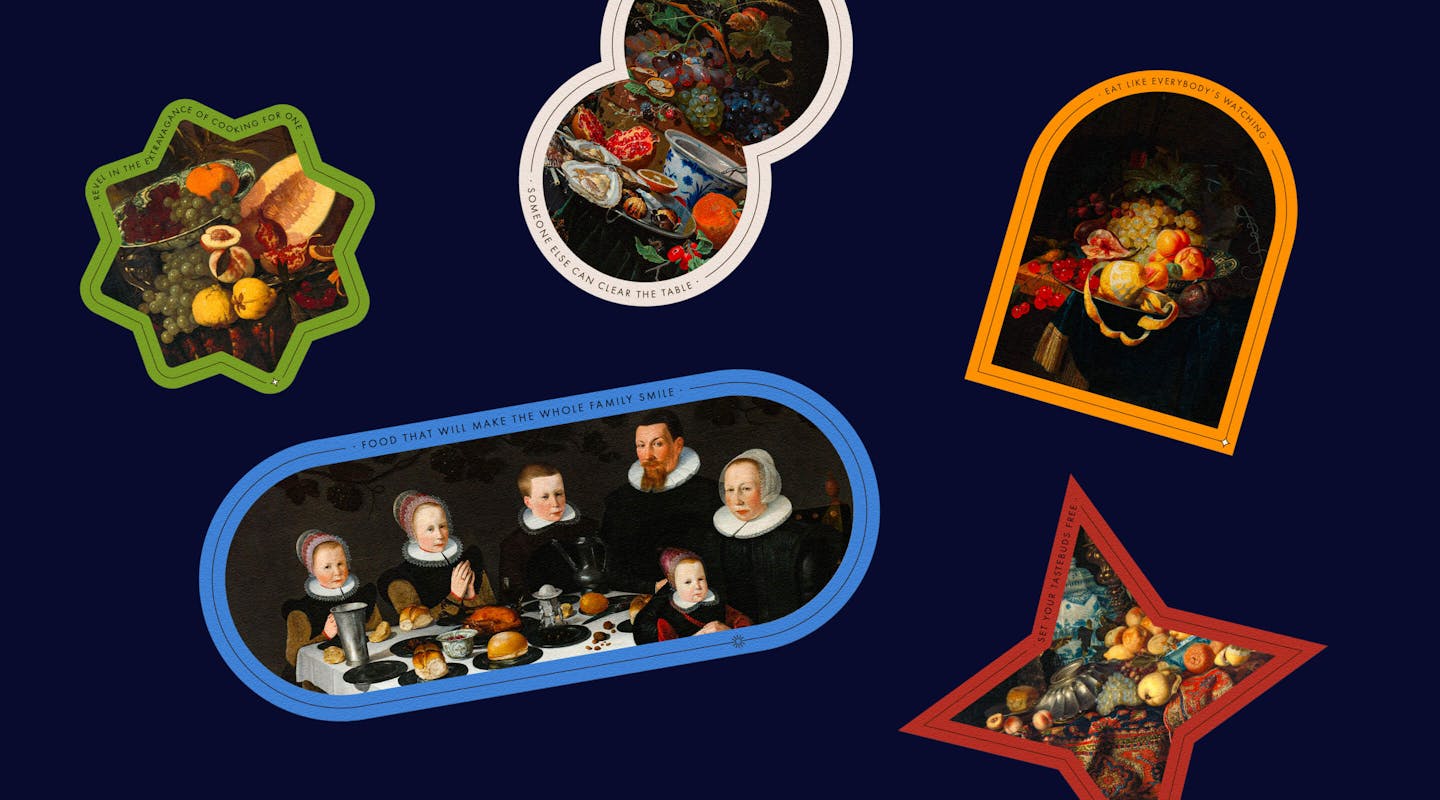
Babette’s makes it ok to indulge in food again. To feast, knowing that the produce is great and every part of the supply chain is cared for. Through the visual identity, we decided to inject a level of drama back into food. Portray food with grandeur. Glorify the ingredients that make up good meals but got lost in the era of processed food. Working with Joe Woodhouse, we took food photography to a higher level of drama, portraying modern-day ingredients as if they were painted by Dutch Masters.
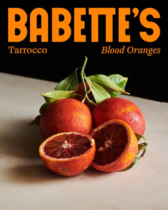
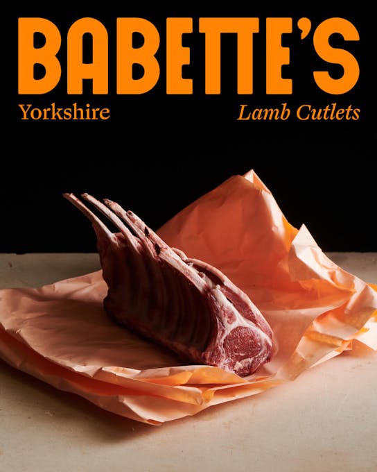
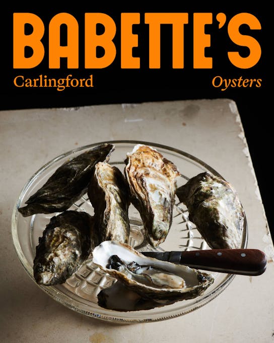
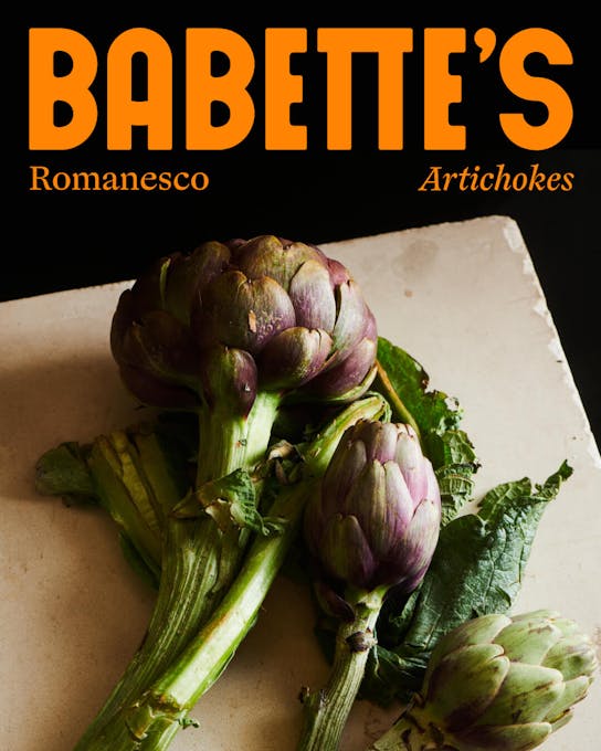
The Dutch Masters made their way into the rest of the visual identity as well, where we leverage baroque and renaissance food portraiture that is available in the public domain, to make mouths water again in 2022.
To balance out the drama and introduce a level of quirk and playfulness, we play with pop colours, over-the-top embellishments and witty writing. We leave no doubt: this brand doesn’t take itself as seriously as the food that it serves up.

Credits
The team
- Creative Director: Mélanie Hubert-Crozet
- Strategic Planning Director: Mattijs Devroedt
- Art Director: Mason El Hage
- Producer: Maud Dedecker
Partners
- Brand strategy: Maarten Van Daele
- Photography: Joe Woodhouse
This website uses cookies.
Learn more.
case study
→ View
project
→ Discover
more →