Canada Goose ‣ City Sense: Urban excursion guides
Client
- CANADA GOOSE
Role
- Creative Direction
- Conception
- Art direction
- Graphic Design
- Print production
Deliverables
- Printed city guides
Date
- 16 Oct 2019
To drive excitement for the opening of Canada Goose’s new stores in Milan, Paris and Shanghai, we concepted, designed and produced a series of urban excursion guides.
The guides helped city-dwellers experience nature within their urban confines and were available in-store during the opening weeks.
/01 Background
Developing a flexible tool for new store openings across the world
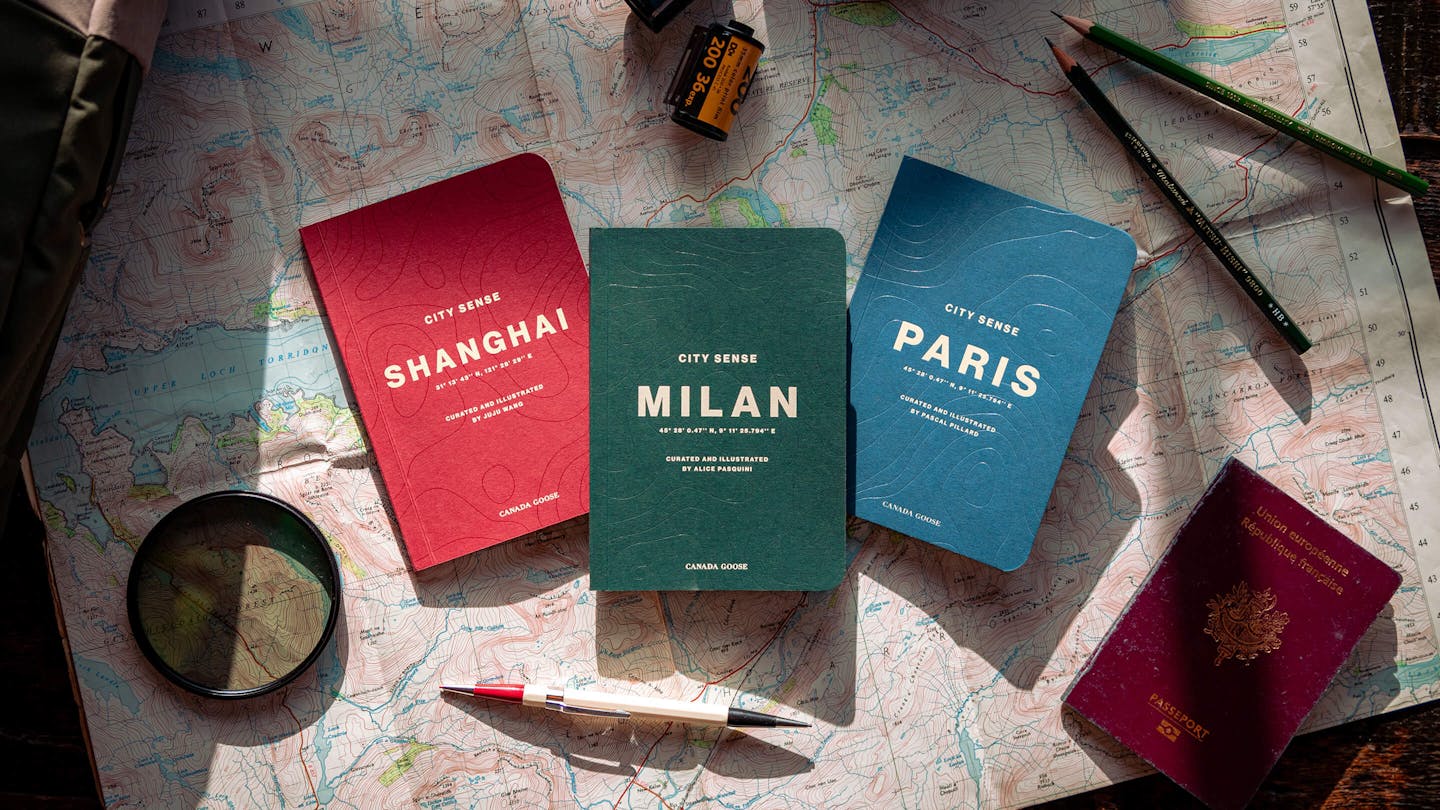
As Canada Goose is growing its retail footprint across the world, the brand was looking for a tool to drive excitement and anticipation in the new cities. monopo was asked to develop the global concept for a city guide-style publication and produce the publication for the opening of new stores in Milan, Paris and Shanghai. We took charge of the process from concept to delivery, in close collaboration with Canada Goose’s in-house copywriting team. The result is the Canada Goose City Sense. An urban excursion guide designed to motivate city-dwellers to Live in the Open within the confines of the city.
/02 Concept and Art Direction
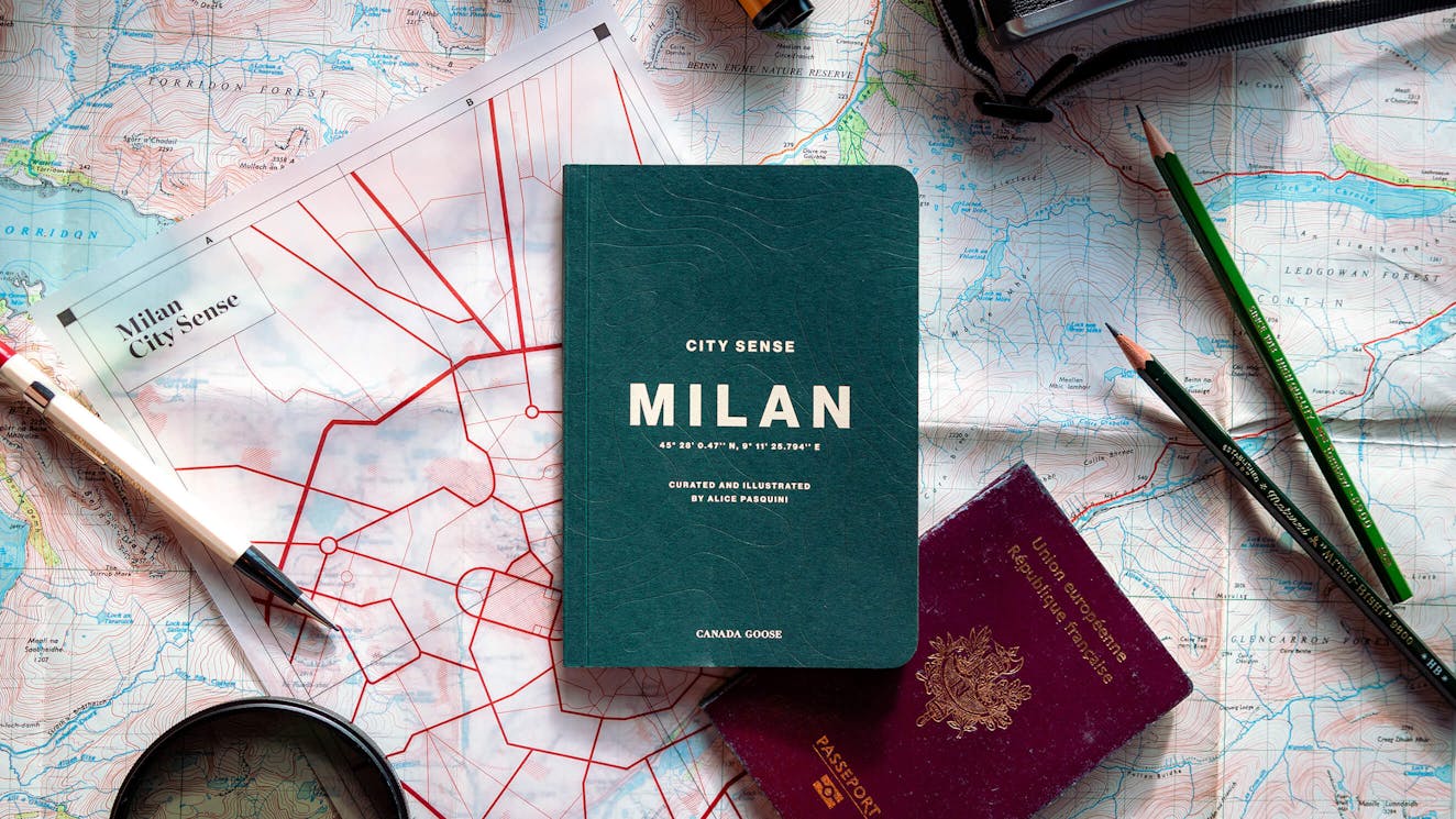
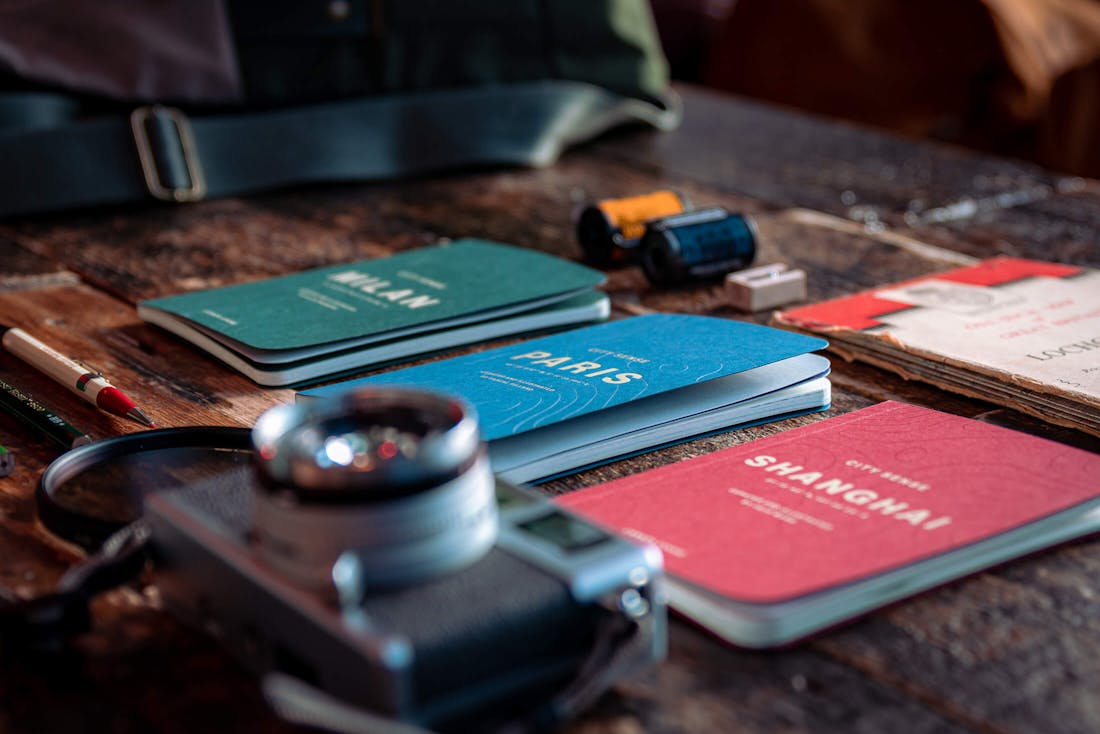
City Sense: An urban excursion guide
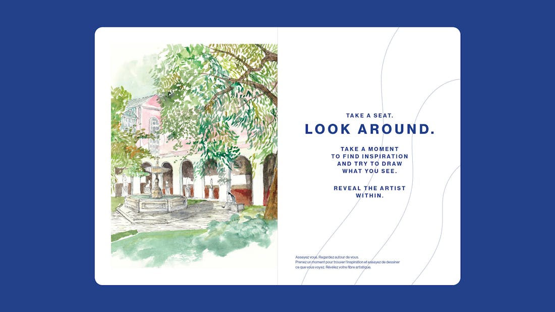
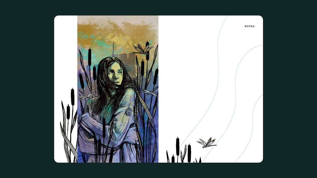
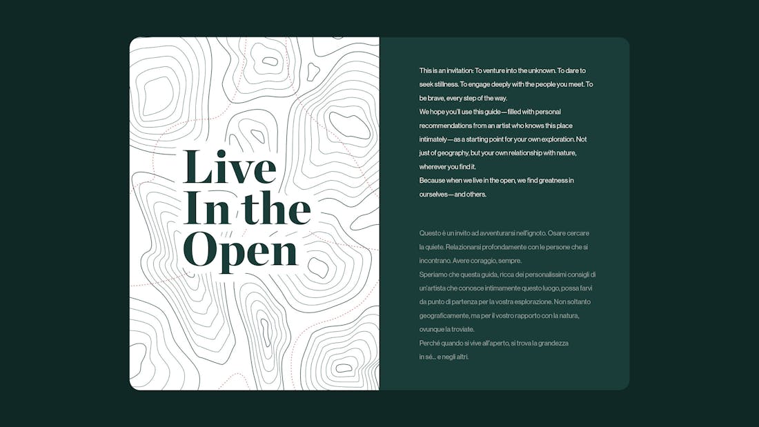
Canada Goose is a function-first outerwear brand that exists to inspire and enable all people to engage with the outside world. To embrace rather than escape nature’s elements. To Live in the Open. A privilege that is often lost on those living in the city. With this project, we wanted to develop a guide that doesn’t just show you the popular places in a city, but actually helps you find the hidden spots that allow you to truly engage with nature’s elements. The City Sense series was born.
We decided to combine the function-first philosophy of the Canada Goose brand with the tactile side of nature. The art direction had to feel like a hybrid between an excursion book, a field manual and a travel journal. Something that provokes action. City Sense shouldn’t feel like an effortless and complete publication, just suggesting a few locations to visit. It should feel like a guide that challenges you to explore and take action.
/03 Format
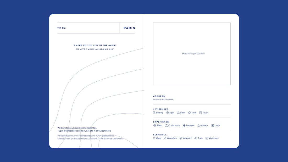
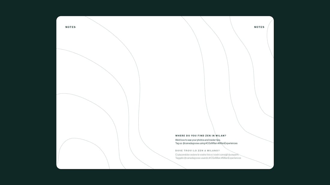
A constant dialogue between the guide and the reader
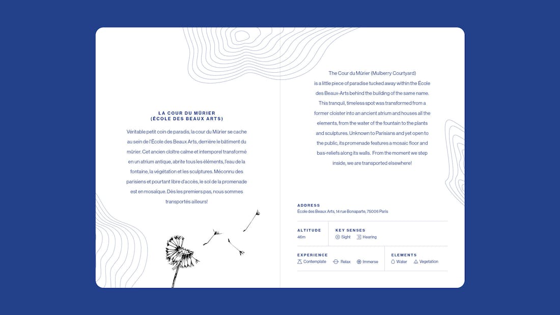
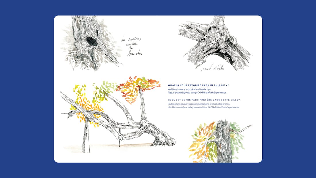
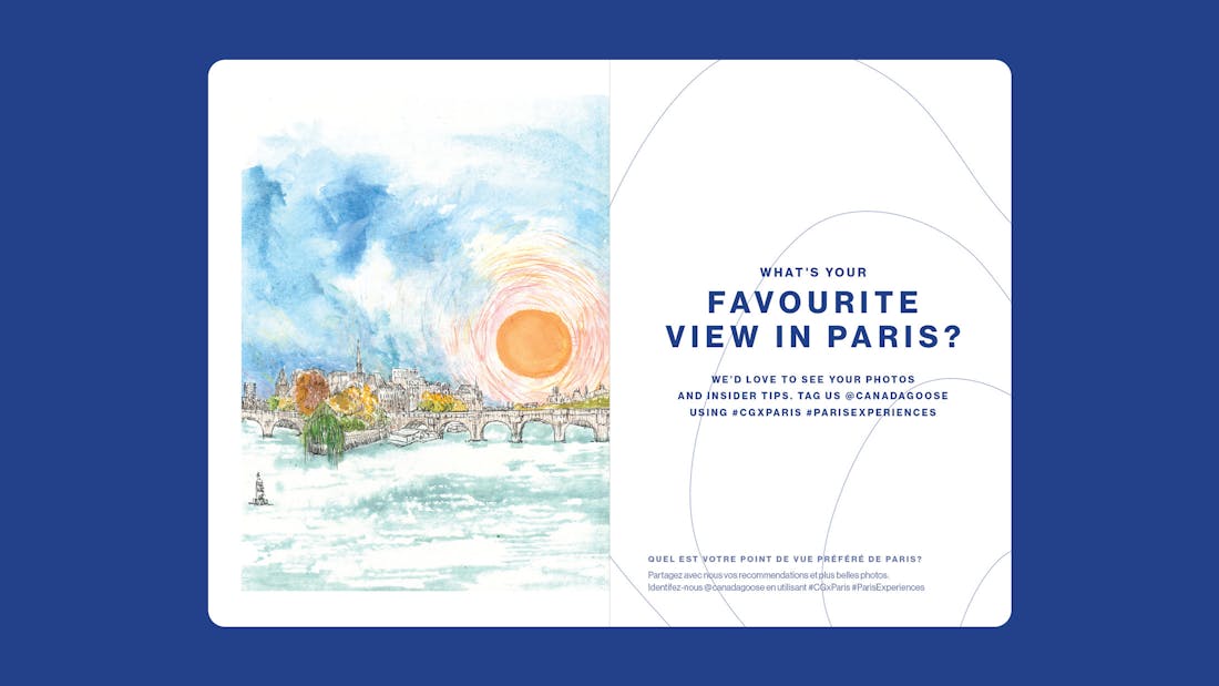
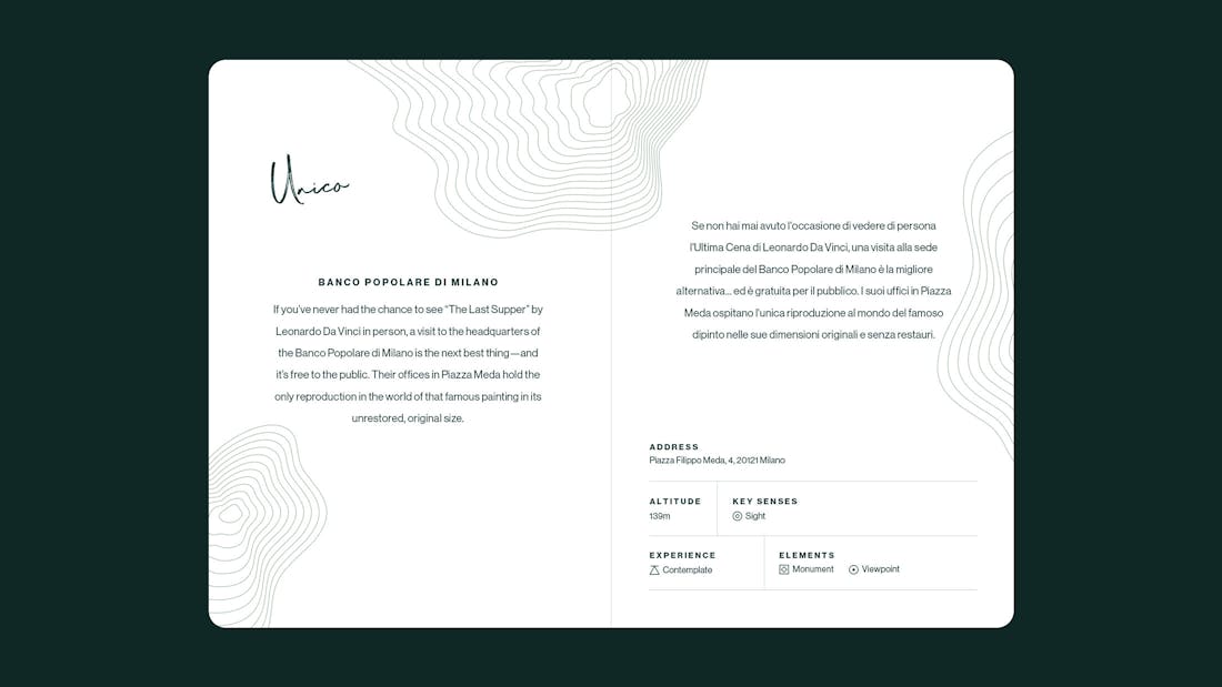
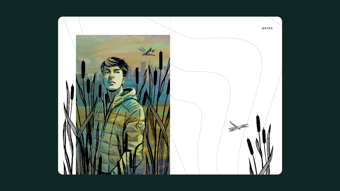
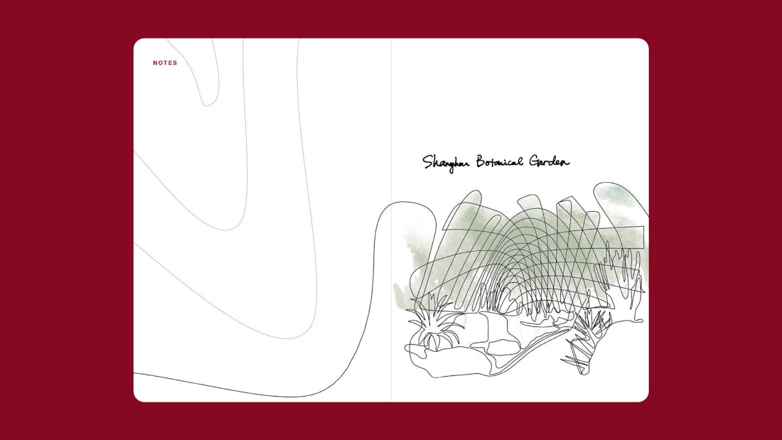
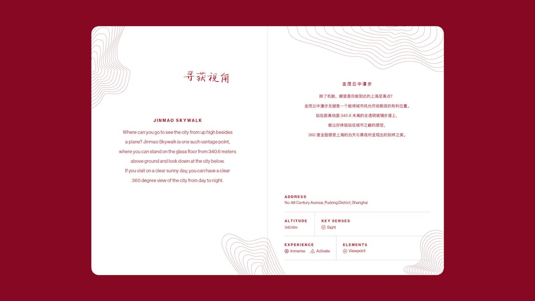
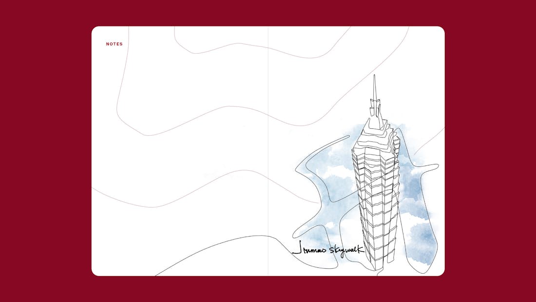
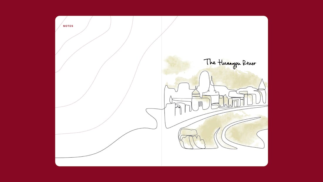
Our City Sense urban excursion guide prompts users to go on mini excursions and discover 6 locations in Milan, Paris and Shanghai. The locations were selected by artists that live locally and know where to experience nature within the city. For every location, the City Sense provides facts, a description and an illustration by the local artist, but it also provokes the reader to make notes of their own and describe how they personally experience this location. To look up at the clouds, draw the vegetation or come back in different seasons. It challenges the reader to experience for themselves rather than just accept the experience as it is described by the guide.
/04 Feature
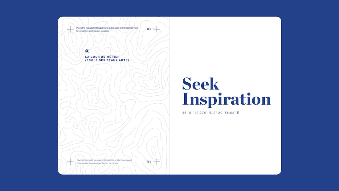
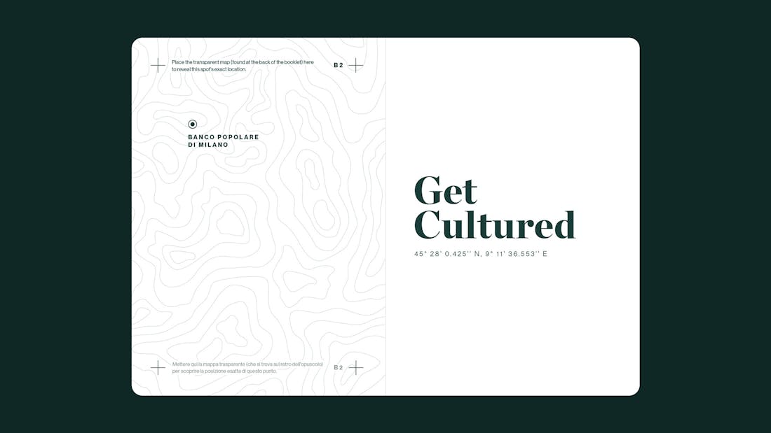
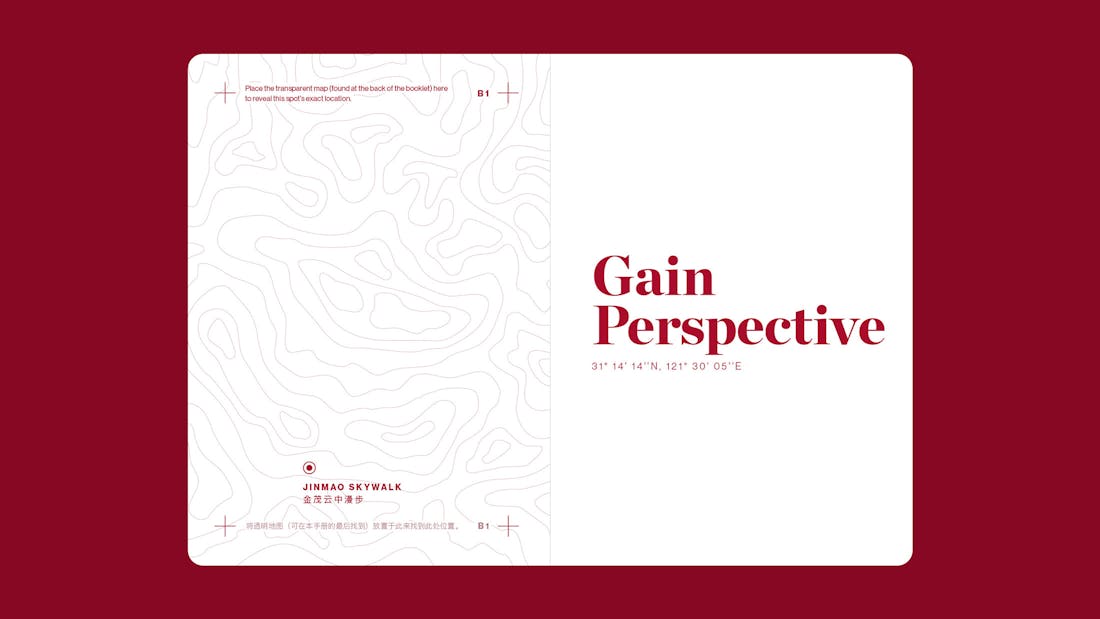
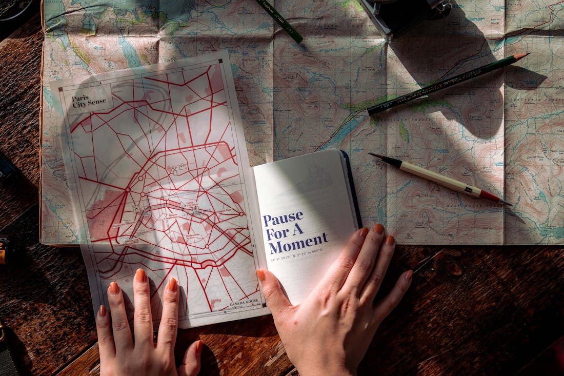
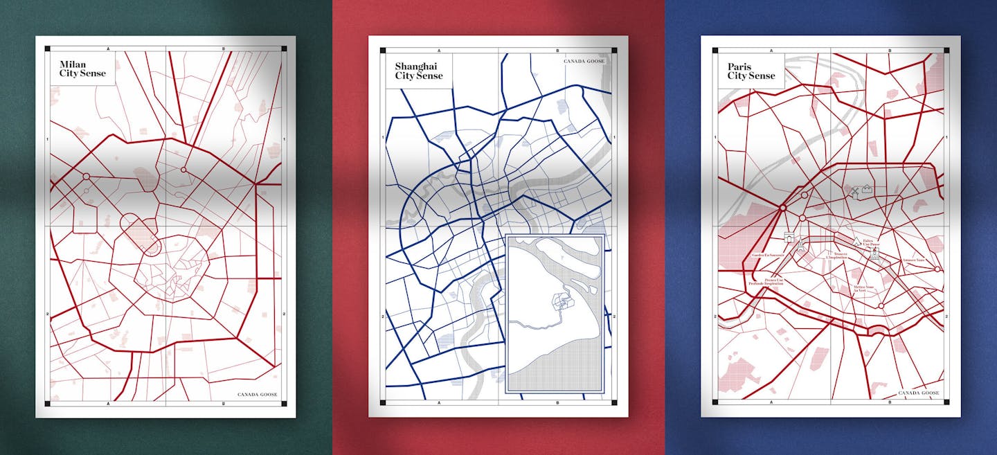
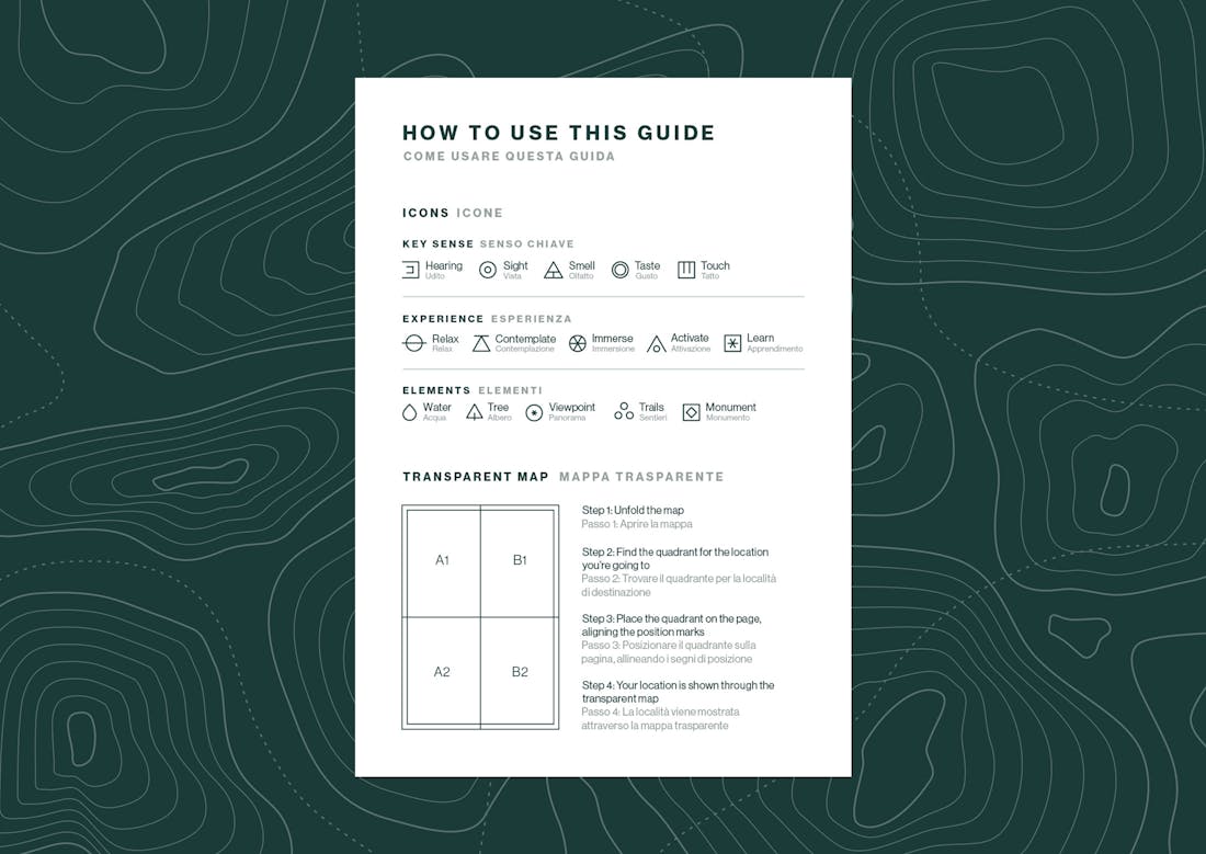
Discovering the location through the transparent map
To add an extra level of wonder and interaction, the guide doesn’t immediately show where the different locations can be found. Instead, the guide comes with a transparent map that has to be placed on top of the different chapter pages to reveal where every location is.
/05 Design Details
Borrowing from the visual codes of excursion guides
Topographic shapes play a central role in the design of City Sense. They are at the same time factual and mysterious objects, showing elevation through abstract shapes. They evoke a sense of exploration and functionality - two key elements of the Canada Goose brand. And while it’s not obvious to the reader, the topographic shapes used on the chapter title pages are in fact accurate to where that location is in real life. Beyond topographic shapes, we also created a bespoke set of markers to identify the different natural elements and human senses for every location.
/06 Print
Premium finish through functional details
Just like the Canada Goose brand, we wanted to give the City Sense guides a premium yet functional finish. Quality rather than glamour. Small details made all the difference. Quality GF Smith Colorplan paper stock with thin transparent foil-printed topographic shapes for the cover, rounded corners for sturdy sophistication and thread-sewn bindings for durability.
Credits
The team
- Creative & Art Director: Mélanie Hubert
- Strategy & Account management: Mattijs Devroedt
- Conception: Mei Kanamoto, Mélanie Hubert
- Graphic Designer: Mai Takano
- Producer & Photographer: Fred Mouniguet
Partners
- Content & Copywriting: Canada Goose
- Paris & Milan editions printing: Park Communications Ltd., London
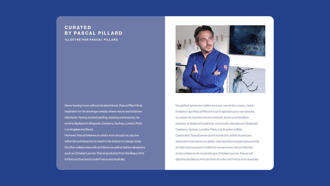
- Paris illustrations and curation: Pascal Pillard
- Milan illustrations and curation: Alice Pasquini
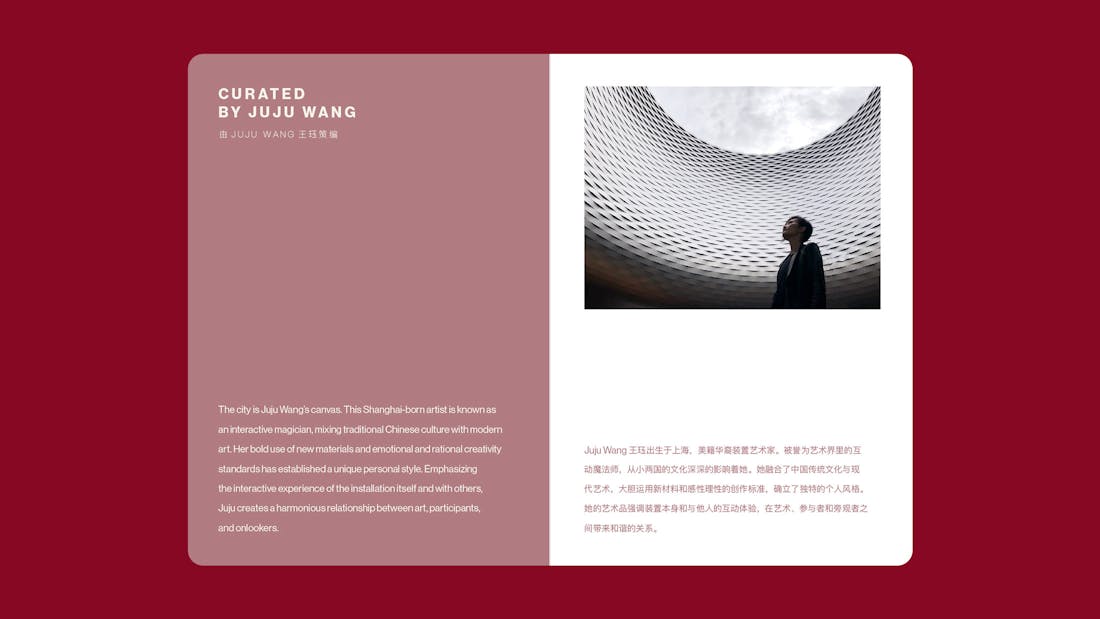
- Shanghai illustrations and curation: Juju Wang
This website uses cookies.
Learn more.
case study
→ View
project
→ Discover
more →