JETRO Japanese Green Tea ‣ US Campaign Website
Client
- JFOODO (JETRO)
Role
- ART DIRECTION
- DESIGN
- DEVELOPMENT
- PHOTOGRAPHY
Deliverables
- Campaign website
- Photography
Date
- 17 Aug 2020
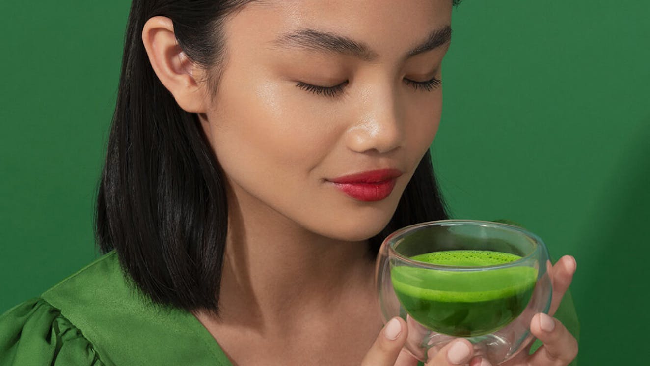
monopo London was invited to build a website supporting JETRO’s campaign to promote Japanese Green Tea in the US. The website had to speak to a young generation intrigued by Japanese Green Tea but unsure about how it fits into their life.
We built a website that finds the overlap between American millennial culture and the unique qualities of Japanese Green tea.
/01 Challenge
Help American millennials gain a deeper understanding of Japanese Green Tea
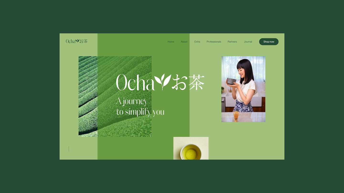
In the summer of 2020, JETRO launched a campaign to promote Ocha (Japanese Green Tea) in the US. Under the banner “A journey to simplify you”, the campaign celebrated how Japanese Green Tea can help remove the complexities of life.
The core target audience was a young generation that had developed an interest in tea and had heard of Japanese Green Tea, but never really dug into the subject. Actual knowledge of its specific benefits, the available varieties and the production process was lacking.
While the media campaign, led by Dentsu and starring Japanese lifestyle celebrity Marie Kondo, established Japanese Green Tea as a way of simplifying life, the role of the website was to provide deeper information for those curious to learn more.

/02 Art direction
Traditional Japan meets the colorful Californian millennial aesthetic
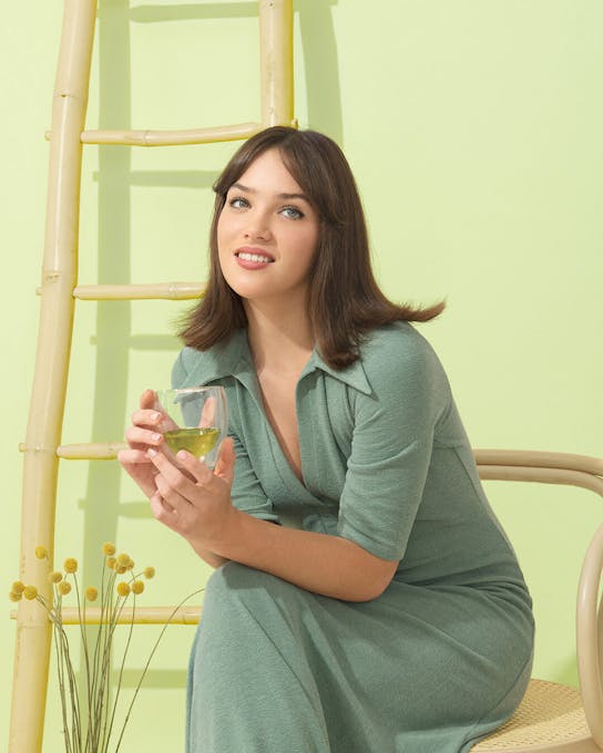
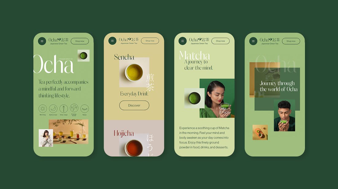
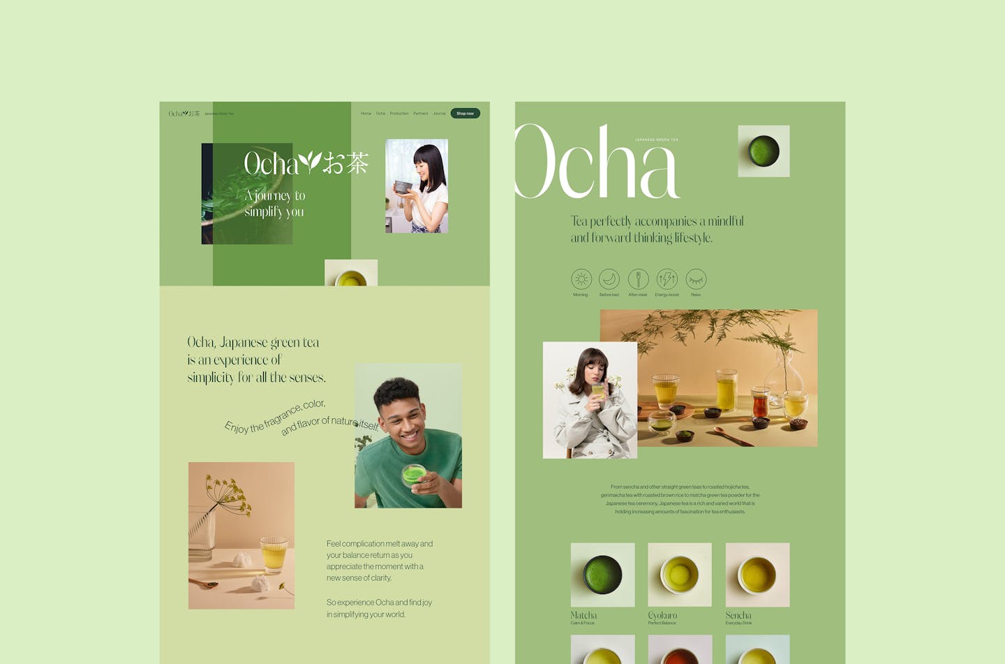
We took inspiration into the colorful look of well-being Californian brands to brand Japanese Green Tea in a new light. We wanted to get away from the traditional representation of Japanese Green Tea which can feel alienating to foreign audiences and instead give it a more unexpected look, more modern and optimistic that feels intriguing and more accessible. By still keeping inspiration from the traditions, it was a very exciting way to picture great quality tea. The positioning being all about “simplifying your life”, we used negative spaces, pastel colors and icons to create this easy and relaxing experience.

/03 Photography
Bespoke photography to cast new light on a traditional product
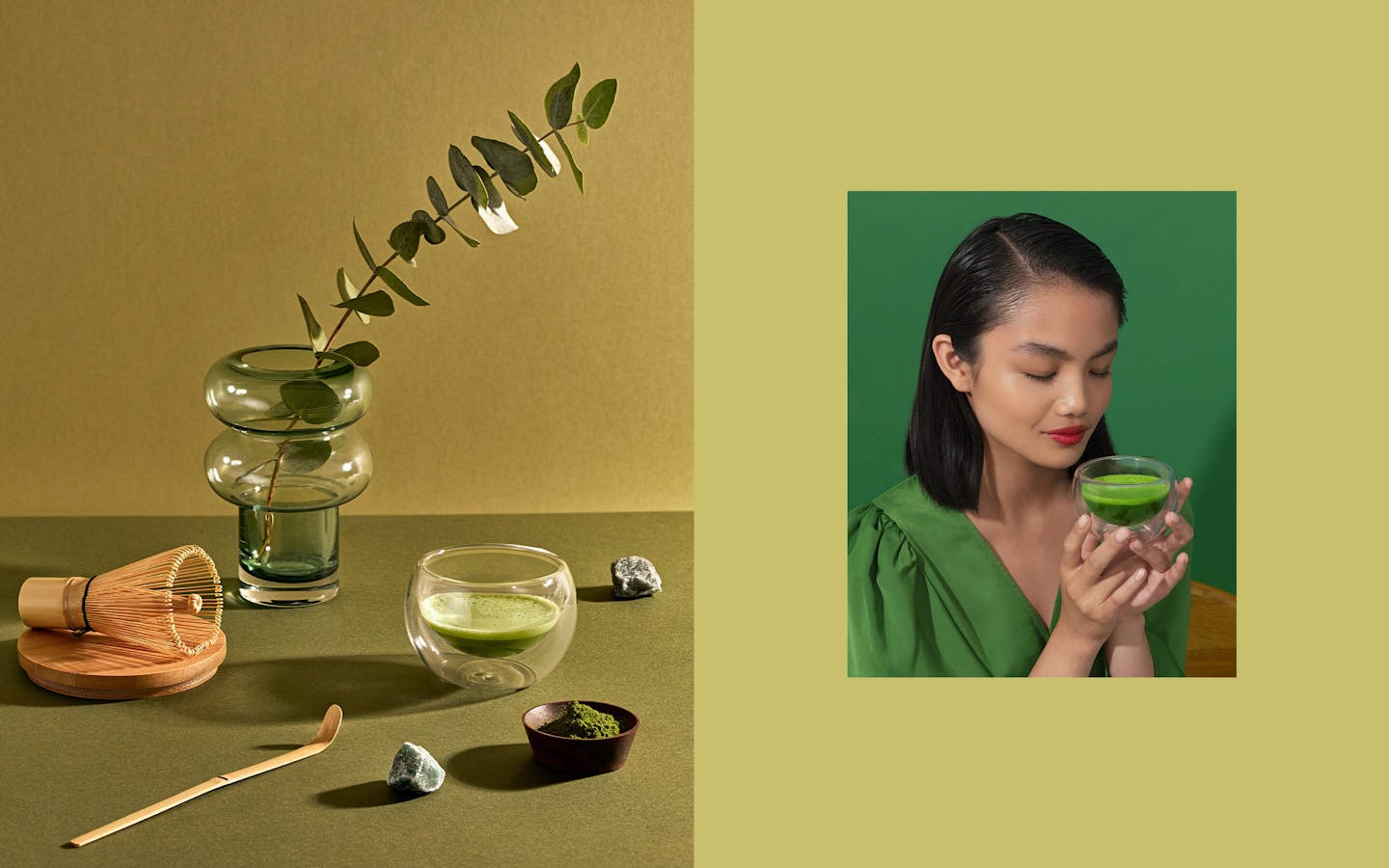
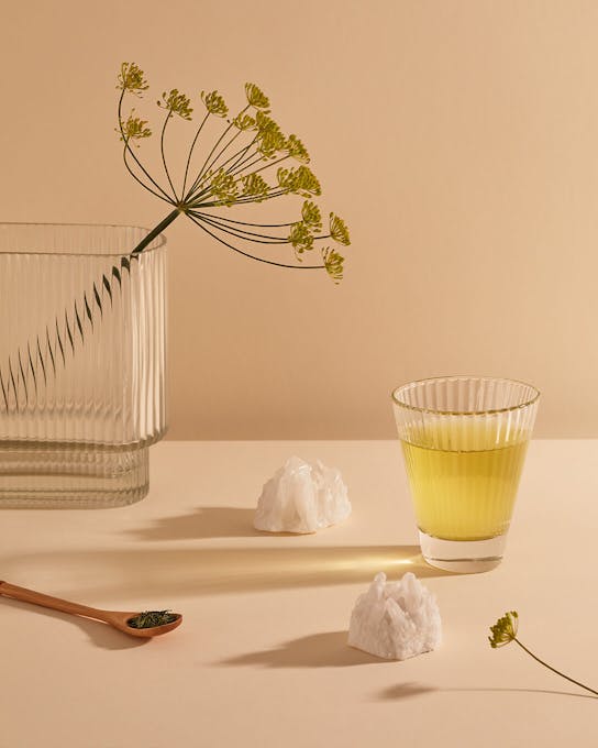
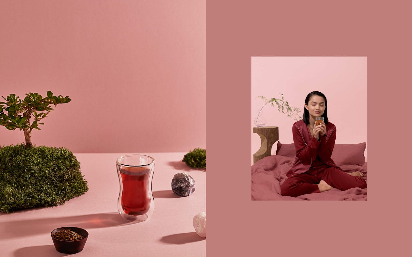
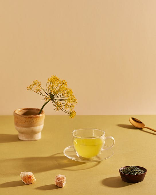
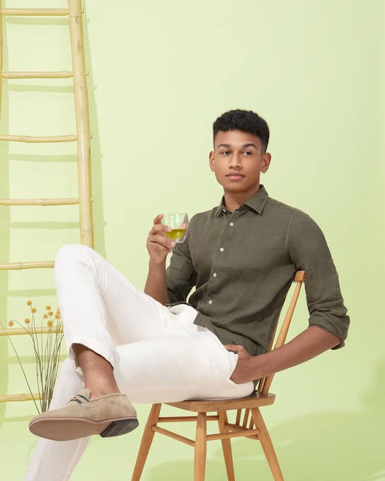
To truly show Japanese Green Tea in a new light, we decided to shoot bespoke photography for the website. We looked to create the overlap between millennial visual culture and Japanese mindfulness.
For each tea variety we shot a still life portrait. Intricate set design and prop selection allowed us to show the mood that each tea creates. We also captured a series of model shots, showing the effects of Japanese Green Tea firsthand and communicating the idea that Japanese Green Tea helps you simplify life.

/04 User Experience
An entry-point into the world of Japanese Green Tea
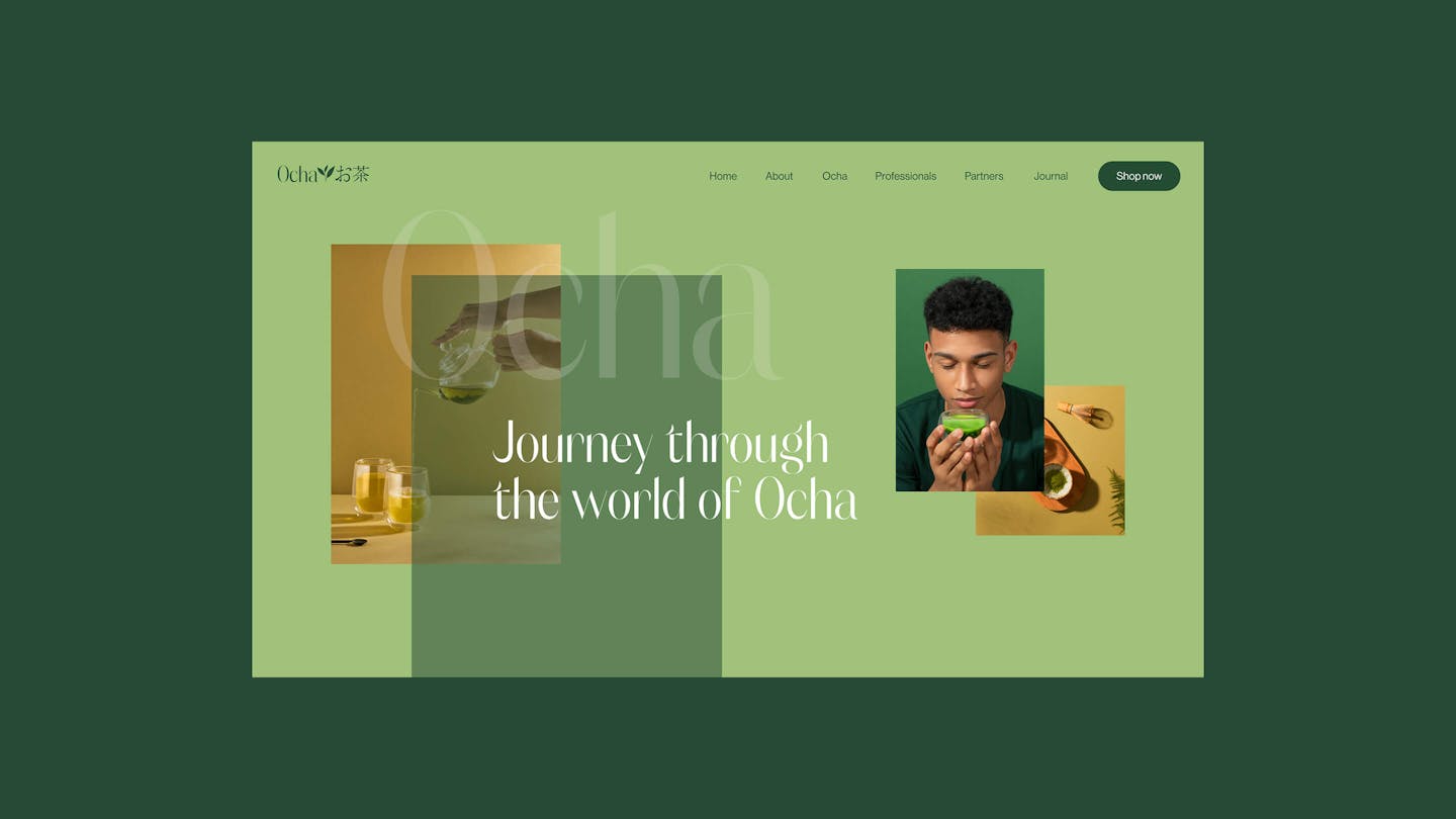
We designed the homepage as a one-page entry point to Japanese Green Tea, directing people on to specific pages to discover more about the range, the production process and the Green Tea farmers. Each page also links out to a bespoke Amazon store where the full range of Japanese Green Teas is available for US visitors.

/05 Varieties
Helping people navigate the range of tea varieties
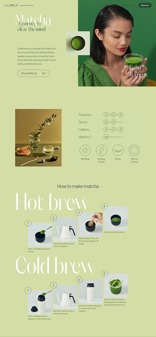
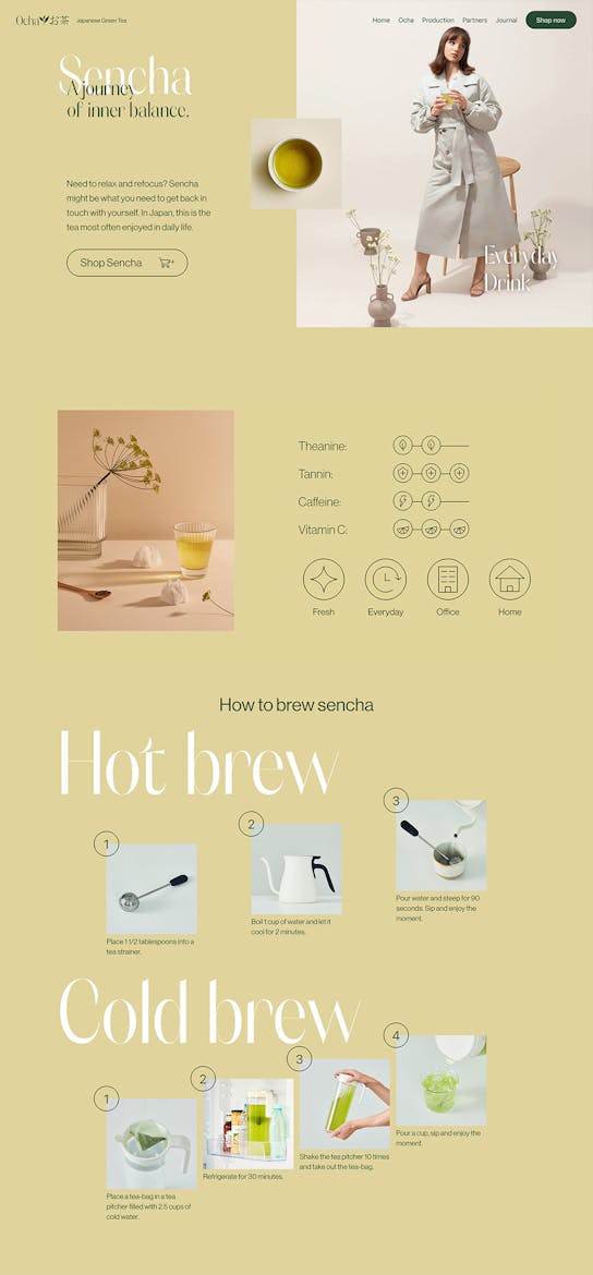
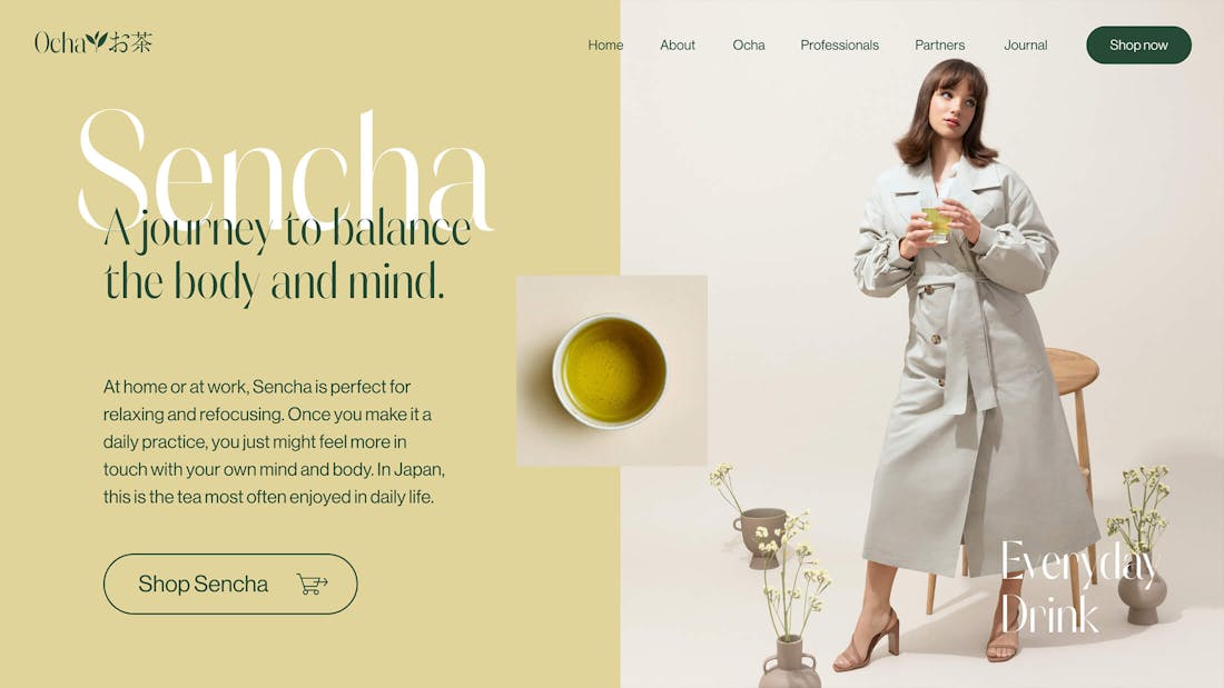
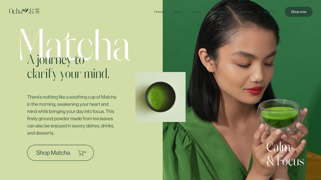
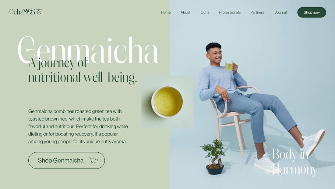
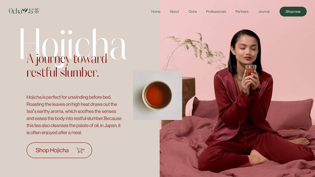
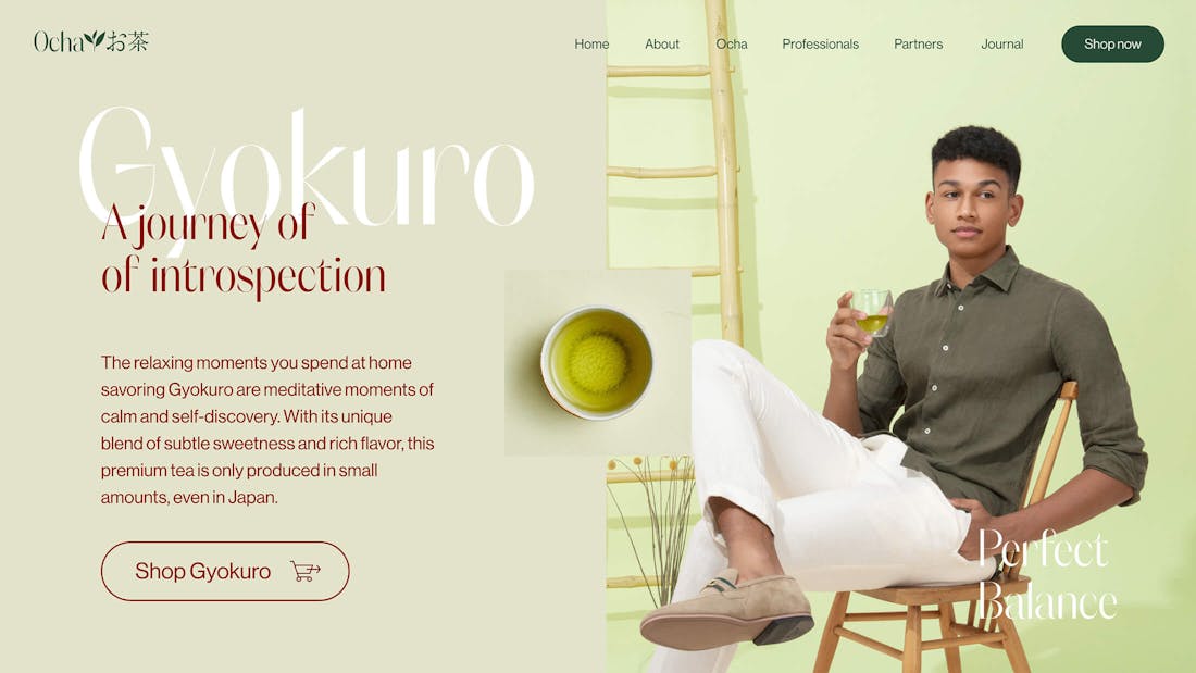
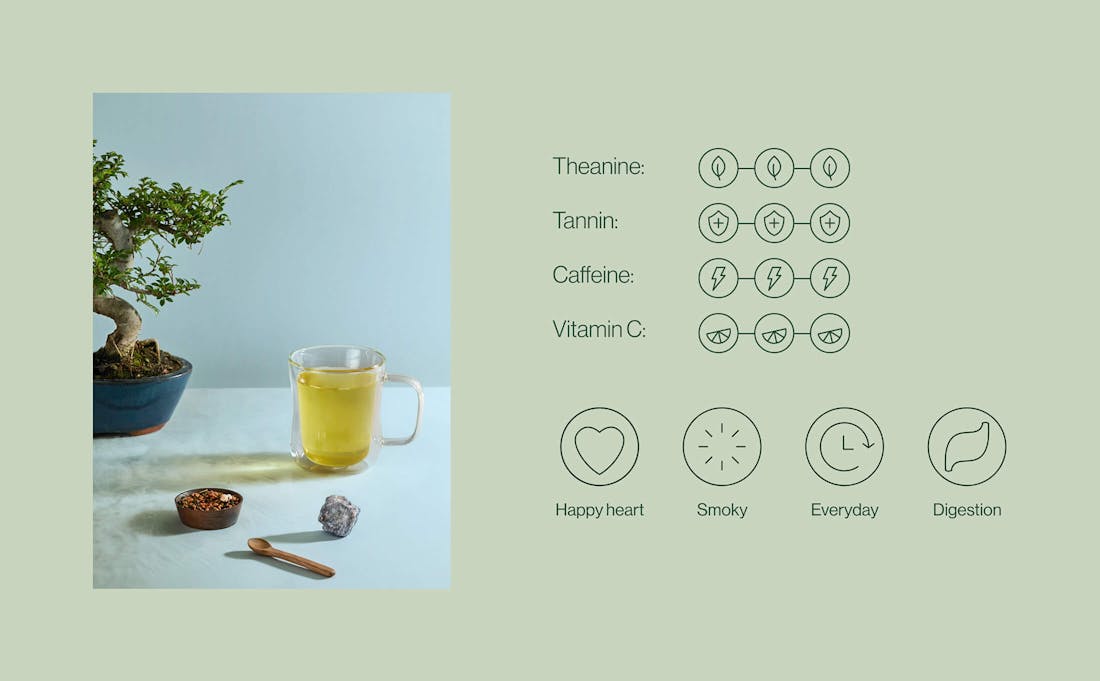
A lot of attention went into simplifying and clarifying the different varieties of Japanese Green Tea available. Each variety has its own qualities and evokes different moods when drinking it. Matcha for example provides a calm focus, making it a great alternative to coffee. Hojicha on the other hand is perfect for relaxation, with its toasted flavours.
Since the general art direction plays with different tints of green, every tea was assigned a hue that could represent it's specific effects.

/06 Producers
Spotlight on the generations of farmers that keep the art of Japanese Green Tea alive
The stars of Japanese Green Tea are without a doubt the farmers that produce it. Often building on decades or even centuries of knowledge within the family, they keep evolving the craft and keep innovating on what it means to produce Japanese Green Tea. A full page is dedicated to the farmers and their stories.
Credits
The team
- Art Director & Designer: Mélanie Hubert-Crozet
- Designer: Mai Takano
- Producer: Fred Mouniguet, Maud Dedecker, Mattijs Devroedt
Partners
- Producer: Shota Hatama (Hatama inc.)
- Creative Director: Tsubasa Kayasuga (Dentsu)
- Copywriter and Planner: Kana Idetsu
- Copywriters: Shuya Araki, Lilia Silva
- Technical direction, Development: Le Polish Bureau
- Development support: PRMO
- Photography: Wolf & Badger Studios
This website uses cookies.
Learn more.
case study
→ View
project
→ Discover
more →