PRESIGHT PARTNERS ‣ WEBSITE AND BRAND IDENTITY
Client
- PRESIGHT PARTNERS
Role
- Strategy
- Branding
- Concept
- Art Direction
- Web Design
- Production
Deliverables
- WEBSITE
- BRAND IDENTITY
- ILLUSTRATIONS
Date
- 15 Nov 2021
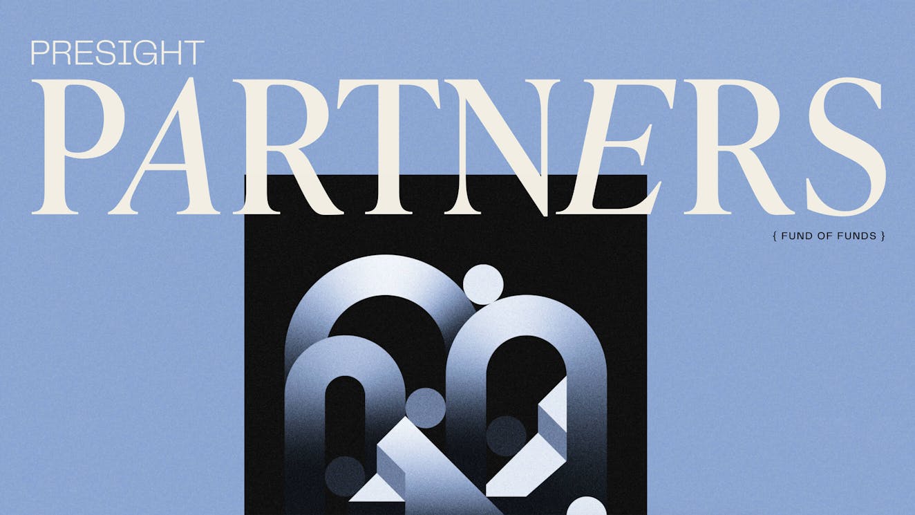
monopo helped the new fund of venture funds Presight Partners to build their launch website and visual identity.
The goal was to set Presight Partners apart as a fresh alternative within the risk-averse fund-of-funds category.
/01 Challenge
Establishing Presight Partners as a fresh alternative within the category of Fund-Of-Funds.
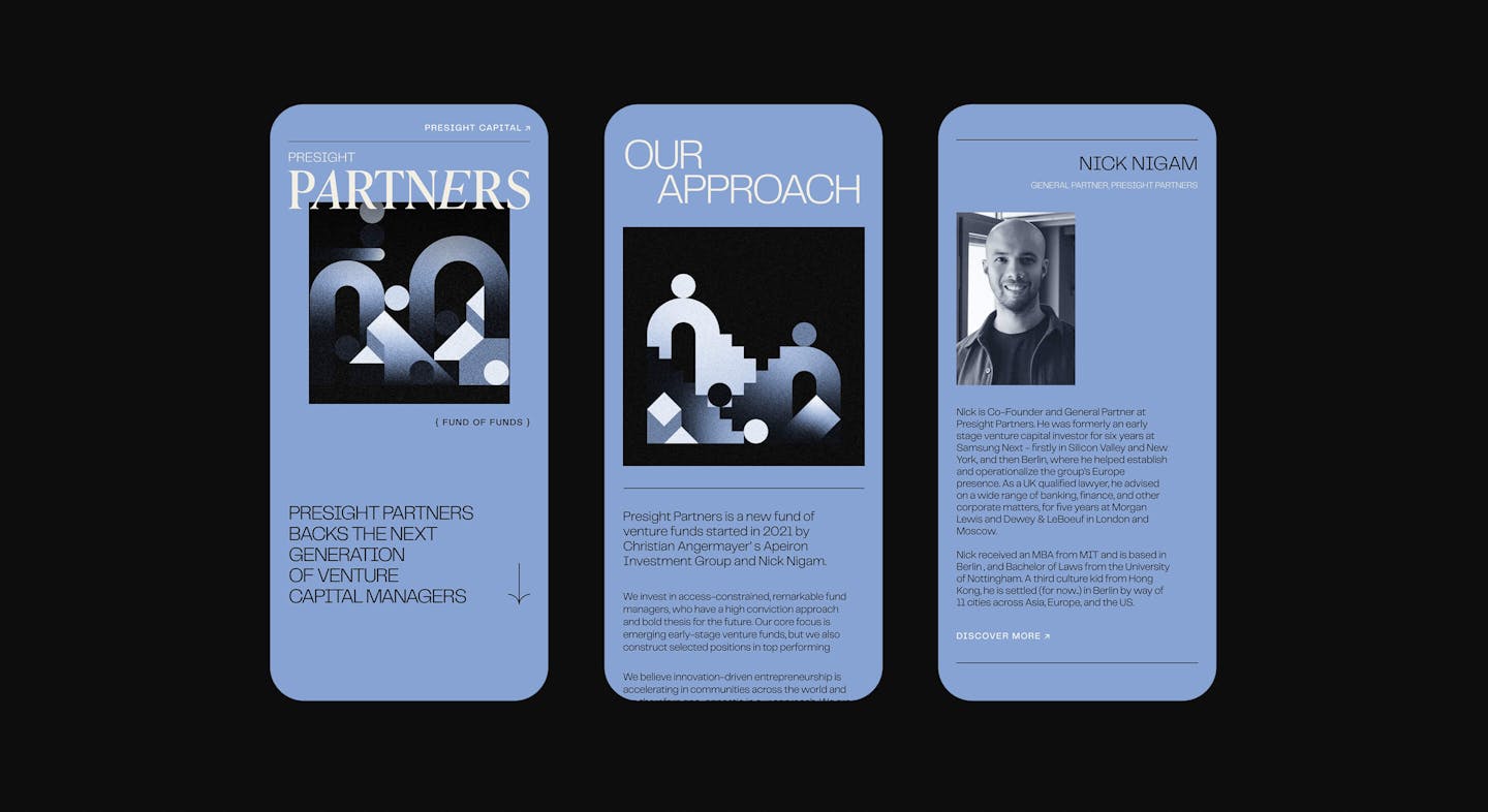
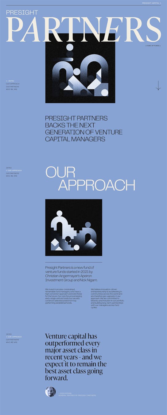
Presight Partners is a new fund of venture funds started in 2021 by Christian Angermayer’s Apeiron Investment Group and Nick Nigam. Within the category of Fund-Of-Funds, Presight Partners aims to be a fresh alternative, attracting younger, emerging fund managers. monopo helped Presight Partners to build their launch website and visual identity to set the company apart within the risk-averse fund-of-funds category.
/02 Art direction
Editorial, metaphysical and contemporary.
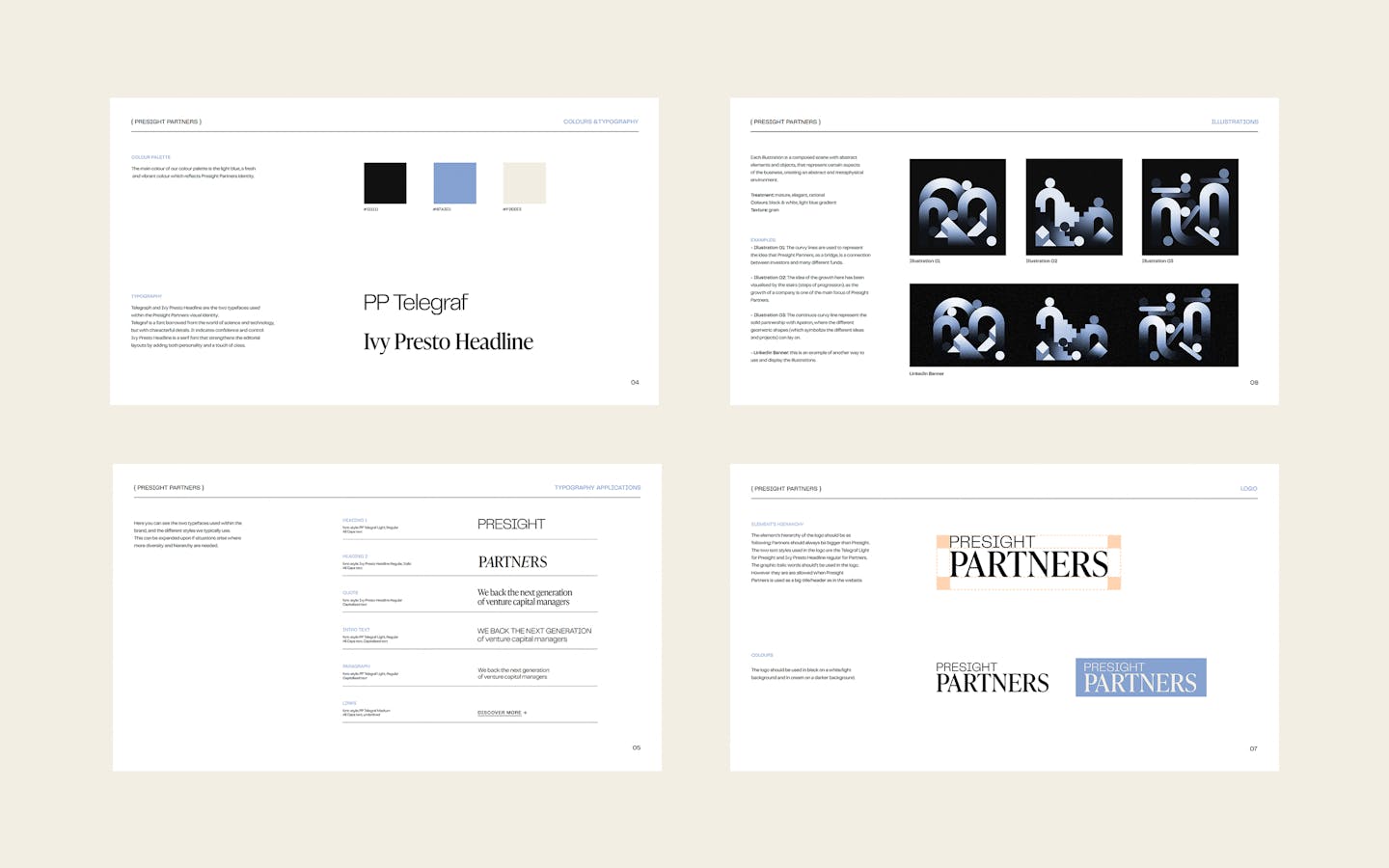
The brand’s visual direction is rooted in the solid foundations of editorial design, reinterpreted in a more contemporary way to reflect Presight Partners’ fresh approach to fund-of-funds. The website is typography-led with a combination of serif and sans-serif fonts. We were looking for a very editorial look inspired by newspaper layouts.
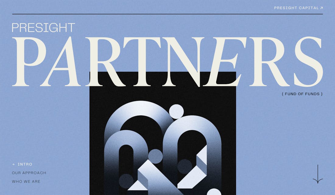
A "fund-of-funds" is an investment firm investing in other investment funds rather than direct assets. For us, a “fund-of-funds” can be seen as a meta concept as it literally sits on top of other investments. To represent this aspect of the brand, we took inspiration from metaphysical and surreal universes and created abstract and symbolic illustrations.
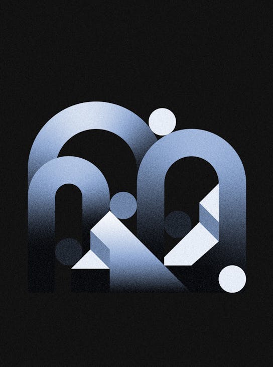
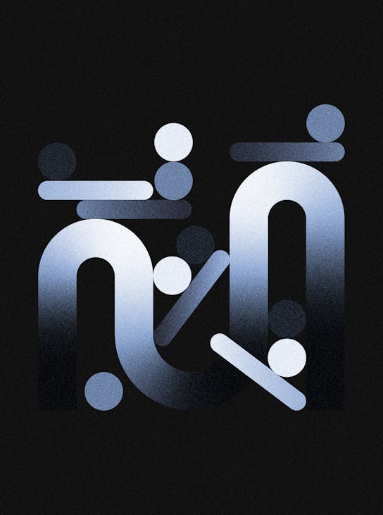
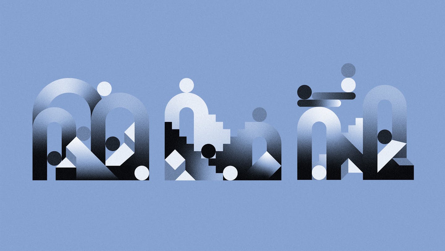
/03 Illustrations
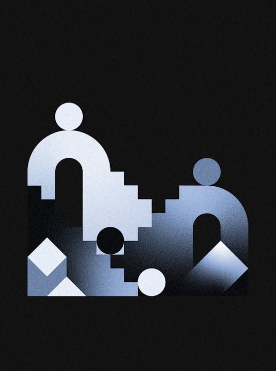
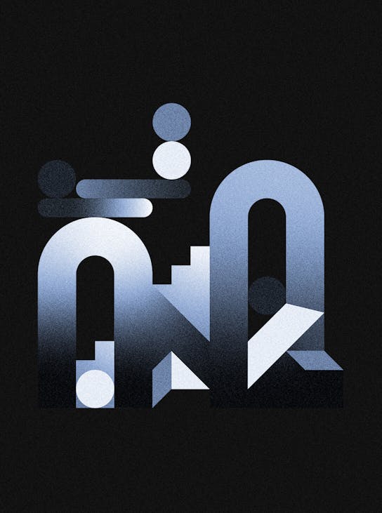
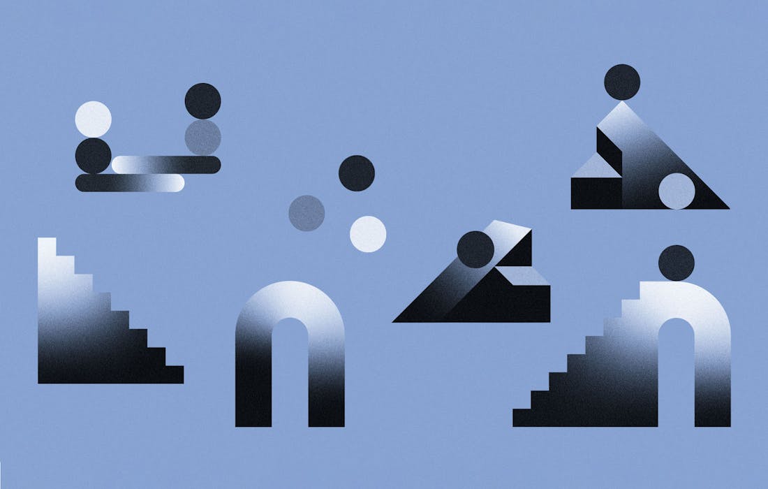
Metaphysical illustrations: abstract and symbolic.
Part of the branding system, we created a series of illustrations that embody Presight Partners’s values and give the brand a striking personality. To represent the meta concept of "fund-of-funds", we took inspiration from the symbolism of Esher and metaphysical Dalì paintings. Each illustration is a composed scene made of symbolic elements and objects representing certain aspects of the business, creating a surreal and metaphysical environment.
The hero image captures the essence of Presight Partners: as a fund-of-funds it's an overarching partner to other funds. Like a bridge, Presight Partners is a connection between investors and different funds. The second visual focused on the idea of growth and progression. The growth of a company is a core focus of Presight Partners. Either by working with early-stage ventures or established funds, the purpose is to generate growth. The final visual illustrates the concept of partnership, conveying a message of collaboration and support on which partnerships rely heavily.
To expand the visual vocabulary of the brand, we created sub-illustrations to be used in further communication executions.
/04 Website
A soothing and reassuring experience.
The main execution and front door of the brand is the website. We created a one-page website with an editorial layout to launch the brand. We took extra care to craft the animations and create a soothing feeling while browsing the website. Have a browse on presightpartners.vc!
Credits
The team
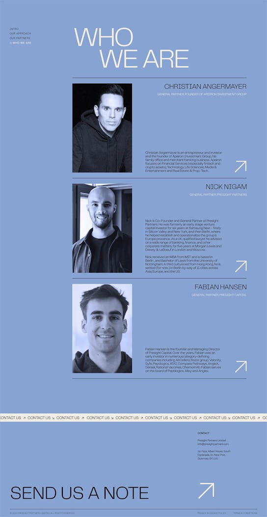
- Creative Director: Mélanie Hubert
- Strategic Planning Director: Mattijs Devroedt
- Art Director and Designer: Stella Grotti
- Illustrator & Graphic Designer: Jorie Einarsen
- Creative Producer: Maud Dedecker
Partners
- Developer: Cyd Stumpel
This website uses cookies.
Learn more.
case study
→ View
project
→ Discover
more →