QUEST PORTAL ‣ BRAND UNIVERSE
Client
- Quest Portal
Role
- BRANDING
- STRATEGY
- ART DIRECTION
- DESIGN
- CONCEPTION
- AI PROMPTING
Deliverables
- BRAND IDENTITY
- CAMPAIGNS
Date
- 28 May 2024
monopo developed a brand universe and activation launch for the Icelandic virtual tabletop role playing game platform, Quest Portal, to deliver a rich and retro identity reminiscent of the 1970’s spirit; the year TTRPG’s began.
Whimsical visuals of fantasy characters, sweeping gradients of mysterious light and retro compositions formed as visual pillars to help Quest Portal connect and empathise with the RPG community of today.
/01 CONTEXT
You know Dungeons and Dragons, right?
Dungeons and Dragons, created in 1974, is commonly recognised as the birth of TTRPG’s (table top role playing games). Players are invited to set their imaginations free for a few hours, embody a new persona, and embark on a quest with friends and foes. Prompted by a simple set of rules and a game of chance, TTRPG’s challenge the imagination without limitation. Much has changed in the gaming industry since the 70’s, but the reason to play TTRPG games has not. The empathy, humanity and liberation that comes with sitting around a table with friends will always be a deeply powerful experience.
With the technology revolution of the millennium, VTT’s (virtual tabletops) appeared and made it easier to embark on a journey from anywhere. However, the entry barrier for playing TTRPG’s still remains high; the ‘Dungeons and Dragons Player's Handbook’ clocks in at 320 pages. With the increased visibility of TTRPG games in popular media, VTT’s then developed into multi-purpose platforms often becoming over complicated, and as a result, the liberating experience of playing TTRPG’s became lost to over-engineered technology and clunky interfaces.
/02 THE BRAND
A virtual tabletop platform embodying the spirit of the 70’s
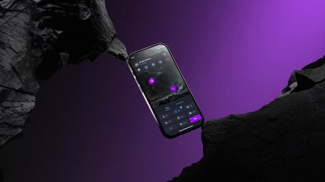
Icelandic startup Quest Portal is a virtual tabletop (VTT) platform that aims to make the RPG experience as human and liberated as it can possibly be. Their employment of smart AI technology and clear platform infrastructure creates a frictionless game experience allowing the imagination to truly wander beyond reality.
We found inspiration within Quest Portal’s commitment to truly liberate the human imagination, and their vision to resurface the 70’s spirit TTRPG’s. Building on the retrospective, we crafted a visual identity inspired by the 70’s zeitgeist, with an injection of modern playfulness and mystery.
/03 THE APPROACH
Sparking a sense of mystery.
The brand and communication should always invite investigation. Inspired by the pleasure of the game itself, we leave space for the imagination to complete what can’t be seen. When you look at the Quest Portal brand, you should have already begun playing.
We blur the lines between fiction and reality by injecting magic into every aspect of the brand; visuals, copywriting, marketing communications. The mechanics of a TTRPG game also provided us with fertile inspiration to develop brand communications that feel honest to the community.
/04 ART DIRECTION
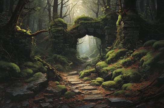
A Light in the Dark
‘A Light in the Dark’ became a key mantra when building out the brand universe further. For us, it provided a strong concept to develop a fresh new art direction for Quest Portal.
“A light in the dark is subjective. It’s a flicker of hope, a flash of inspiration or even a terrifying discovery.” begins the Brand Handbook for Quest Portal.
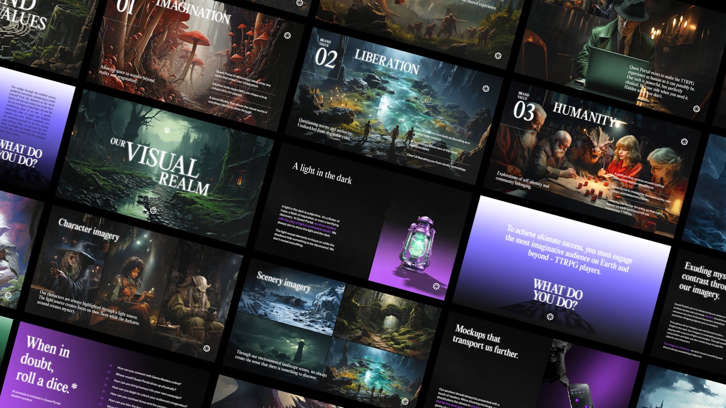
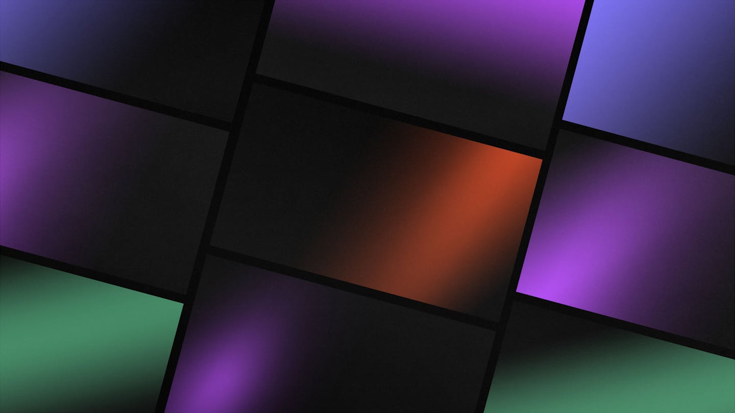
A new gradient colour palette lies at the heart of Quest Portal’s brand identity. It is designed to adapt the many genres of TTRPG games, but also directly reflect the brand’s ambition to strike mystery and intrigue with subtle light streaks. “We always aim to show the light and the dark. The light reveals elements to focus on, while the shadows hide something to be discovered. We don’t reveal everything.”
/05 CREATIVE OPPORTUNITY
Vision of the 70’s, with the tools of 2024.
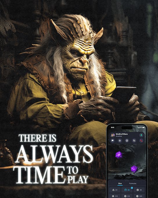
AI plays an important role on the Quest Portal platform. From creating character avatars to checking in-game rules with the help of the ‘AI Assistant’, in-game blockages are a thing of the past. Inspired by the embrace of such technology, we place AI front and centre of the visual identity.
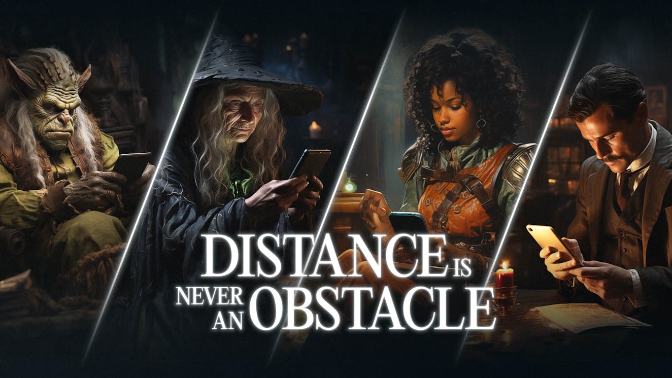
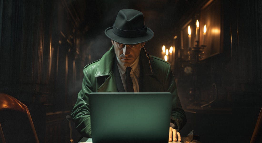
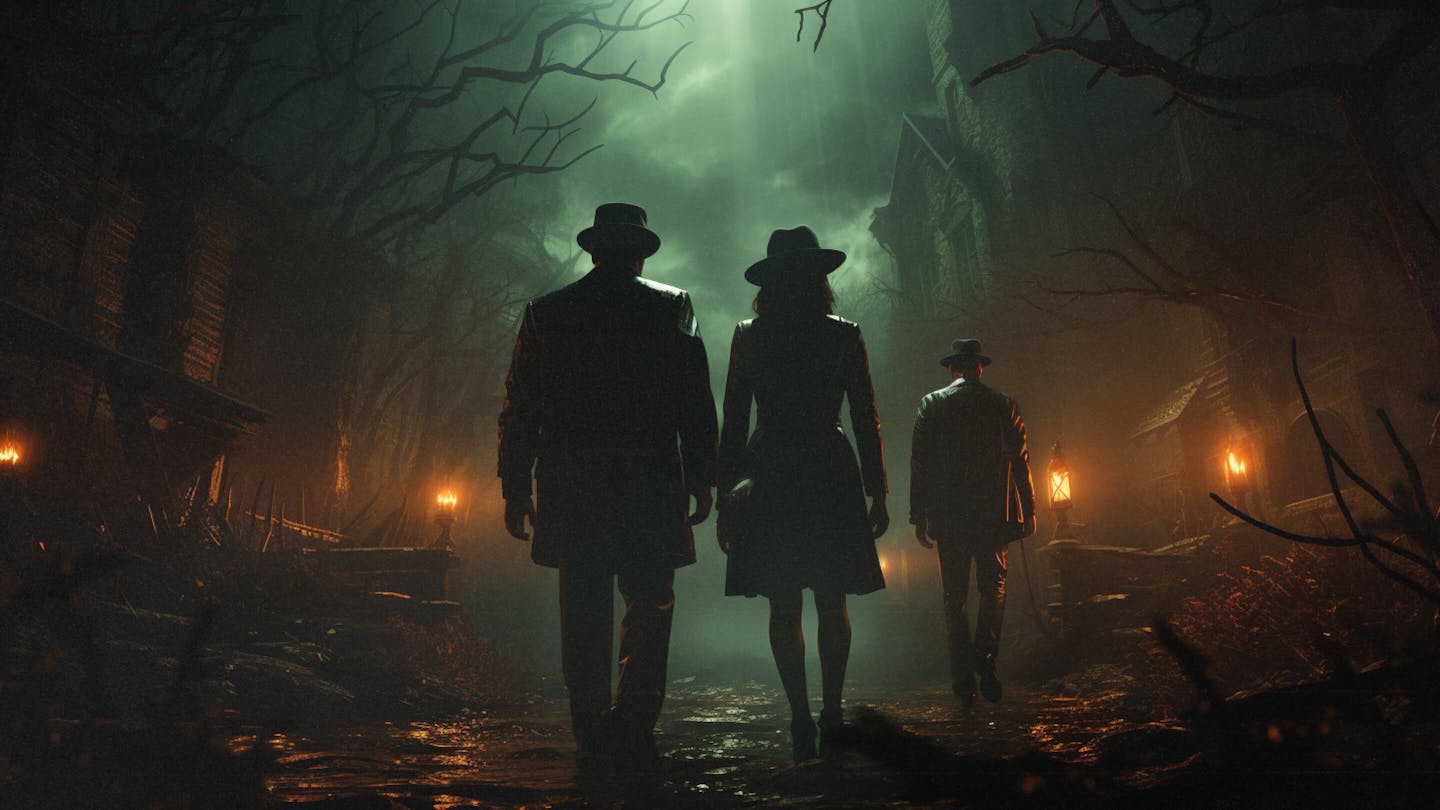
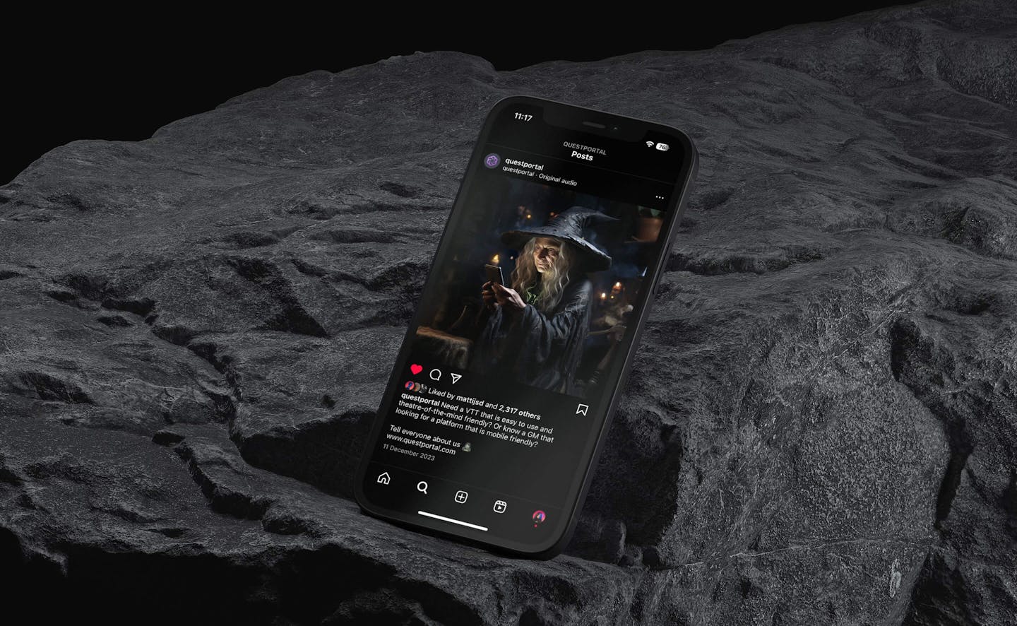
Drawing from the hyper-realistic illustrations found in retro Dungeons and Dragons manuals, we prompted a large database of mystical landscapes, characters and environments that feel rich in lore and storytelling. Characters such as orcs, witches and investigators appear through the Quest Portal brand like mascots, often engaged in a play session via the Quest Portal app. This playful integration blurs the boundaries of what can be possible for a Quest Portal user, and encourages them to already set their imagination free.
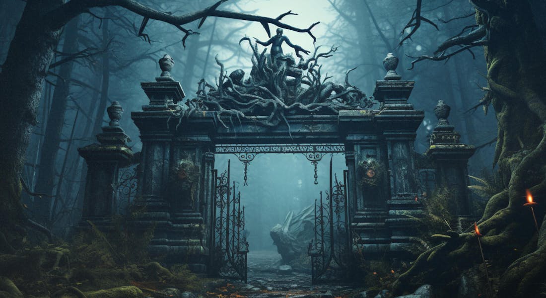
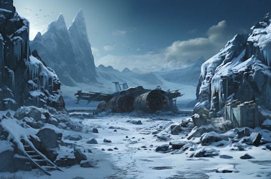
To tie closer to the core concept of Quest Portal, each AI image has been treated to reflect the mantra of ‘A light in the dark’. We use silhouettes, candle light or even moonlight to create that sense of discovery. Visuals for Quest Portal are enhanced with a ‘Retro Veil’ graphic overlay that desaturates and adds grain to the AI images to further immerse viewers in a 70’s decade.
/06 TYPOGRAPHY
Taking inspiration in the 70s book covers
For Quest Portal, a platform for a community of storytellers, the written words hold as much significance as any visual elements. For us, there was an important opportunity to use storytelling within the typographic elements of the brand.
We immediately found inspiration within the book covers of the 70’s that also serve the same purpose; to prompt limitless imagination. The main serif font, Editorial New, immerses the brand into a world of fiction and narrative, whilst the strong typographic titles draw weight and importance to brand statements.
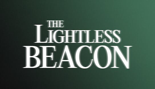
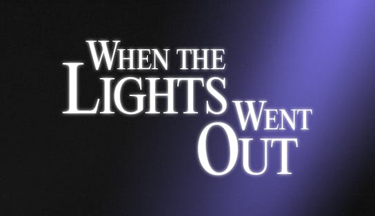
“We found that 70’s book covers had beautiful focus of light, unique type lock ups and subtle glows that all help to bring an atmosphere of mystery. When creating unique typographic lock ups for Quest Portal, we were inspired to bring in those same graphic elements to help pay homage to this unique decade.”
- Mélanie Hubert-Crozet, Creative Director at monopo london
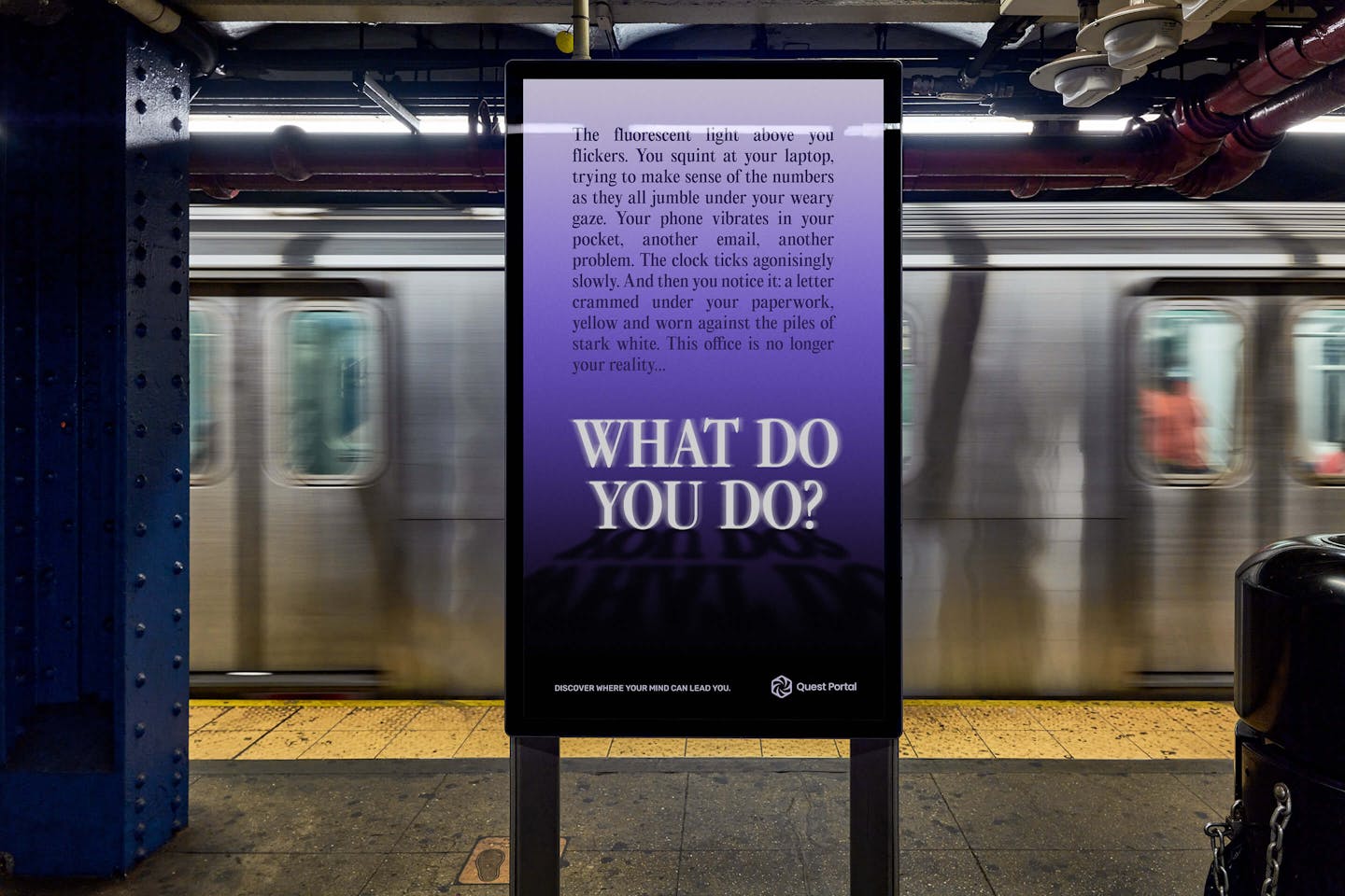
Through Quest Portal’s communications, we adopt longer-form ads that tap into the community's love of reading rich lore, but leaving the ending open to your own imaginations. By treating the typography like a page from a book, we add text as a core part of our graphic system.
/07 TONE OF VOICE
Talking like game masters
TTRPG games aren’t serious. You roll one, and the branch you step over might kill you. When considering a fresh tone of voice, we set the focus on collective enjoyment and unlocking shared wonder. Mysterious stories, open questions and long descriptive paragraphs all play an important role in brand communications, and all play into unbounded play.
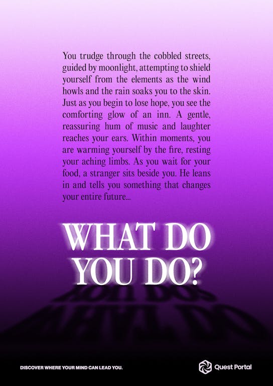
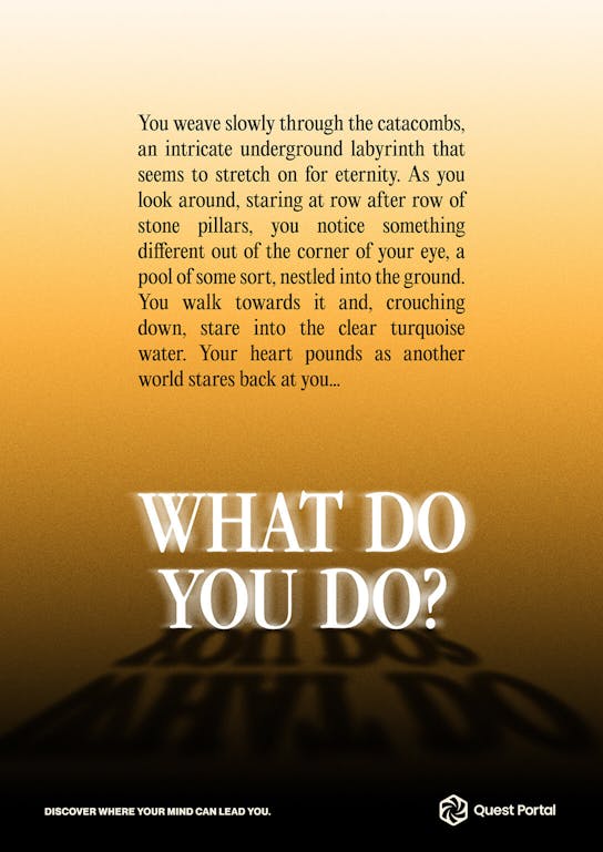
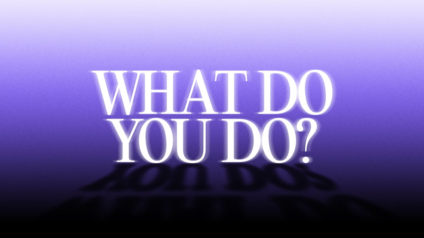
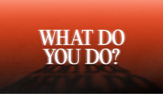
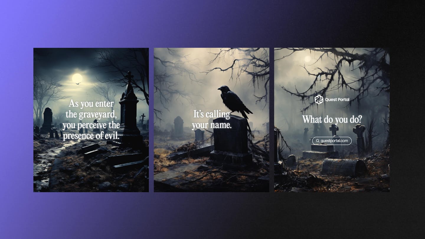
Uttered by the Game Master, ‘What do you do?’ is asked to a player after describing potentially a life threatening in-game scenario. The open question prompts the player’s imagination into making their next move without influence or ‘railroading’. It is such an iconic statement, that it is arguably owned by the community of RPG players. We chose to adopt this as the brand statement for Quest Portal to drive in their communications as an instant connection to the heart of the community.
/08 ACTIVATION
Two campaigns to blur the line between reality and fiction
With Quest Portal’s brand rooted in limitless imagination, to launch the brand, we formed two iconic social campaigns to speak to all members of the TTRPG community.
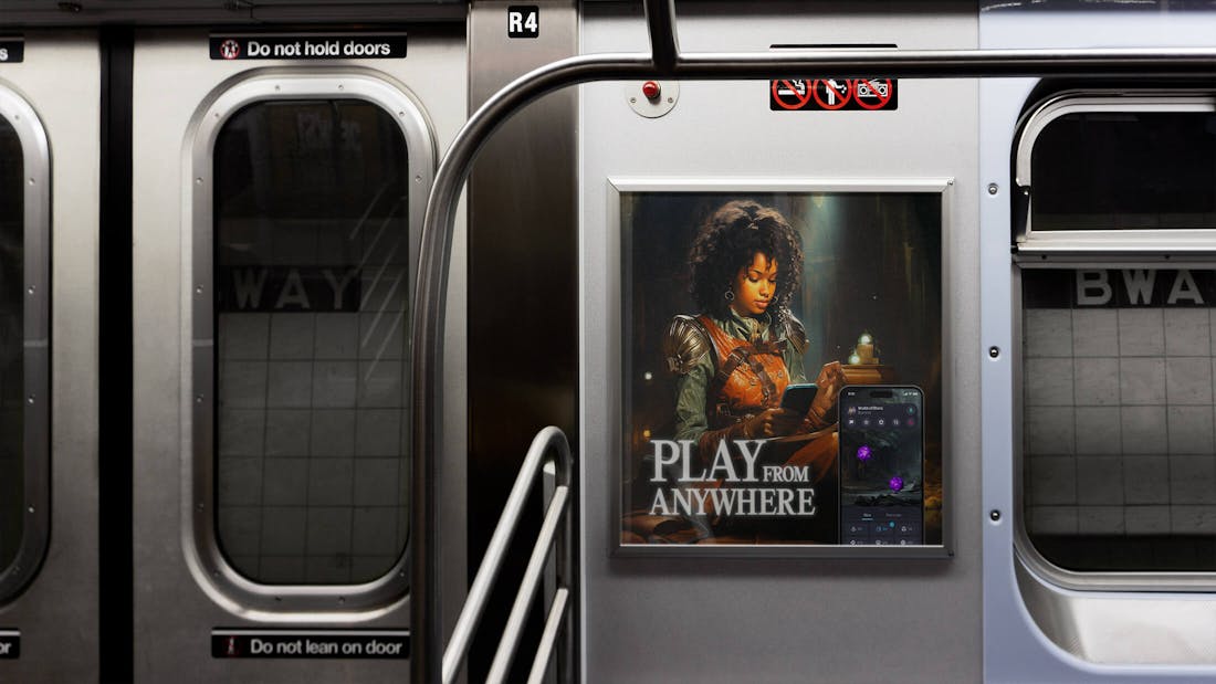
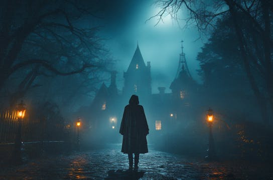
The first social activation highlights the brand tagline ‘What do you do?’ to encourage a craving for a game. A sequence of mysterious AI landscapes call you in, whilst glowing text prompts for your next move – “You reach the address listed on the letter. The once-broken lantern in your hand begins to flicker. What do you do?”. Creating this craving to play a game targets the casual and TTRPG enthusiasts.
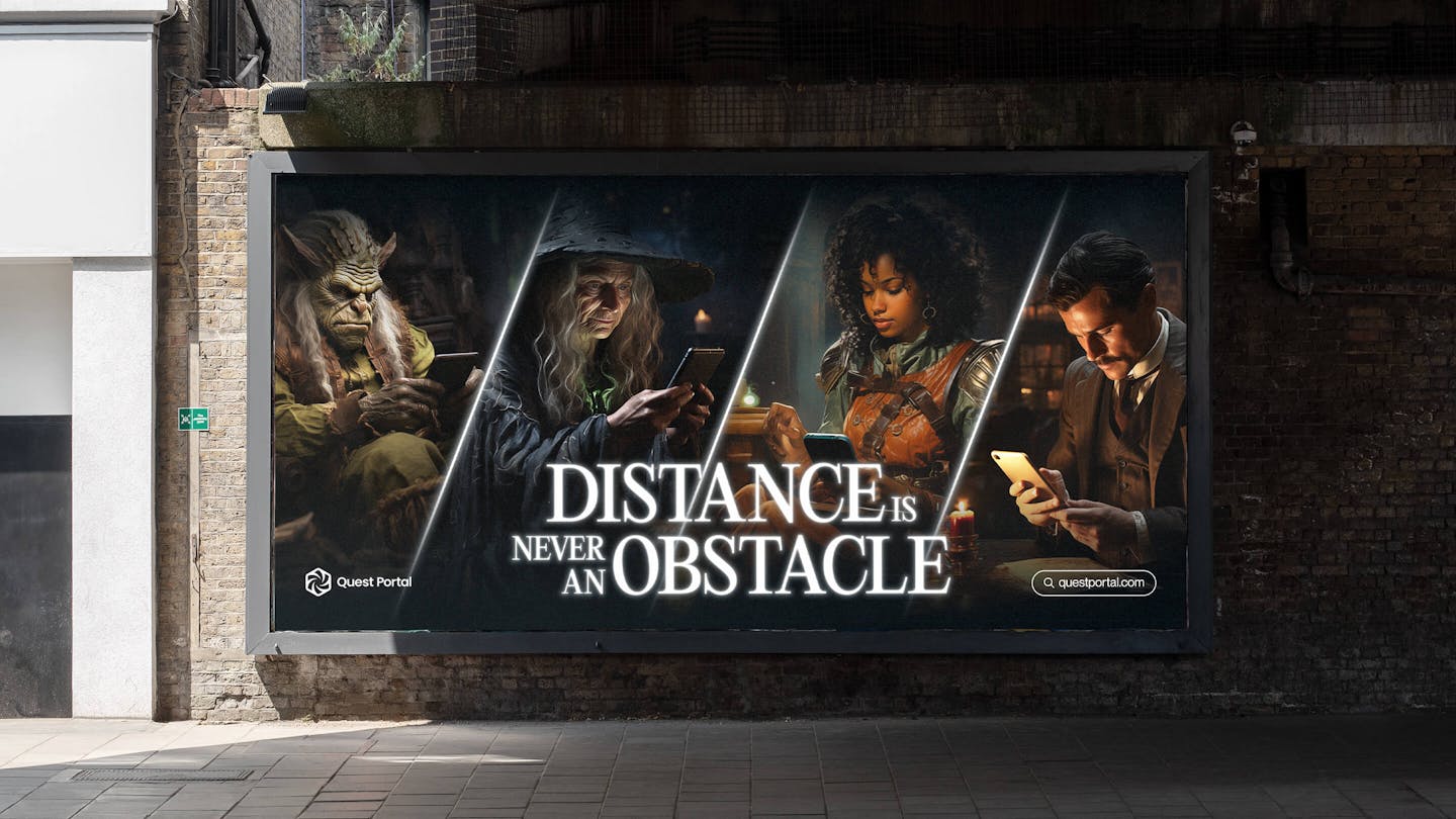
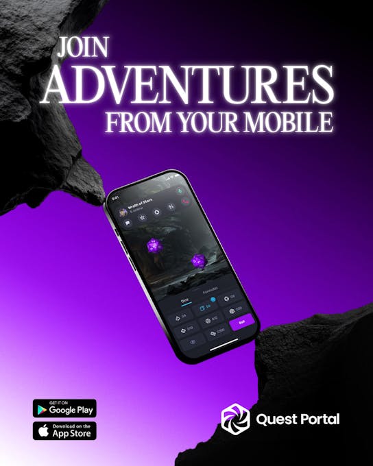
In our second social activation, we chose to focus on driving users to the Quest Portal app with the concept that distance should never be an obstacle to playing TTRPG’s, a key blockage within the TTRPG community. Collaborating with motion designer Christophe Davids, animated fantasy NPC’s are engrossed in a play session, whilst glowing lockups speak to the frictionless ease of playing on the app, and enticing in the Game Masters.
Credits
The team
- Creative/Art Director: Mélanie Hubert-Crozet
- Strategic director: Mattijs Devroedt
- Producer: Paige Collins
- Designer: Jorie Einarsen
Partners
- Copywriter: Felicity Aspen
- Motion Design: Christophe Davids
- Quest Portal - CEO & Co-Founder: Gunnar Holmsteinn
- Quest Portal - Co-Founder and Product Developer: Gummi Gunnlaugsson
- Quest Portal - Lead Designer: Ragnar Freyr
- Quest Portal - Content Manager: Tinna Hallsdottir
This website uses cookies.
Learn more.
case study
→ View
project
→ Discover
more →