Tacos Padre ‣ Cocktail label design
Client
- Tacos Padre
Role
- Art direction
- Graphic design
- Illustration
- Photography
Deliverables
- Series of can labels
Date
- 03 Jan 2022
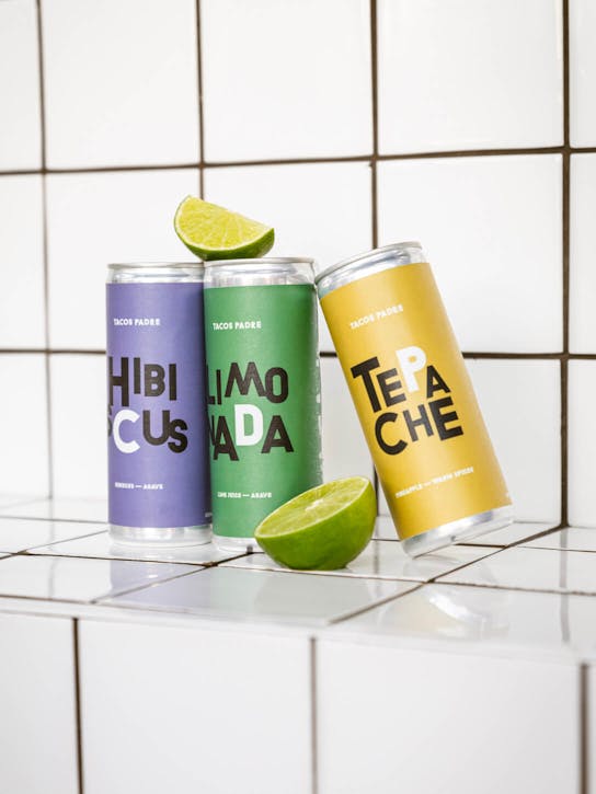
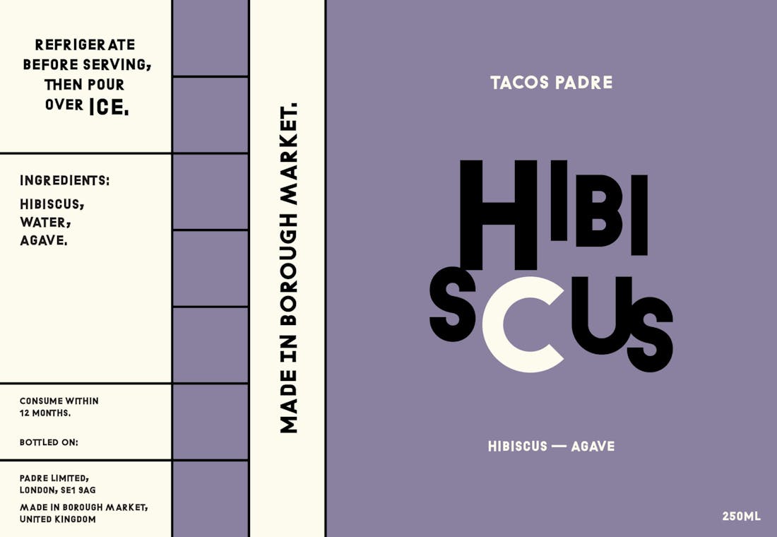
monopo worked with Borough Market-based taqueria Tacos Padre to design a series of labels for their new range of cocktails-in-a-can.
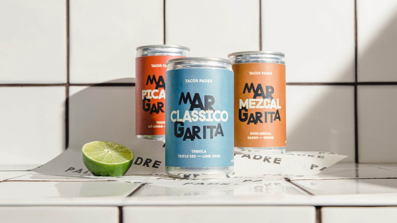
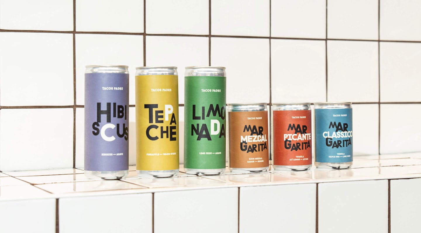
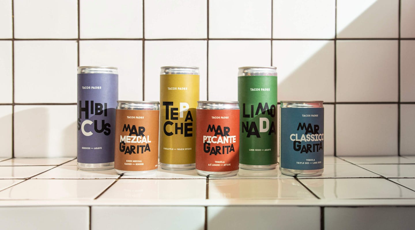
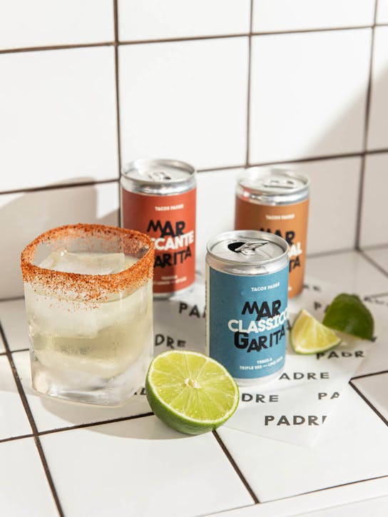
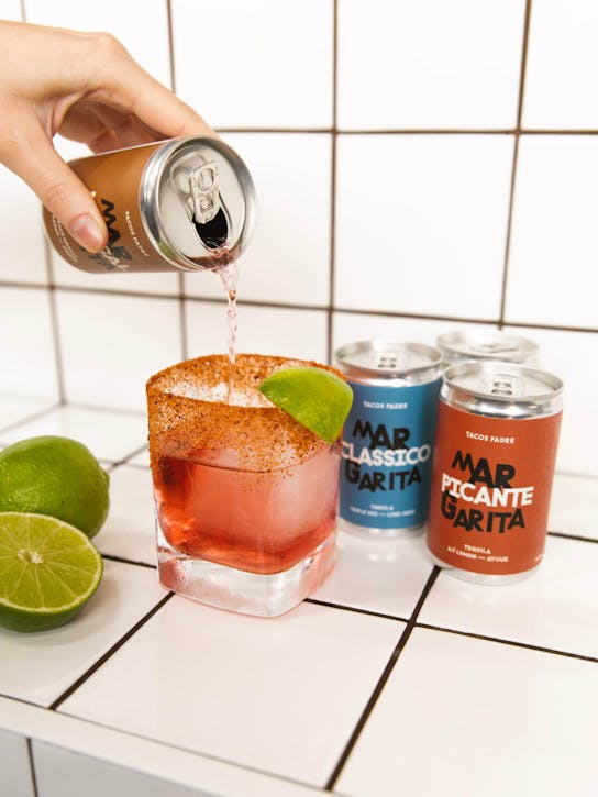
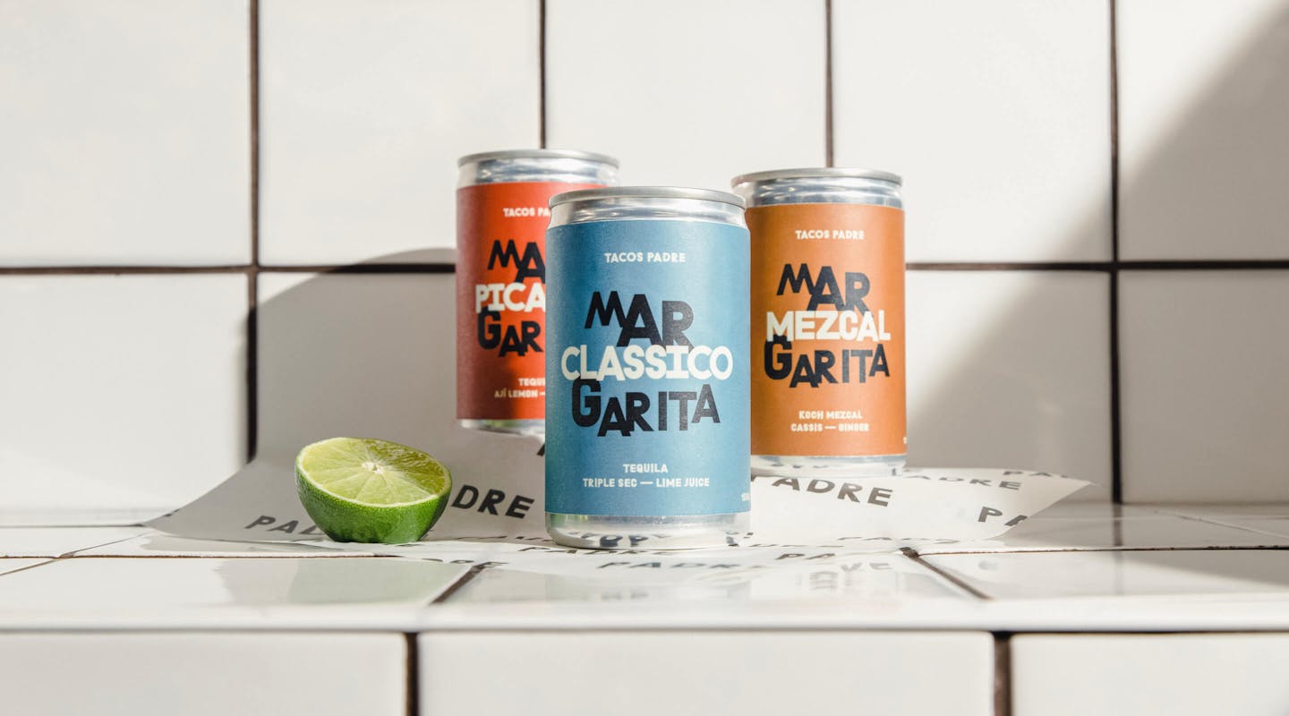
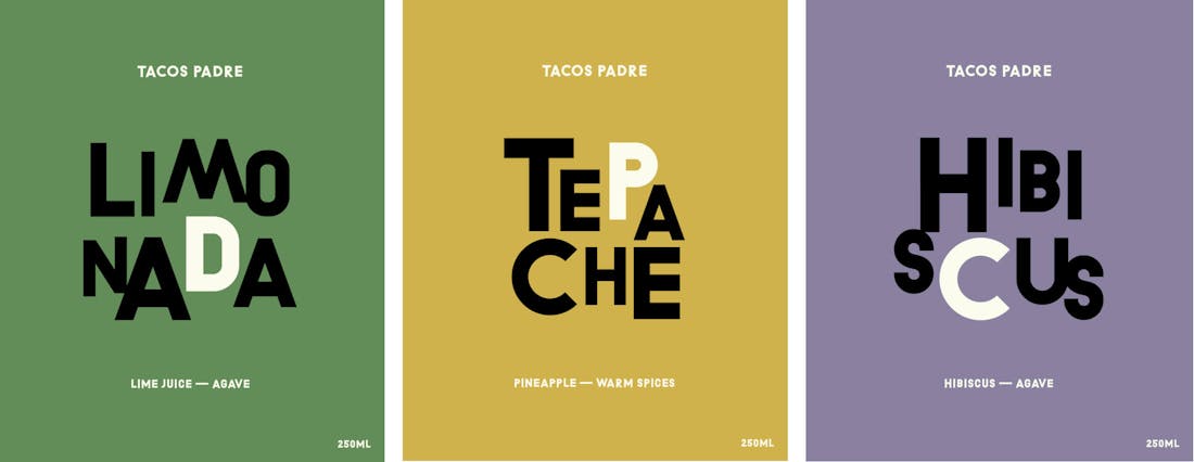
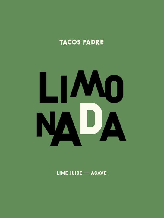
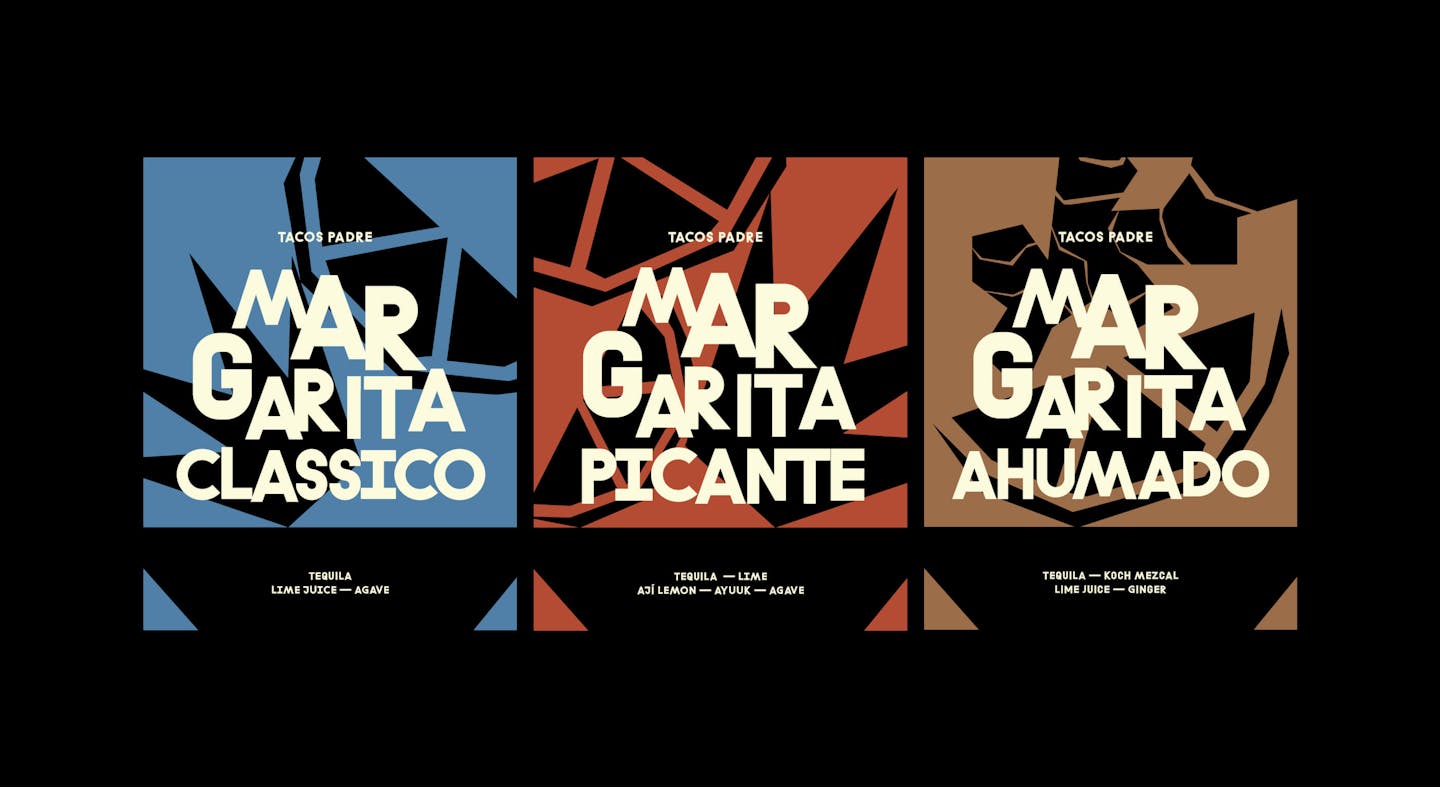
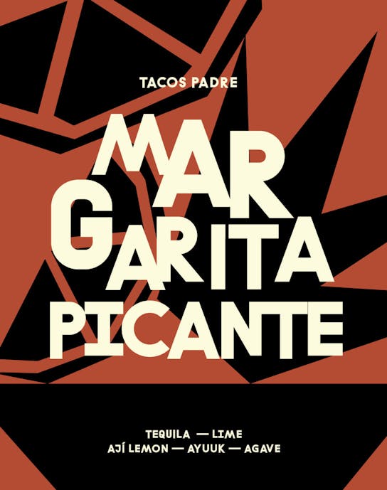
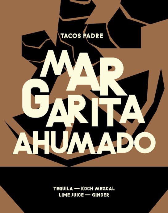
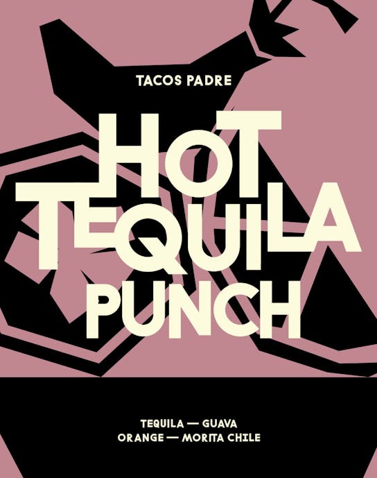
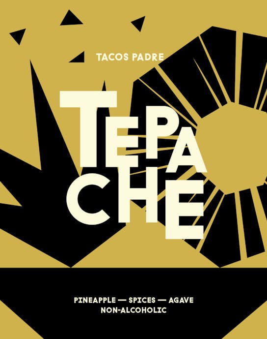
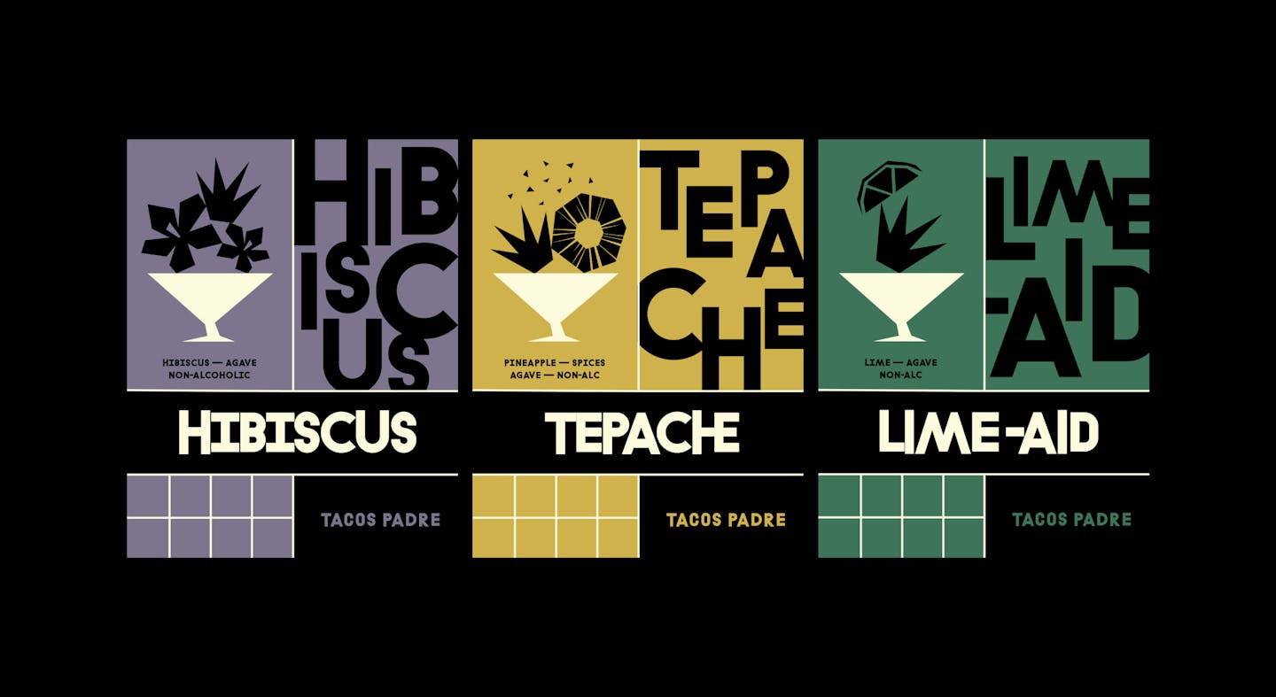
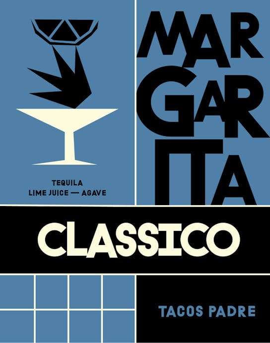
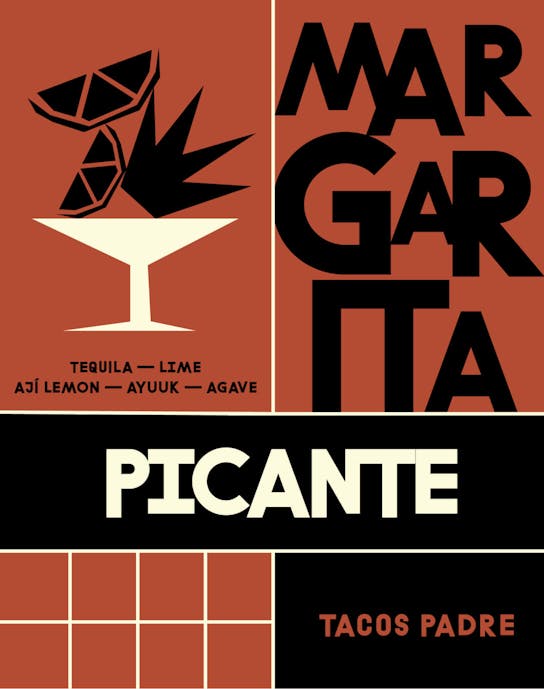
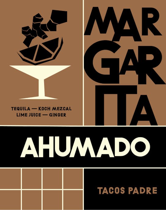
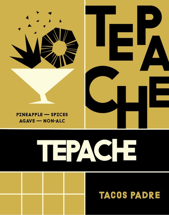
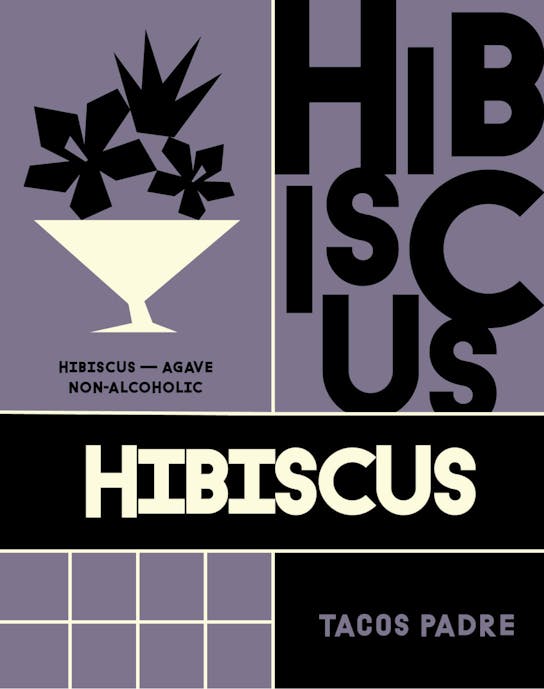
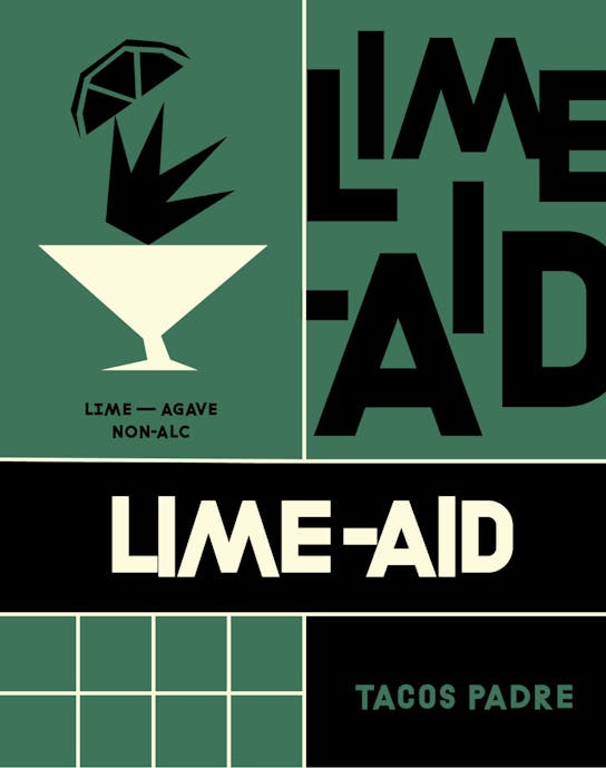
The set consisted of three types of margarita and three Mexican-inspired soft drinks.
/01 BRIEF
Branding a new range of canned cocktails
Tacos Padre is led by culinary mastermind Nick Fitzgerald, who cut his teeth at the culinary institution that is Pujol, Mexico City. With Tacos Padre, Nick is on a mission to bring the authentic flavours of true Mexican street food to London.
Those flavours are not only in the food, but also in the finely-balanced hand-crafted cocktails available at Tacos Padre’s Borough Market HQ. Applying the same care for quality ingredients and sophisticated flavours to the drinks, Tacos Padre’s cocktails became a quick success. To build on their popularity, the restaurant decided to make them available as a set of canned take-away cocktails too. Available in the taqueria, of course, but also online and through select retailers.
To help Tacos Padre scale the cocktail offering, monopo was invited to create a design system for the labels that could span across a wide variety of flavours and formats, while staying true to Tacos Padre’s sophistication and authenticity.
/02 ART DIRECTION
Mid-century Mexican mature vibrancy
Tacos Padre breaks with the template of what Mexican food should taste and look like in the UK. Its focus on sourcing quality ingredients and balancing their flavours perfectly gives Padre a more mature approach to Mexican cuisine.
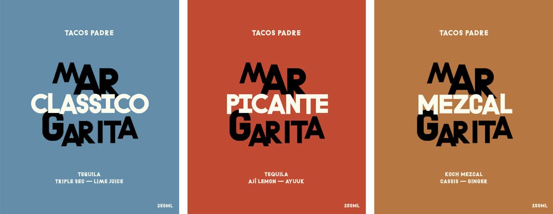
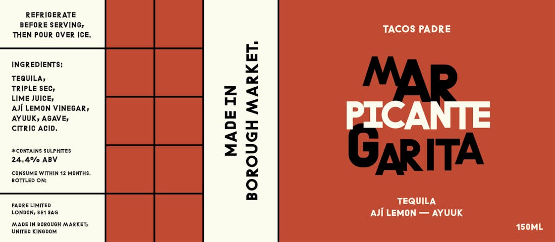
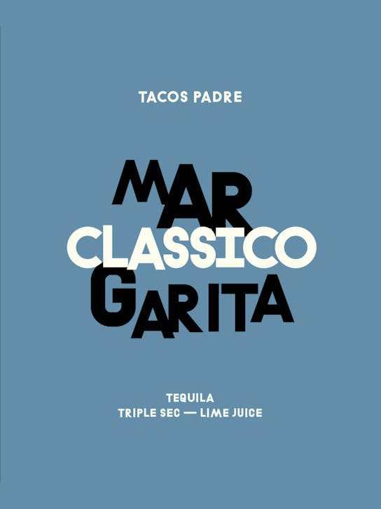
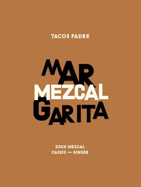
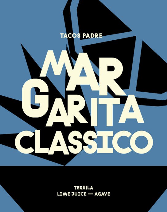
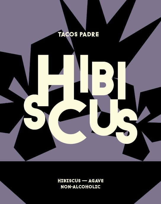
For the canned cocktail branding, we wanted to continue on this basis and took inspiration from Mexico’s mid-century visual culture. A move towards modernism, away from muralism. We wanted to show off the flavour complexity of the cocktails and break with preconceived notions of what a tequila-based drink should look like.
To deliver a design system that would work across an ever-expanding range of flavours, within a tight turnaround, we built the branding around two core components: typography-driven designs with distinctive colours.
/03 ALTERNATIVE
An unselected design direction for the curious
While exploring a design system for the whole range of drinks, we also explored how illustration could play a role in the visual identity. Inspired by mid-century designs and Saul Bass illustrations, we explored an illustration style that would allow us to easily produce a wide range of designs for now and in the future. The designs explore how we could represent the different key ingredients of the drinks, with a candid style working in tandem with the iconic broken-style typography of Tacos Padre.
Credits
The team
- Art Director: Mélanie Hubert-Crozet
- Designer & Illustrator: Jorie Einarsen
- Producer: Maud Dedecker
- Photographer: Fred Mouniguet
This website uses cookies.
Learn more.
case study
→ View
project
→ Discover
more →