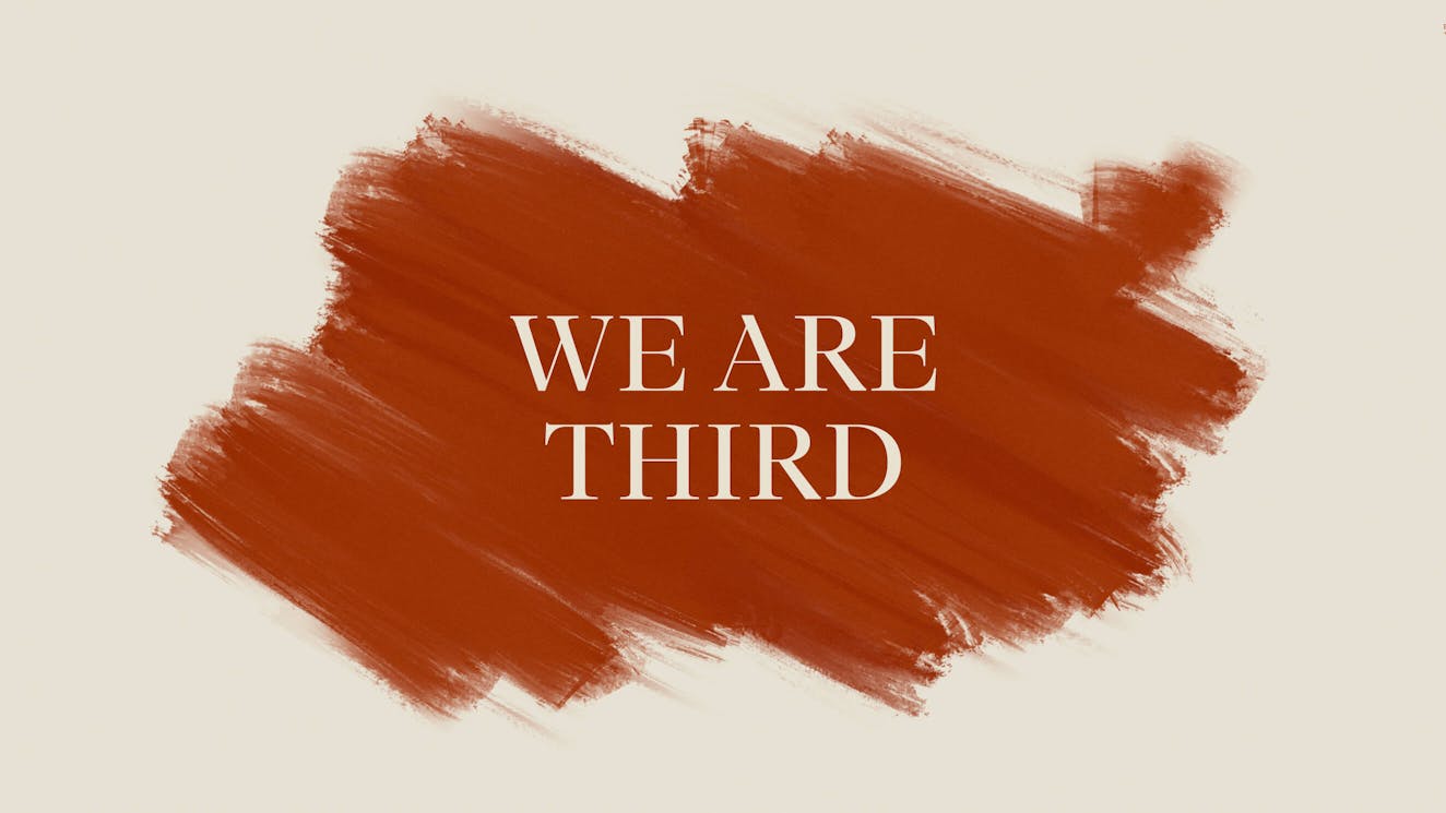
We Are Third ‣ Brand identity and Website
Client
- Kenjiro Family Office
Role
- Strategy
- Branding
- Concept
- Art Direction
- Web Design
- Production
Deliverables
- Visual Identity
- Website
Date
- 06 Apr 2021
Recognitions
THIRD tries to make finance personal again by helping family offices across the world work together. We were invited to create the visual identity and website for this new brand from scratch.
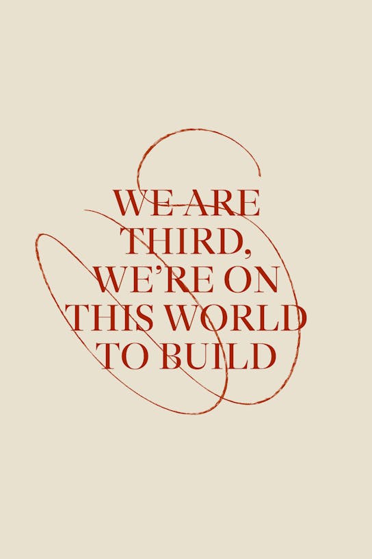
We built a visual identity system that embraces THIRD’s roots in art and construction, and created a website that asks visitors to pick up a paintbrush themselves.
/01 Challenge
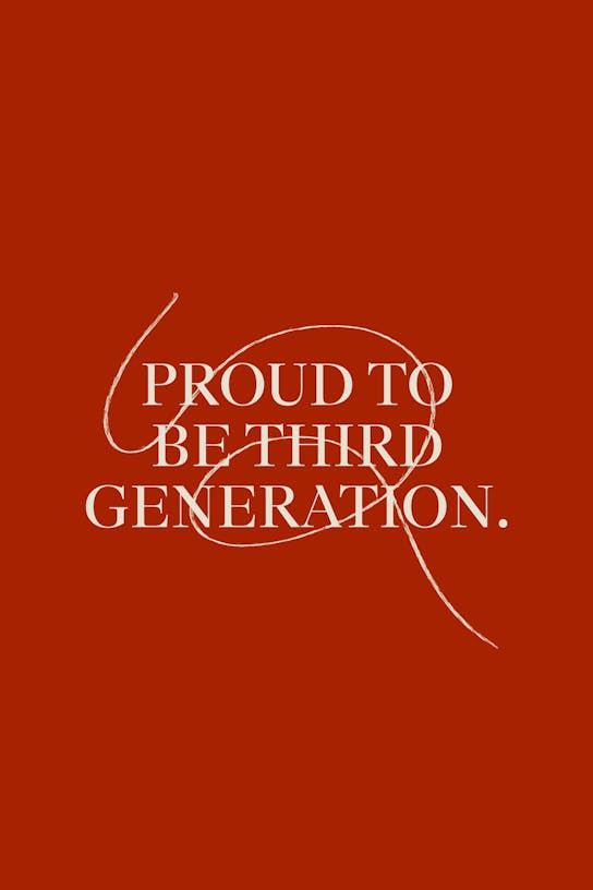
Create a brand that represents a generation that wants to make finance personal
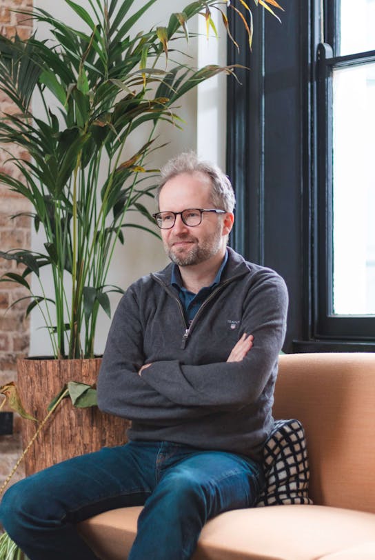
THIRD is a sub-brand within the Kenjiro family office. Kenjiro’s founder Akira Ushioda faced the challenge of managing the wealth of his family when he was still in his twenties. The beginning of a journey that forced him to navigate the complicated world of personal finance at record speed. He saw the good, the bad and the ugly and decided to start THIRD as a community-based company that would help other Third generation kids like him manage wealth in a different way. It offers a constructive alternative to the traditional world of consultants by forging more personal and longer relationships.
Our challenge was to create a brand strategy, visual identity and website that represent THIRD’s ambition of making finance personal again.
/02 Concept
THIRD is here to build
We set out to create a brand that would feel different from anything else that exists within finance. The key to this was to inject the true story and personality of Akira and his family into the brand. With roots in both construction and art, we quickly struck on the idea of building a different future. THIRD would be a brand that represents a generation ready to get their hands dirty and construct something fresh.
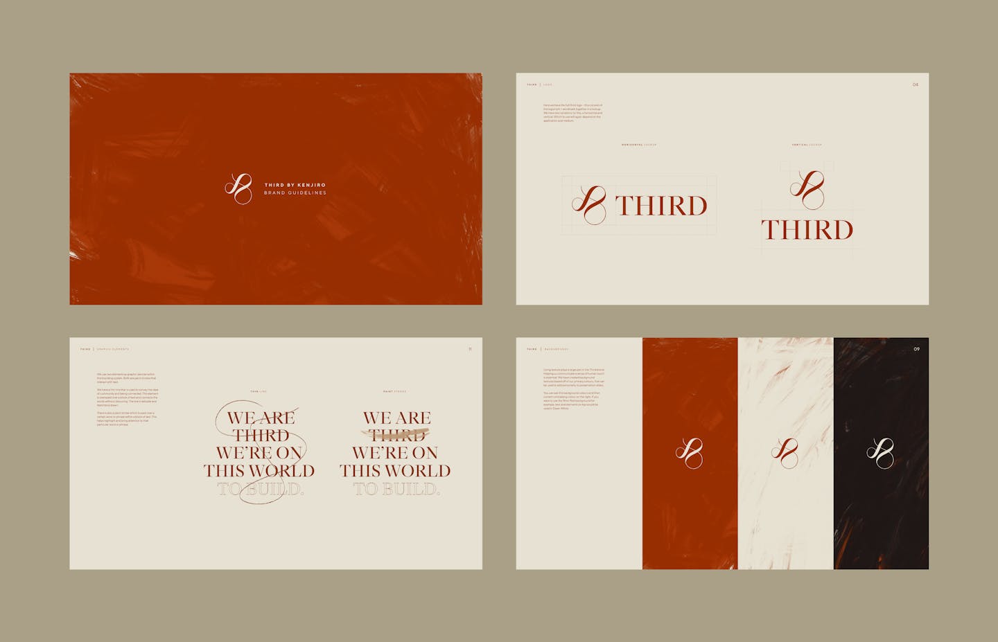
/03 Visual Identity
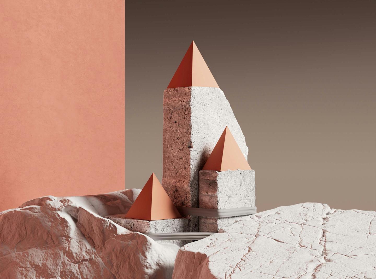
Earthy tones, manual brushes and 3D objects
Inspired by a history in art and construction, we set a color palette for the brand that is composed of earthy tones, textures and techniques. Manual paint brushes became an important visual device used across the visual identity system. They represent the ambition of this generation to tackle a white canvas and create something new, in their own vision.
But THIRD doesn’t want to go it alone. THIRD exists to create a community of like-minded families across the world. Hence we created the logomark as an inverted ampersand, representing the brand’s desire to create unity and collaboration rather than isolation.
Lastly, we collaborated with 3D artist Ross Mason to create a library of visuals that represent the brand’s values. Abstract scenes with organic textures that make the brand feel both human and visionary.
/04 Website
Create and discover
The website was intentionally created to maintain a sense of mystery. Personal finance is a topic relevant to only a small set of visitors and is mainly discussed via direct conversation. The purpose of the website was to represent the values of the brand online and offer those interested to find out more an option to get in touch with THIRD directly for further conversation.
To support this sense of mystery, the website opens on an enigmatic screen that prompts the visitor to “paint” the screen with their cursor to enter the website. This gives the user a sense of control and creativity. Once into the website, the paintbrush remains a consistent engagement device. Hovering on statements and titles creates a manual brush line that follows the mouse. Scrolling the page creates a brush stroke in the background that changes the texture of the website. Transitioning between pages results in the full page being painted in a different color.
Credits
The team
- Creative Director: Mélanie Hubert
- Strategic Planning Director: Mattijs Devroedt
- Concept, Art Direction & Design: Mason El Hage
- Web Design: Stella Grotti
- Production: Maud Dedecker, Fred Mouniguet
Partners
- Development: Jonas Folletête
- 3D Illustrations: Ross Mason
This website uses cookies.
Learn more.
case study
→ View
project
→ Discover
more →