Yonex All England ‣ Brand Universe
Client
- Badminton England
Role
- STRATEGY
- BRANDING
- ART DIRECTION
- DESIGN
- MOTION DESIGN
- PRODUCTION
Deliverables
- BRAND IDENTITY
- CAMPAIGN TOOLKIT
Date
- 26 Sept 2023

monopo london was invited to rebrand and reposition the prestigious YONEX All England Open Badminton Championships.
We crafted an electrifying identity to transform the tournament into a festival of badminton.
/01 CONTEXT
Rebranding one of the most prestigious badminton tournaments to reach new audiences
The YONEX All England Open Badminton Championships, or simply the YONEX All England, is the oldest and most prestigious badminton tournament in the world. Since 1899, athletes from around the world have competed for a chance to win the title of champion. Each year, 155 matches and 50 hours of live badminton are contested in front of a global audience of more than 350 million.
Badminton England invited us to redefine the visual identity of the YONEX All England in order to introduce the exhilarating experience of live badminton to new communities, as well as bring together the sport’s global fanbase.

/02 BRAND STRATEGY
A brand evolution that transforms the tournament into a festival of badminton
The long term vision for the YONEX All England’s rebrand is to truly make the tournament feel like a festival of badminton. A challenge that applies as much to the IRL tournament as to the digital experience for the thousands of fans tuning in remotely.
The direction emphasises the thrilling experience of attending the tournament itself: the lightning-fast speed of the shuttlecock (the world record badminton smash speed was set just this April at 565 km/h), the raucous cheering of global crowds that come together from countries as far away as Indonesia, Malaysia and Japan and the bright lights that bring drama to the action over six days of intense competition.
/03 ART DIRECTION
Capturing the thrill of live badminton by electrifying the brand and building on its heritage
Watching live badminton is an incredibly exciting experience: lightning-fast games, intense rallies, spectacular shots, hyper-focused athletes, enthusiastic fans cheering… It was important to create a brand that fully captures the thrill of watching live badminton and gets us pumped and excited with each piece of communication.

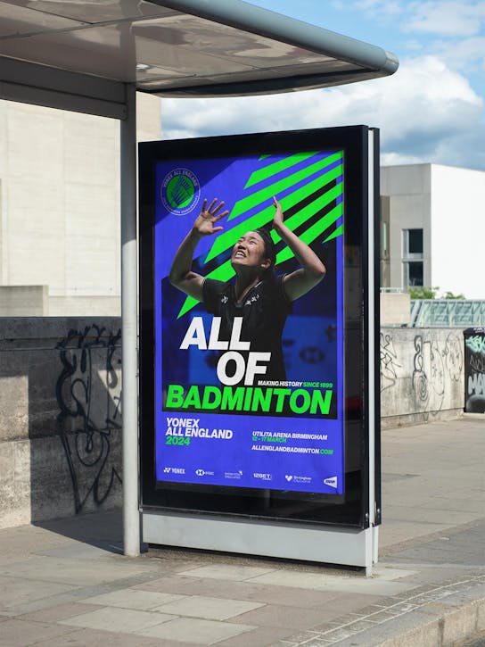
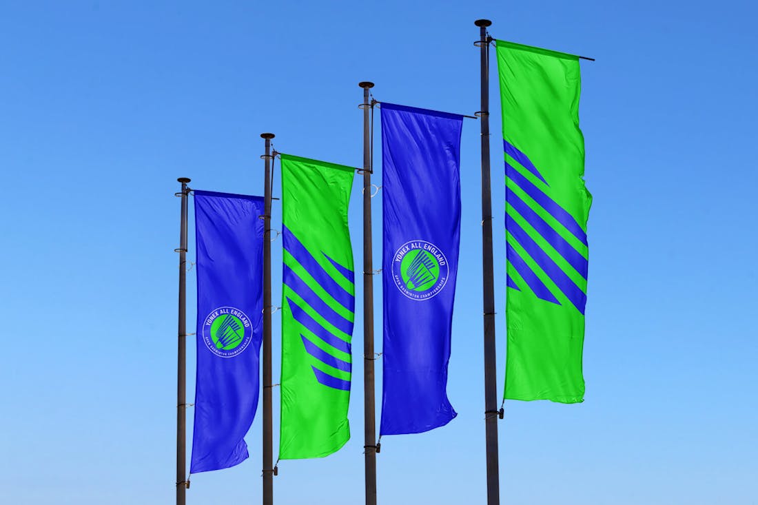
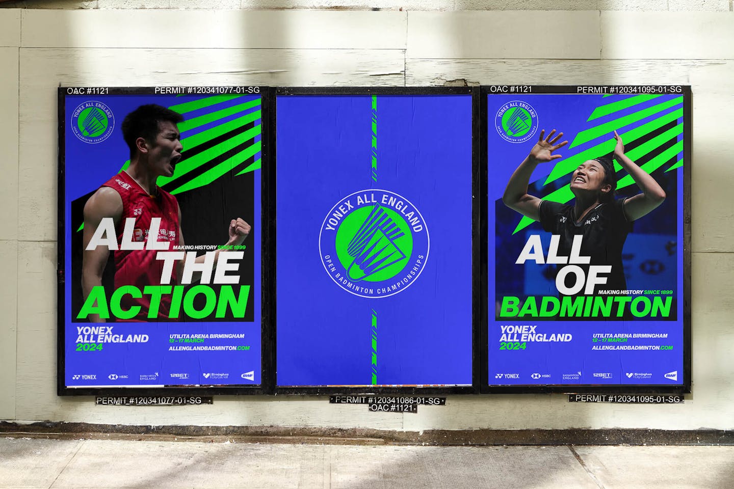
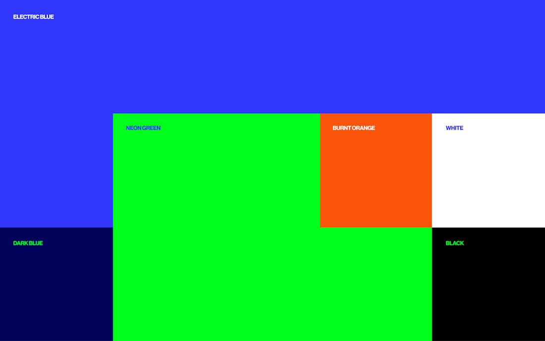
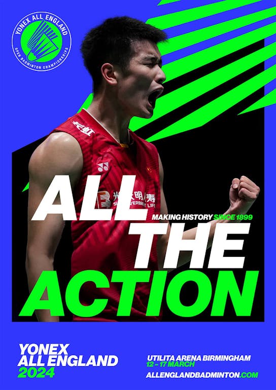
Since the YONEX All England is such a prestigious tournament with deep history, the rebrand should build on the strengths of the existing heritage. The rebrand retains the tournament’s iconic roundel logo, but now modernised and simplified in its lines for a digital-first identity that engages youth audiences. In the same respect, the new colour palette infuses the blue and green heritage colours of the tournament but re-energised as a vibrant neon green and electric blue with accents of burnt orange, inspired by Badminton England’s brand colour.
/04 GRAPHIC ELEMENTS
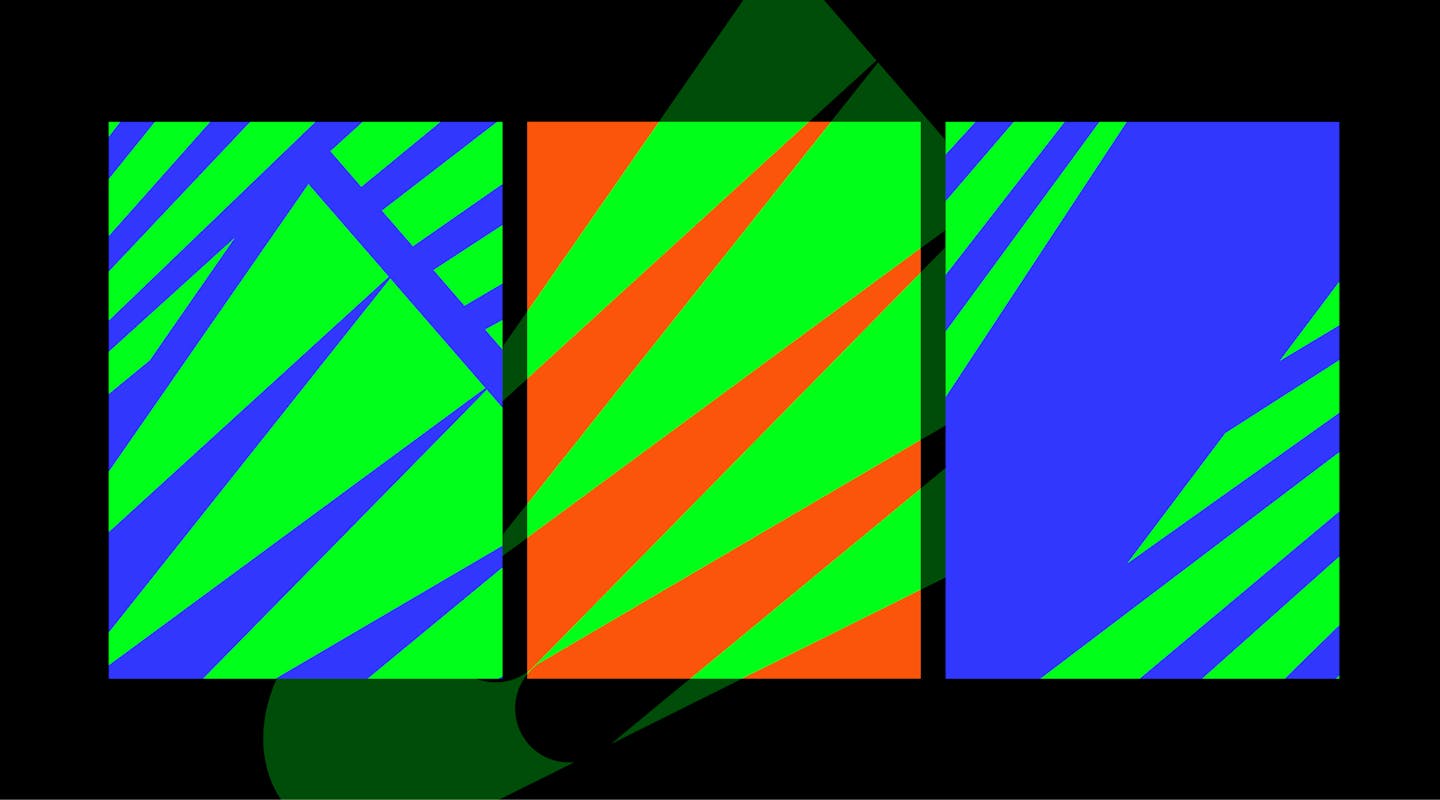
Deconstructing the logo to create dynamic patterns
Harnessing the shuttlecock icon in the centre of the logo, we created a versatile collection of graphic patterns by cutting and deconstructing the icon in various ways to build powerful compositions. Expanding upon the iconic shuttlecock icon allowed us to create the most iconic graphic elements on the rebrand. Additionally, playing with the repeated shuttlecock icon and a masking technique, we crafted an ownable graphic strip for the tournament that speaks to the energy of the sport.
/05 THE FEEL
Closer to the action than ever before
To mimic the raw power of live badminton, we adopted three copy statements across the key visuals that dial straight into the explosive action: “All the action. All together. All of badminton.”. Reading these in the updated bold italic sans-serif typography should feel as though you are glued to your seat, leaning into the action.
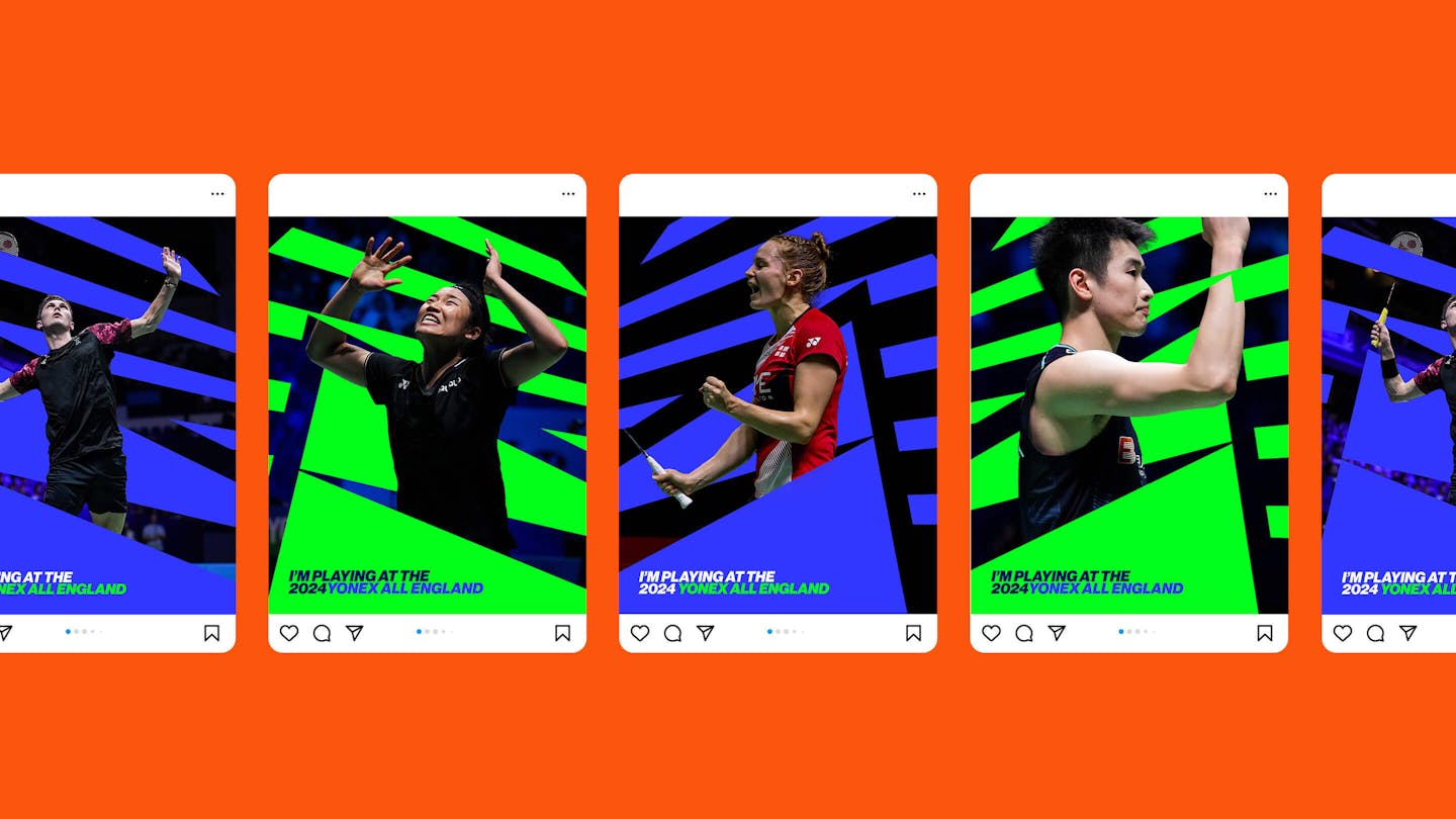
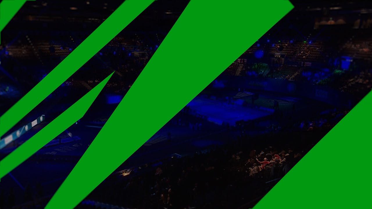
In addition, cropped graphic windows bring focus to imagery of the tournament’s most explosive moments, both of the athletes on court and fans in the arena.

/06 MOTION
A brand in motion, inspired by fast-paced badminton games
As a brand aiming to capture the fast game that is badminton, motion is a crucial aspect of the visual identity. YONEX All England is a brand in motion where its movements are fast, sharp, powerful and snappy. The motion is inspired by badminton itself: the fast-paced games, the smash, the back-and-forth movements during a game.
/07 FUTURE
A festival that lives the year-round, online and IRL
Within the broader objective of opening up the sport and connecting and growing the badminton community in the United Kingdom and around the world, the new visual identity also seeks to inspire a new generation to engage with and get involved in the sport. This digital focus elevates the YONEX All England beyond one annual tournament to become a brand platform that can host a spectrum of content all year long, online and offline, all around the world: A way for audiences everywhere to discover the electrifying experience of live badminton.
“We’re thrilled to launch the YONEX All England’s new brand identity. Live badminton is an exhilarating experience and the new brand identity really captures what makes the sport and tournament so special. We can't wait to bring it to as many people as possible next March.”
– Jenny Clark, Badminton England Commercial Director
Credits
The team
- Creative Director: Mélanie Hubert-Crozet
- Strategic Director: Mattijs Devroedt
- Creative Producer: Maud Dedecker
- Graphic Designer: Ferdaws Alizada
- Graphic Designer: Jack MacKinnon
- Project Manager: Mary Wu
Partners
- Motion designer (Brand video): Christophe Davids
- Motion designer (Brand assets): Christian Rubio
- Motion designer (Teasing assets): Kryštof Ježek
This website uses cookies.
Learn more.
case study
→ View
project
→ Discover
more →